Cygnet
Your Guide to Using the Cygnet Template for Joomla
Introduction
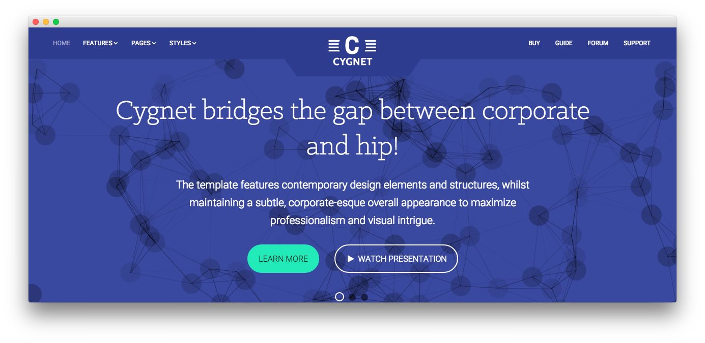
Cygnet bridges the gap between corporate and hip! The template features contemporary design elements and structures, whilst maintaining a subtle, corporate-esque overall appearance to maximize professionalism and visual intrigue.

Requirements
- Apache 2.2+ or Microsoft IIS 7
- PHP 5.3.10+ (PHP 5.5+ Recommended)
- MySQL 5.1+
- Joomla 3.4+
NOTE: Gantry v4.1.35 is required for Cygnet to work correctly. For more details on the Gantry Framework, please visit its Dedicated Website.
Key Features
- Responsive Layout
- 6 Preset Styles
- Content Animations
- 90 Module Positions
- 1200 Fixed Option
- 20 Styled Module Suffixes
- Structural Module Suffixes
- 960 Fixed Option
- Dropdown-Menu and Split-Menu
- Custom Typography
- Custom Logo Option
- Mobile Menu
- Social Buttons Option
- Chart.js
- Coming Soon Page
Responsive Layout
A responsive layout adapts automatically to the viewing device's width, such as mobile, tablet or desktop, without the need for a separate layout or content. Mobile modes have a unique menu to aid usability. 960px and 1200px fixed layout options are also available.
| Label | Description | Layout Width | Column Width |
|---|---|---|---|
| Smartphones | Standard smartphones | 480px and below | 100% fluid |
| Smartphones to Tablets | Larger smartphones and small tablets | 767px and below | 100% fluid |
| Tablets | Larger tablets | 768px and above | 64px |
| Desktop | Standard desktops and laptops | 960px and above | 80px |
| Large Display | Large desktops and high-resolution laptops | 1200px and above | 100px |
Found errors? Think you can improve this documentation? Please edit this page. You can also view the history of this page.