Denali: Showcase Slider Particle
Your Guide to Recreating Elements of the Denali Demo for Grav
Introduction
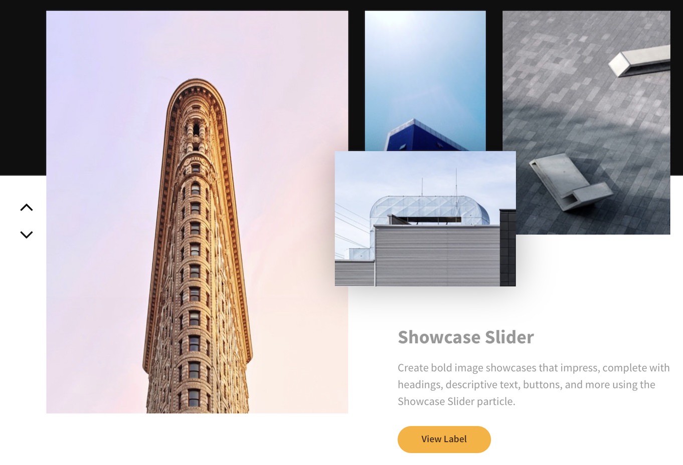
The Showcase Slider particle gives you the ability to easily display multiple overlapping images with a single adjoining text.
Here are the topics covered in this guide:
Configuration
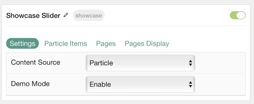
Settings
These options affect the main area of the particle, and not the individual items within.
| Option | Description |
|---|---|
| Particle Name | This is the name of the particle used for back end management. It does not appear on the front end. |
| Content Source | Choose between Particle and Grav as the Content Source. |
| Demo Mode | Enables or Disables Demo Mode. If enabled the preset number will be synced with the set number. |
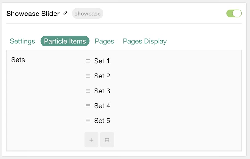
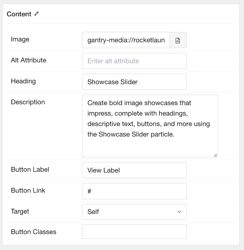
Particle Item Options
These items make up the individual featured items in the particle. Items in this section will only appear if Particle is selected as the Content Source.
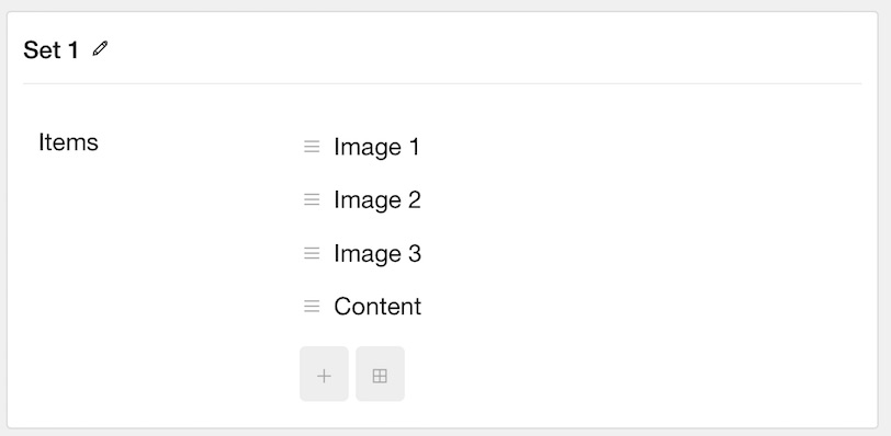
You'll notice in our demo that each slide is a series of four items. The first three items are simply images while the fourth contains an image and text in the Heading, Description, and Button Label fields.
| Option | Description |
|---|---|
| Item Name | This is the name of the item. This only appears in the back end. |
| Image | Select an image for the item. |
| Alt Attribute | Enter an alt attribute for the image. |
| Heading | Enter a text heading for the item. |
| Description | Enter a text description for the item. |
| Button Label | Enter a text label for the button. |
| Button Link | Enter a URL you would like the item to link to. |
| Target | Choose the target tab you would like the URL to open to. |
| Button Classes | Enter any CSS class(es) you wish to have apply to the button. |
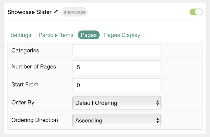
Pages
This area determines how Article Content is discovered and selected by the particle if Grav is selected as the Content Source.
| Option | Description |
|---|---|
| Categories | Select the categories of pages this particle will display. |
| Number of Pages | Enter the maximum number of pages to display. |
| Start From | Enter offset specifying the first article to return. The default is '0' (the first article). |
| Order By | Choose the type of factor to order by. |
| Ordering Direction | Choose between Ascending and Descending as the article ordering method. |
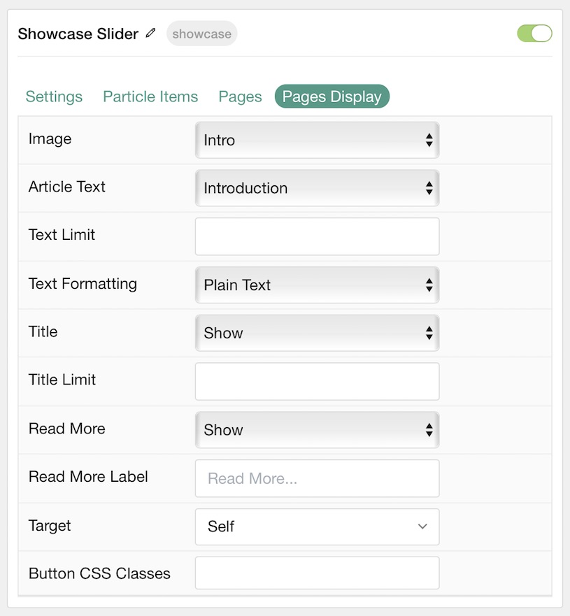
Display
This section configures how pages are displayed.
| Option | Description |
|---|---|
| Image | Display the image assigned to the article's Intro, Full or None. |
| Article Text | Choose whether to display the Introduction, Full Article, or Hide (none). |
| Text Limit | Enter the number of characters you wish to limit the text displayed to. |
| Text Formatting | Choose between plain text and HTML. |
| Title | Show or Hide the article's title. |
| Title Limit | Enter the maximum number of characters in the title to display. |
| Read More | Show or Hide the Read More link. |
| Read More Label | Enter any text you wish to have appear as the read more link. |
| Target | Choose whether to have the link open in a new tab or the same tab. |
| Button Classes | Enter any CSS class(es) you wish to have apply to the button. |