Kraken: Block Content Particle
Your Guide to Recreating Elements of the Kraken Demo for Grav
Introduction
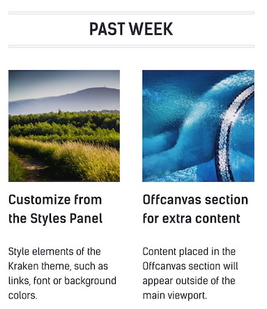
The Block Content particle is a great way to create a clean and simple content block with images and text.
Here are the topics covered in this guide:
Configuration
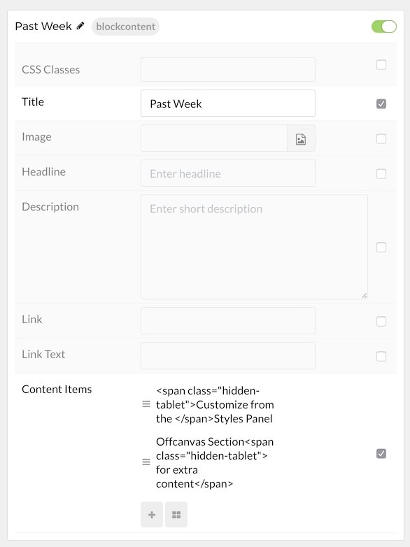
Main Options
These options affect the main area of the particle, and not the individual items within.
| Option | Description |
|---|---|
| CSS Classes | Enter the CSS class(es) you want to use in the content of the particle. |
| Title | Enter the title of the particle, as it will appear on the front end. |
| Image | Set a main image that appears separate from any Block Item images. |
| Headline | Enter a headline you want to appear on the front end. |
| Description | Enter the text you wish to have appear as the description for the particle. This text appears below the title and headline. |
| Link | Customize the link you want the link to go to. |
| Link Text | Customize the text you want to have appear in the link. |
Item Options
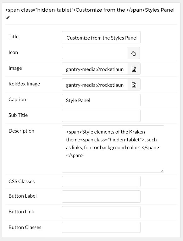
These items make up the individual featured items in the particle.
| Option | Description |
|---|---|
| Title | Enter the title for the block item. |
| Icon | Select the icon you would like to have appear with the title area in the block item. |
| Image | Select the image you would like to have displayed with the item. |
| Lightcase Image | If you would like to have a popup appear with a larger version of the image when the image is clicked, this is where you assign the larger image. |
| Caption | Add a caption for the image here. |
| Subtitle | Add a subtitle for the item here. |
| Description | Enter a description for the item here, appears as paragraphed text. |
| CSS Classes | Enter any CSS classes you would like to have apply just to this item. |
| Button Label | Enter the text you would like to have appear as the button link. |
| Button Link | Enter the url you want that link to go to. |
| Button Classes | Enter any CSS classes you want to have apply just to the button. |
Found errors? Think you can improve this documentation? Please edit this page. You can also view the history of this page.