Studius: Comments Slider
Your Guide to Recreating Elements of the Studius Demo for Grav
Introduction

The Comments Slider particle creates a grid of user comments/testimonials, including text content, avatar, name and position.
Here are the topics covered in this guide:
Configuration
Main Options
These options affect the main area of the particle, and not the individual items within. You can set the title of the particle, as well as give it an introductory paragraph here.
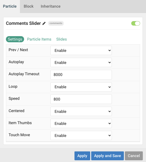
| Option | Description |
|---|---|
| Particle Name | Give the particle a name. This only appears on the backend. |
| Autoplay | Enable or Disable autoplay. |
| Autoplay Timeout | Enter (in milliseconds) the delay between automatic switching between items. |
| Loop | Enable or Disable looping of items. |
| Speed | Set the transition speed (in milliseconds). |
| Centered | Enable or Disable centered slides. |
| Item Thumbs | Enable or Disable slider thumbnails. |
| Touch Move | Enable or Disable touch movements. |
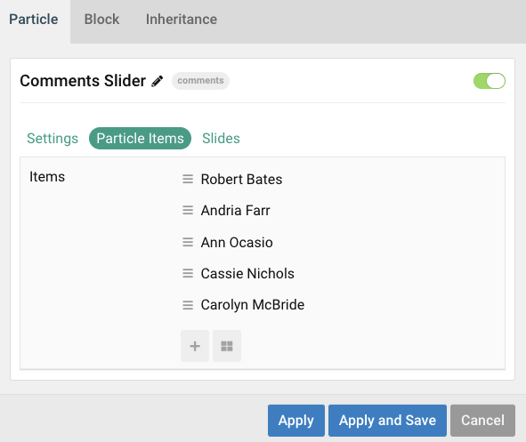
Item Options
These items make up the individual featured items in the particle. They sit apart from the particle's title and introduction. Each item can have its own properties, including icons and written content.
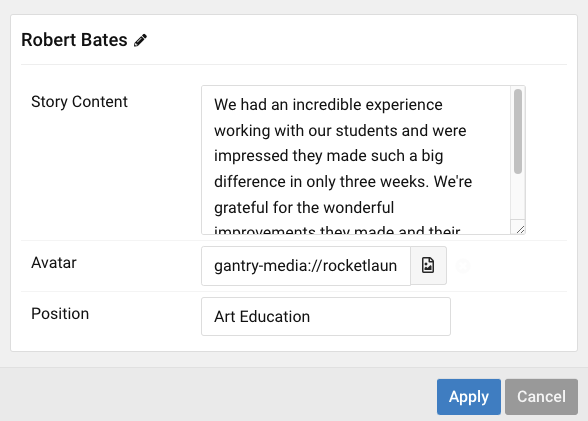
| Option | Description |
|---|---|
| Story Content | Enter text content that makes up the quote or body of the testimonial/comment. |
| Avatar | Pick desired avatar. |
| Position | Work position. |
Found errors? Think you can improve this documentation? Please edit this page. You can also view the history of this page.