RokGallery: User Guide
Your Guide to Setting Up and Using RokGallery for Joomla
RokGallery Administrator Overview
RokGallery is a large extension that consists of several different parts, including: the RokGallery component, two plugins and the RokGallery module. It is centrally controlled via the RokGallery component, and can be used to create gallery modules, which themselves can be managed independently.
RokGallery enables you to create and manage galleries which can be used to sort and arrange photos you wish to have appear within your site. You can customize how and where various images are presented to visitors, and maintain full control over them through a single, centralized component.
Administering RokGallery can take some getting used to, though it does deliver absolute control over your images and their appearance on your site.
How to Get to the RokGallery Administrator

Accessing the main RokGallery Administrator within Joomla is fairly easy. You simply need to navigate to Administrator -> Components -> RokGallery once the extension is activated.
Understanding the Administrator
-
 1Image ControlsProvides image-specific control options.2Gallery ControlsGives you the ability to see jobs status, manage galleries, configure RokGallery settings, and upload new images.3Filter ControlsFilters have a range of variables such as gallery, file type, published, etc. to allow you to sort your images for simple and efficient management. Statistics for the filters appear on the right-side of the row.
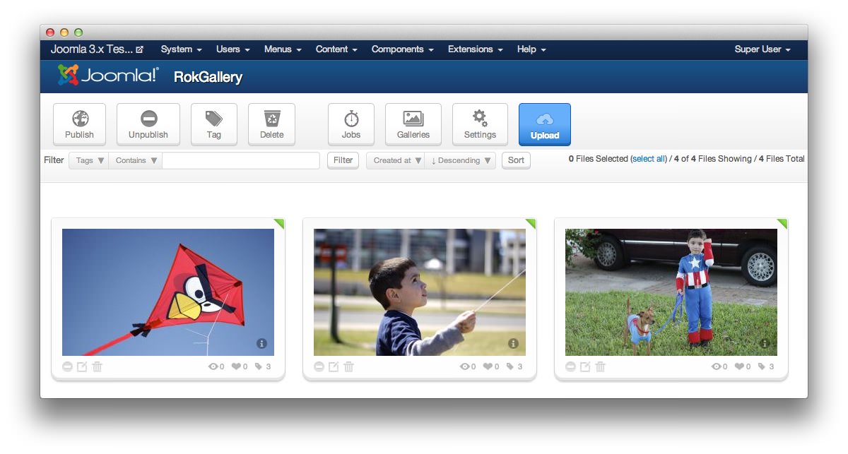
RokGallery's Component Administrator is broken into two main areas.
-
The four large icons on the left represent image-level options.
- Publish: This button publishes images highlighted in the image area below. You can highlight images by clicking and dragging your mouse over them. A blue box will appear as you drag, indicating which images your selection area affects. You can tell an image is published by the presence of a green triangle in the upper-right corner of the image box.
- Unpublish: This option unpublishes currently-published images selected in the image area below. These images will not appear on the frontend, or any gallery modules they are presently linked to.
- Tag: The Tag button opens a popup that will give you the option to assign tags to a particular image, as well as assign it to a gallery. This gallery can then be used to present the image on the site either as a direct injection into an article or via a RokGallery module.
- Delete: This option gives you the ability to delete an image from RokGallery. Once deleted, it will no longer be available to appear on your site.
-
The four icons on the right represent gallery-level controls.
- Jobs: Shows a popup log of all previous and current operations, such as imports. This is a good place to go if you have recently made changes to an image or gallery and do not see them on the frontend. This is typically due to the time required to process changes made to image files on the backend.
- Galleries: Allows you to create, delete and manage all tag galleries. This popup is also available within a RokGallery module when you have a gallery assigned. Changes made in this popup will impact all instances of the tag gallery.
- Settings: Gives you access to configuration for general aspects of RokGallery.
- Upload: This button opens a HTML5/Flash drag and drop image uploader.
Filters have a range of variables such as gallery, file type, published, etc. to allow you to filter your images for simple and efficient management. Statistics for the filters appear on the right-side of the row.
-
 1EditOpens the Image Editor.
On the image panes themselves, you can unpublish the individual image, go into the Image Editor, delete the image from RokGallery, and see how many views, likes, and tags each image has. You can also check out the original image's basic details such as the file name and size by either entering the image editor or selecting the information option that appears while hovering over the image with the cursor.
Tags
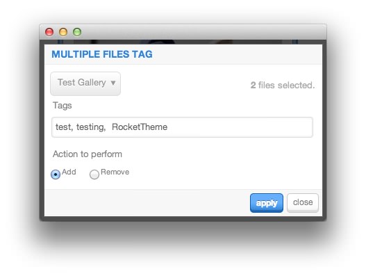
The Tag popup gives you the ability to set tags (and assign galleries) to an image. Because galleries are tag-based, you could add the tags for multiple galleries in order to have an image (or images) appear in multiple tag galleries.
RokGallery uses a digital-negative approach to image management. This allows you to keep the original image intact while assigning a gallery tag (or tags) creates new copies of the image with the appropriate gallery-specific settings (width, height, cropping, etc.) so they work seamlessly with the specified gallery.
The tag popup allows you to select a gallery for quick tag associations, add/remove specific tags, and apply those changes to the selected image(s). Keep in mind that some changes will require background jobs before they take effect. This can take anywhere from a few seconds to a few minutes, depending on your host.
Jobs Manager
-
 1RefreshRefreshes the status of all current and completed jobs in the list.2CleanRemoves completed jobs from the list.3Wipe AllRemoves all jobs from the list.4Update Individual JobUpdates the status of an individual job.5Delete Individual JobRemoves an individual job from the list.
The Jobs Manager gives you a real-time look at processes being executed by RokGallery. When you change the size or tag gallery association of a photo, it renders a new file that matches the specifications needed to meet these needs. This takes time, and the Jobs Manager is a great resource to check and see if your changes are not appearing on your site correctly due to misconfiguration or the time required to process these requests.
Refresh: Refreshes the status of all current and completed jobs in the list.
Clean: Removes completed jobs from the list.
Wipe All: Removes all jobs from the list.
Update Individual Job: Updates the status of an individual job.
Delete Individual Job: Removes an individual job from the list.
Galleries Manager
-
 1GalleriesSelect an existing gallery, or create a new one.2New Based OnCreate a new tag gallery based on an existing one.3NameEnter or change the name for the current or new gallery.4TagsEnter tag(s) for the gallery, separated by commas, which should be present on associated images.5ImageSet the image preferences for images appearing within the tag gallery.6Thumbnails SizeSet the image preferences for thumbnails associated with images presented in as part of the gallery.7OrderingThe Ordering button allows you to manage the ordering of the gallery, manually.8PublishThe Publish button publishes images associated with the selected gallery.9DeleteThe Delete button removes the gallery from the site. You have the option to have slices created for associated images removed, as well.
Galleries: Select an existing gallery, or create a new one.
New Based On: Create a new tag gallery based on an existing one.
Name: Enter or change the name for the current or new gallery.
Tags: Enter tag(s) for the gallery, separated by commas, which should be present on associated images.
Images: Set the image preferences for images appearing within the tag gallery. This field will limit the absolute pixel width and/or height of the image. Leaving it blank will revert to the default image size.
Thumbnails Size: Sets the image preferences for thumbnails associated with images presented in as part of the gallery. This will set an absolute pixel limit on the width and/or height of the thumbnail. Leaving it blank will revert this display to default values. For most modern themes, this means the images will be displayed based on responsive values for the theme.
The Ordering button allows you to manage the ordering of the gallery, manually.
The Publish button publishes images associated with the selected gallery.
The Delete button removes the gallery from the site. You have the option to have slices created for associated images removed, as well.
The Galleries Manager allows you to create and manage tag galleries which are used to determine which images should display in various locations on your site. For example, a RokGallery module can be set to display a specific tag gallery, based on the tags assigned to the specific gallery (and images within that gallery).
For example, setting up a gallery with the tag Gallery1 would allow for any image with the same tag to appear in any module with that gallery assigned. You can add multiple tags to a single gallery (as seen in the image above) with commas between tags.
Using the New Based On button in the upper-right area of the Galleries Manager, you can create a new gallery based on the settings assigned to an existing gallery. This is especially useful if you are setting up a site with multiple individual RokGallery Modules, but wish to maintain the image, thumbnail, and other settings.
Galleries enable you to also set a specific image size for any images displayed via the gallery tags. For example, if you want to have 640x480 images appear in a slideshow on the front page, this is configurable through the Galleries Manager. You can also opt to have the original image's aspect ratio retained or to have the changes forced, depending on your individual needs. Keep in mind that a gallery displaying with multiple aspect ratios may adjust in shape and form with each image displayed. Any changes made here will create a new image file, leaving your original image completely intact and available for full image viewing via RokBox or in a separate browser tab.
Thumbnails are used in some gallery display settings to give users a quick overview of all of the images in a specific gallery. By clicking on a thumbnail, the image selected is sent to the primary viewing area in the module, linked to a different page or area of the site, or made larger via a RokBox popup.
You can also opt to adjust the ordering of images within a gallery, publish all images assigned to a gallery, or delete the gallery itself. In addition, the Galleries manager gives you the ability to automatically delete slices created for the gallery when an image is removed, freeing up some space on your server.
Upload
-
 1BrowseOpens a file browser enabling you to select one or more image files to upload to RokGallery.2UploadInitiates the upload process for selected files. You will see the upload status update during upload.
The Browse button opens a file browser enabling you to select one or more image files to upload to RokGallery. This is useful if you would prefer not to click and drag files manually into this popup, or if your browser does not support that functionality.
The Upload button initiates the upload process for selected files. You will see the upload status update during upload.
Uploading images to RokGallery using the built-in file uploader is the best way to get images into RokGallery. The standard media uploader included in Joomla will add files to the media folders, but won't actually include them in RokGallery's directory.