Acacia: Recreating the Demo - FP RokSprocket Showcase
Your Guide to Recreating Elements of the Acacia Template for Joomla
FP RokSprocket Showcase
The RokSprocket Showcase module used near the top of the front page is a great way to feature some of your site's more notable articles or areas of interest.
We utilized the Simple Content Content Provider type in order to create custom articles for the front page. Most of the magic involving the look and feel of these items happen in the Title and Description fields for the individual line items.
Details
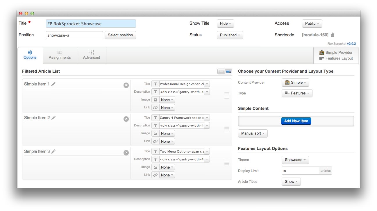
| Option | Setting |
|---|---|
| Title | FP Showcase - RokSprocket Features |
| Show Title | Hide |
| Access | Public |
| Position | showcase-a |
| Status | Published |
| Content Provider | Simple |
| Type | Features |
Filtered Article List
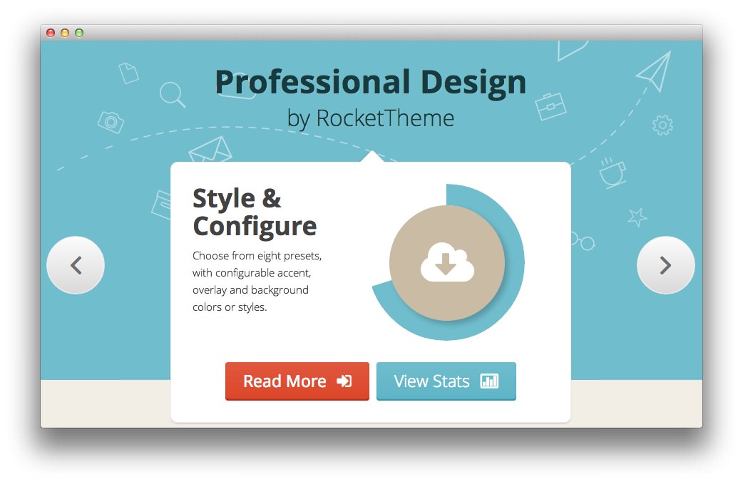
Article 1
Title
Professional Design<span class="rt-title-tag">by RocketTheme</span>
Description
<div class="gantry-width-40">
<div class="gantry-width-spacer">
<h3 class="title">Style & <br/>Configure</h3>
<p class="rt-normal-text">
Choose from eight presets, with configurable accent, overlay and background colors<span class="hidden-tablet"> or styles</span>.
</p>
</div>
</div>
<div class="gantry-width-60">
<div class="gantry-width-spacer">
<div class="rt-center">
<div class="canvas-graph" data-canvas-graph='{"icon":"icon-cloud-download","iconSize":70,"radius":110,"size":30,"start":70}'>
</div>
</div>
</div>
</div>
<div class="clear">
</div>
<div class="rt-sprocket-readon">
<a href="/?amp;view=article&id=22&Itemid=121" class="readon">Read More</a><a href="/?amp;view=article&id=22&Itemid=121" class="readon2">View Stats</a>
</div>
<div class="clear">
</div>
Article 2
Title
Gantry 4 Framework<span class="rt-title-tag">Powered Features</span>
Description
<div class="gantry-width-40">
<div class="gantry-width-spacer">
<h3 class="title">Ultimate <br/>Control</h3>
<p class="rt-normal-text">
Gantry provides the environment for the template features, such as the intuitive user interface.
</p>
</div>
</div>
<div class="gantry-width-60">
<div class="gantry-width-spacer">
<div class="rt-center">
<div class="canvas-graph" data-canvas-graph='{"icon":"icon-cloud-download","iconSize":70,"radius":110,"size":30,"start":70}'>
</div>
</div>
</div>
</div>
<div class="clear">
</div>
<div class="rt-sprocket-readon">
<a href="/?amp;view=article&id=1&Itemid=107" class="readon">Read More</a><a href="/?amp;view=article&id=1&Itemid=107" class="readon2">View Stats</a>
</div>
<div class="clear">
</div>
Article 3
Title
Two Menu Options<span class="rt-title-tag">Dropdown & Splitmenu</span>
Description
<div class="gantry-width-40">
<div class="gantry-width-spacer">
<h3 class="title">Quick <br/>Access</h3>
<p class="rt-normal-text">
Dropdown is CSS based, featuring icons, inline positions and <span class="hidden-tablet">configurable </span>columns.
</p>
</div>
</div>
<div class="gantry-width-60">
<div class="gantry-width-spacer">
<div class="rt-center">
<div class="canvas-graph" data-canvas-graph='{"icon":"icon-cloud-download","iconSize":70,"radius":110,"size":30,"start":70}'>
</div>
</div>
</div>
</div>
<div class="clear">
</div>
<div class="rt-sprocket-readon">
<a href="/?amp;view=article&id=5&Itemid=111" class="readon">Read More</a><a href="/?amp;view=article&id=5&Itemid=111" class="readon2">View Stats</a>
</div>
<div class="clear">
</div>
Layout Options
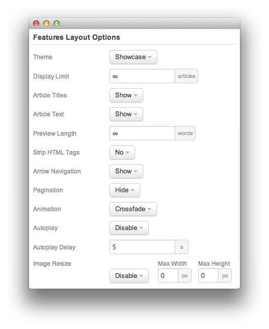
| Option | Setting |
|---|---|
| Display Limit | ∞ |
| Theme | Showcase |
| Article Titles | Show |
| Article Text | Show |
| Preview Length | ∞ |
| Strip HTML Tags | No |
| Arrow Navigation | Show |
| Pagination | Hide |
| Animation | Crossfade |
| Autoplay | Disable |
| Autoplay Delay | 5 |
| Image Resize | Disable |
Advanced
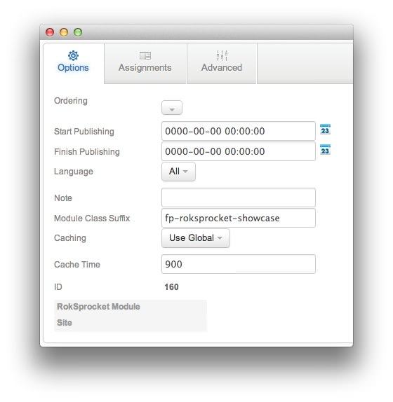
| Option | Setting |
|---|---|
| Module Class Suffix | fp-roksprocket-showcase |
Found errors? Think you can improve this documentation? Please edit this page. You can also view the history of this page.