Iridescent: Recreating the Demo - Layouts
Your Guide to Recreating Elements of the Iridescent Demo for Joomla
Layouts
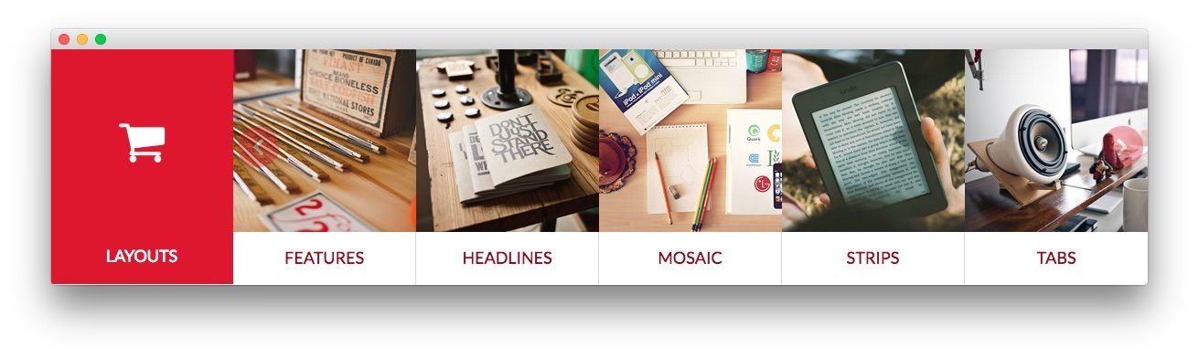
We used a RokSprocket module with the Strips layout to make up this area of the front page. You will find the settings used in our demo below.
One important note about this particular module is that there is some custom styling behind how the title and icon appears. You may notice that the title we used has some RokCandy scripting on it. Below are some pieces of the .fp-rokpsrocket-strips CSS class styling found in the demo.less file for the template which you can alter to meet your individual needs:
The first piece sets the percentage of responsive width that appears when against the module's title, which takes up an area to the left of the content. If you elect to hide the module title and just have content, you can set this to 100%. Otherwise, the full space may not be used.
    .module-content {
        width: 83.33333%;
This next piece contains data that defines how the title and icon appear. Depending on how many items you have appear next to the title/icon, you will want to adjust the margin-top settings to meet your needs.
    .rt-icontitle {
        display: block;
        font-size: 3em;
        margin-top: 75px;
        // Desktop Mode
        @media only screen and (min-width: 960px) and (max-width: 1199px) {
            body.layout-mode-responsive & {
                margin-top: 60px;
            }
        }
        // Tablet Mode
        @media only screen and (min-width: 768px) and (max-width: 959px) {
            body.layout-mode-responsive & {
                font-size: 2.5em;
                margin-top: 45px;
            }
        }
        // Mobile Mode
        @media (max-width: 767px) {
            body.layout-mode-responsive & {
                margin-top: 20px;
            }
        }
    }
    .rt-title {
        position: absolute;
        left: 0;
        bottom: 15px;
        width: 16.66667%;
        // Mobile Mode
        @media (max-width: 767px) {
            body.layout-mode-responsive & {
                position: relative;
                left: inherit;
                bottom: inherit;
                width: 100%;
                padding: 15px 0;
                display: block;
            }
        }
    }
Details
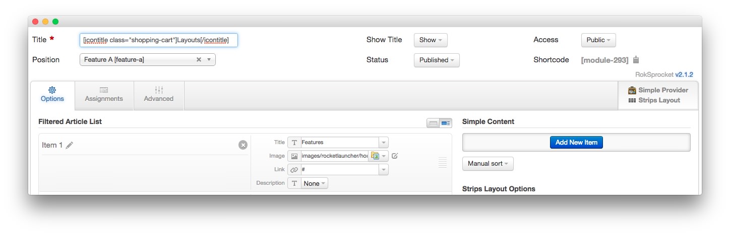
| Option | Setting |
|---|---|
| Title | [icontitle class="shopping-cart"]Layouts[/icontitle] |
| Show Title | Show |
| Access | Public |
| Position | feature-a |
| Status | Published |
| Content Provider | Simple |
| Type | Strips |
Simple Item Example
| Option | Setting |
|---|---|
| Title | Features |
| Image | Custom |
| Link | Custom |
| Description | None |
Layout Options
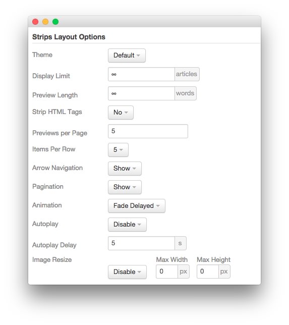
| Option | Setting |
|---|---|
| Theme | Default |
| Display Limit | ∞ |
| Preview Length | ∞ |
| Strip HTML Tags | No |
| Previews Per Page | 5 |
| Items Per Row | 5 |
| Arrow Navigation | Show |
| Pagination | Show |
| Animation | Fade Delayed |
| Autoplay | Disable |
| Autoplay Delay | 5 |
| Image Resize | Disable |
Advanced
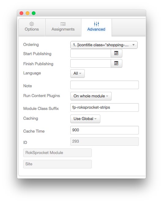
| Option | Setting |
|---|---|
| Module Class Suffix | fp-roksprocket-strips |