Photon: Recreating the Demo - Expanded Section
Your Guide to Recreating Elements of the Photon Demo for Joomla
Introduction
-
 1Content Tabs2Owl Carousel3Simple Content
The Showcase section includes three particles: Content Tabs, Owl Carousel, and Simple Content. The Content Tabs particle is assigned to the expanded-a module position, while the Owl Carousel and Simple Content particles are assigned to the expanded-b module position.

Here is a breakdown of the module(s) and particle(s) that appear in this section:
Section Settings

| Option | Setting |
|---|---|
| Layout | Boxed |
| CSS Classes | nomarginbottom |
| Tag Attributes | Blank |
Content Tabs (Particle)
The Content Tabs particle is a Gantry 5 Particle module placed within the expanded-a module position. Adding a particle to a module position can be done by creating a Gantry 5 Particle module, adding the particle using the settings found in the section below, and assigning it to the position.
Module Position Particle Settings
Particle Settings
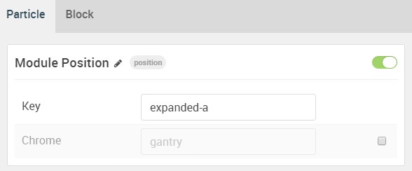
| Option | Setting |
|---|---|
| Particle Name | FP Expanded A |
| Key | expanded-a |
| Chrome | gantry |
Block Settings
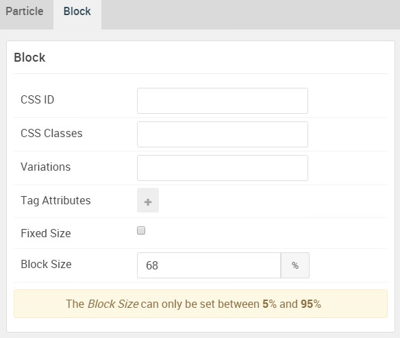
| Option | Setting |
|---|---|
| CSS ID | Blank |
| CSS Classes | Blank |
| Variations | Blank |
| Tag Attributes | Blank |
| Fixed Size | Unchecked |
| Block Size | 68% |
Content Tabs Particle Settings
Particle Settings
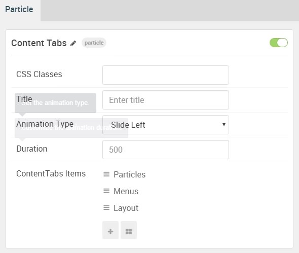
| Option | Setting |
|---|---|
| Particle Name | Content Tabs |
| CSS Classes | Blank |
| Title | Blank |
| Animation Type | Slide Left |
| Duration | 500 |
| Item 1 Name | Particles |
| Item 1 Tab Name | Particles |
| Item 1 Title | Particles |
| Item 1 Subtitle | Blank |
| Item 1 Description | Blank |
| Subitem 1 Name | News Slider |
| Subitem 1 Tag | News Slider |
| Subitem 1 Dot Accent Color | Accent Color 1 |
| Subitem 1 Dot Custom Color | Blank |
| Subitem 1 Subtag Text | 1 |
| Subitem 1 Description | Highlight top headlines without taking up a lot of vertical space. This particle is perfect for breaking news and important information. |
Owl Carousel (Particle)
The Owl Carousel particle is a Gantry 5 Particle module placed within the expanded-b module position. Adding a particle to a module position can be done by creating a Gantry 5 Particle module, adding the particle using the settings found in the section below, and assigning it to the position.
Module Position Particle Settings
Particle Settings
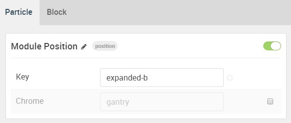
| Option | Setting |
|---|---|
| Particle Name | FP Expanded B |
| Key | expanded-b |
| Chrome | gantry |
Block Settings
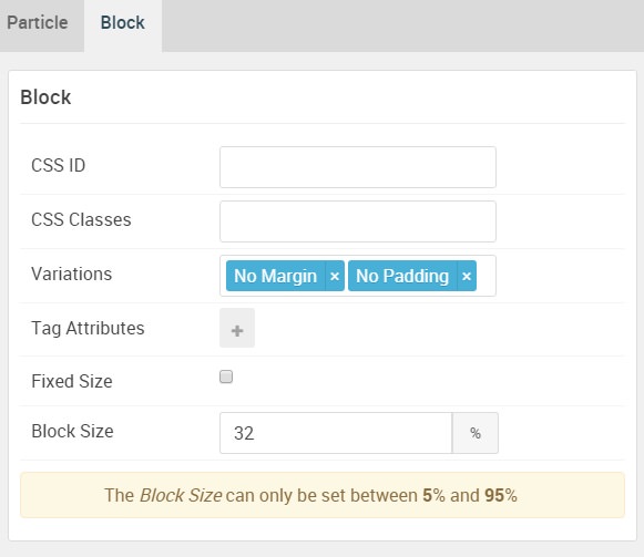
| Option | Setting |
|---|---|
| CSS ID | Blank |
| CSS Classes | Blank |
| Variations |
No Margin No Padding
|
| Tag Attributes | Blank |
| Fixed Size | Unchecked |
| Block Size | 32% |
Owl Carousel Particle Settings
Particle Settings
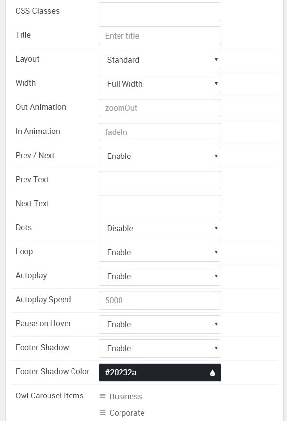
| Option | Setting |
|---|---|
| Particle Name | Owl Carousel |
| CSS Classes | Blank |
| Title | Blank |
| Layout | Standard |
| Width | Full Width |
| Out Animation | zoomOut |
| In Animation | fadeIn |
| Prev / Next | Enable |
| Prev Text | Blank |
| Next Text | Blank |
| Dots | Disable |
| Loop | Enable |
| Autoplay | Enable |
| Autoplay Speed | 5000 |
| Pause on Hover | Enable |
| Footer Shadow | Enable |
| Footer Shadow Color | #20232a |
| Item 1 Name | Business |
| Item 1 Image | Blank |
| Item 1 Icon | Blank |
| Item 1 Title | Business |
| Item 1 Description | Blank |
| Item 1 Link | Blank |
| Item 1 Link Text | Blank |
| Item 1 Target | Self |
| Item 1 Button Class | Blank |
Simple Content (Particle)
The Simple Content particle is a Gantry 5 Particle module placed within the expanded-b module position. Adding a particle to a module position can be done by creating a Gantry 5 Particle module, adding the particle using the settings found in the section below, and assigning it to the position.
Module Position Particle Settings
Particle Settings

| Option | Setting |
|---|---|
| Particle Name | FP Expanded B |
| Key | expanded-b |
| Chrome | gantry |
Block Settings

| Option | Setting |
|---|---|
| CSS ID | Blank |
| CSS Classes | Blank |
| Variations |
No Margin No Padding
|
| Tag Attributes | Blank |
| Fixed Size | Unchecked |
| Block Size | 32% |
Simple Content Particle Settings
Particle Settings
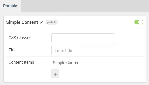
| Option | Setting |
|---|---|
| Particle Name | Simple Content |
| CSS Classes | Blank |
| Title | Blank |
| Item 1 Name | Simple Content |
| Item 1 Layout Style | Standard |
| Item 1 Created Date | MAR 03, 2016 |
| Item 1 Content Title | About Photon |
| Item 1 Author | Blank |
| Item 1 Main Content | Blank |
| Item 1 Read More Label | Read More |
| Item 1 Read More Link | Blank |
| Item 1 Read More Classes | button |
| Item 1 Target | Self |
Leading Content
All demo content is for sample purposes only, to represent a live site.
<br>
Note: Photon is built on the latest version of the Gantry 5 Framework.