Praxis: Recreating the Demo - RokSprocket Tabs
Your Guide to Recreating Elements of the Praxis Template for Joomla
RokSprocket Tabs
 We used a RokSprocket module with the Tabs layout to make up this area of the front page. You will find the settings used in our demo below.
Details
| Option | Setting |
|---|---|
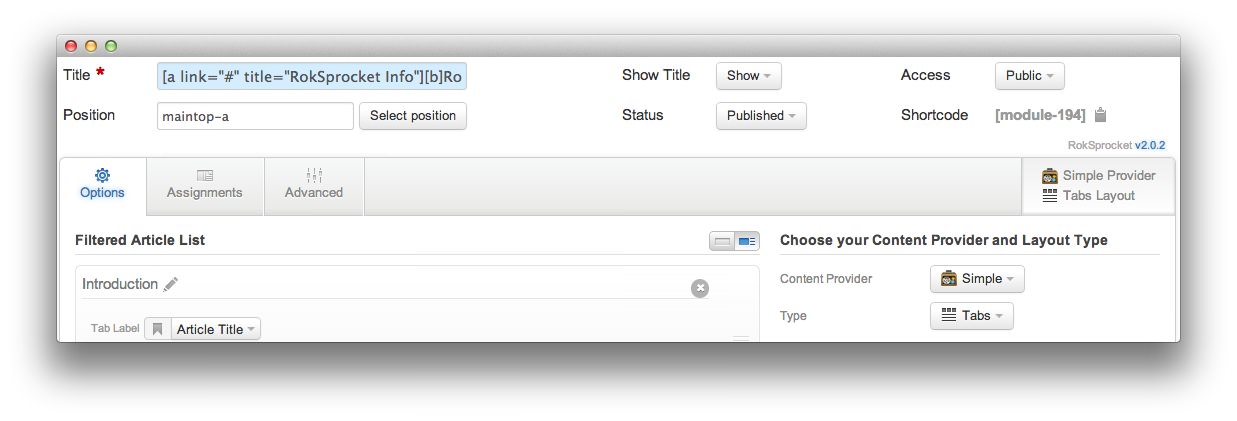
| Title | [a link="#" title="RokSprocket Info"][b]RokSprocket:[/b][/a] A multi-faceted content addon |
| Show Title | Show |
| Access | Public |
| Position | maintop-a |
| Status | Published |
| Content Provider | Simple |
| Type | Tabs |
Introduction Description
<div class="gantry-width-40 gantry-width-block">
<div class="gantry-width-spacer nomarginleft">
<div class="sprocket-tabs-image">
<img src="/images/rocketlauncher/frontpage/roksprocket-tabs/img1.jpg" alt="image" />
</div>
</div>
</div>
<div class="gantry-width-60 gantry-width-block">
<div class="gantry-width-spacer">
<p class="promo2 smallmarginbottom">
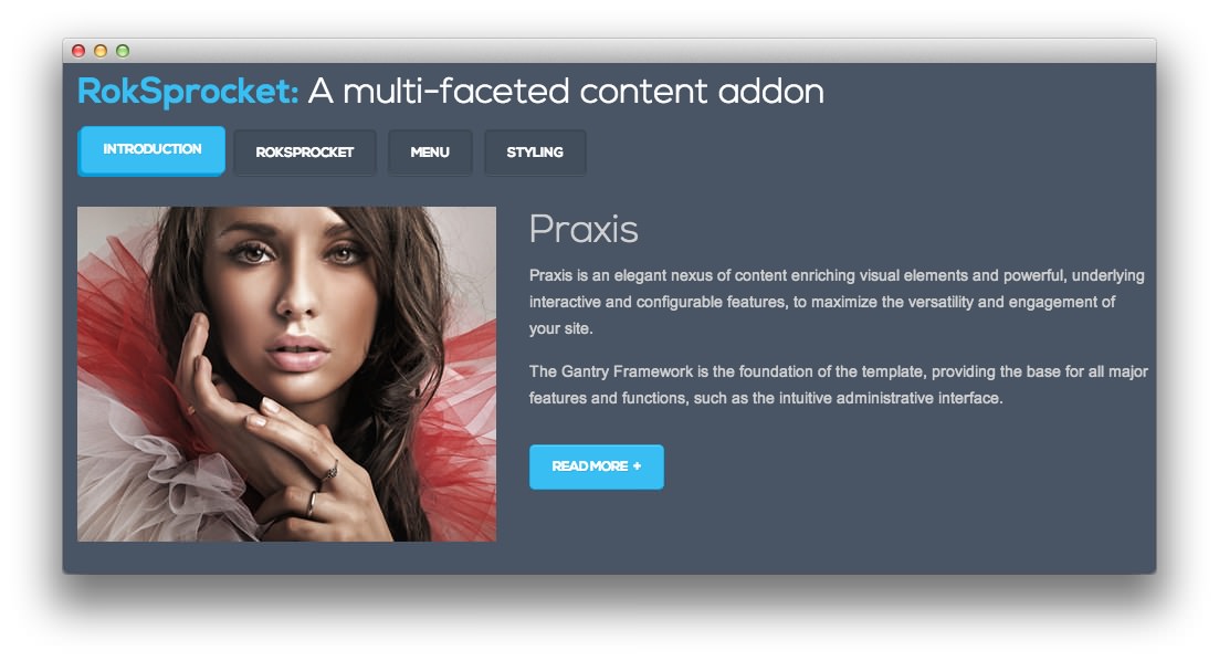
Praxis
</p>
<p>
Praxis is an elegant nexus of content enriching visual elements and powerful, underlying interactive and configurable features, to maximize the versatility and engagement of your site.
</p>
<div class="visible-large">
<p>
The Gantry Framework is the foundation of the template, providing the base for all major features and functions, such as the intuitive administrative interface.
</p>
</div>
<a href="/?amp;view=article&id=1&Itemid=108" class="readon largemargintop">
Read More
</a>
</div>
</div>
<div class="clear">
</div>
RokSprocket Description
<div class="gantry-width-40 gantry-width-block">
<div class="gantry-width-spacer nomarginleft">
<div class="sprocket-tabs-image">
<img src="/images/rocketlauncher/frontpage/roksprocket-tabs/img2.jpg" alt="image" />
</div>
</div>
</div>
<div class="gantry-width-60 gantry-width-block">
<div class="gantry-width-spacer">
<p class="promo2 smallmarginbottom">
Multiple Layouts
</p>
<p>
RokSprocket is a powerful switchblade content display extension, that has multiple, pre-built layout modes: Features, Headlines, Lists, Tabs, Mosaic and Strips.
</p>
<div class="visible-large">
<p>
RokSprocket has a custom administrative interface to make configuring the extension a quick and easy enterprise. Each article/layout mode has its own RokSprocket specific settings.
</p>
</div>
<a href="/?amp;view=article&id=6&Itemid=113" class="readon largemargintop">
Read More
</a>
</div>
</div>
<div class="clear">
</div>
Menu Description
<div class="gantry-width-40 gantry-width-block">
<div class="gantry-width-spacer nomarginleft">
<div class="sprocket-tabs-image">
<img src="/images/rocketlauncher/frontpage/roksprocket-tabs/img3.jpg" alt="image" />
</div>
</div>
</div>
<div class="gantry-width-60 gantry-width-block">
<div class="gantry-width-spacer">
<p class="promo2 smallmarginbottom">
Dropdown Menu
</p>
<p>
A CSS powered dropdown menu system, with advanced features such as, multiple columns with custom widths, custom item distribution, inline icon, subtext, inline modules.
</p>
<div class="visible-large">
<p>
Also available is Splitmenu, a static menu option that places the first level items in the header and all other child items in the sidebar.
</p>
</div>
<a href="/?amp;view=article&id=5&Itemid=112" class="readon largemargintop">
Read More
</a>
</div>
</div>
<div class="clear">
</div>
Styling Description
<div class="gantry-width-40 gantry-width-block">
<div class="gantry-width-spacer nomarginleft">
<div class="sprocket-tabs-image">
<img src="/images/rocketlauncher/frontpage/roksprocket-tabs/img4.jpg" alt="image" />
</div>
</div>
</div>
<div class="gantry-width-60 gantry-width-block">
<div class="gantry-width-spacer">
<p class="promo2 smallmarginbottom">
Style Variations
</p>
<p>
There are eight preset style variations that are bundled with Praxis. Each can be custom configured, such as font type and link color style.
<span class="rt-displayinline">
<span class="visible-large">
You can create new presets through the administrator also.
</span>
</span>
</p>
<div class="visible-large">
<p>
The template includes an assortment of module class suffixes, both stylistic and structural, that can individualize your modular content per page.
</p>
</div>
<a href="/?amp;view=article&id=10&Itemid=117" class="readon largemargintop">
Read More
</a>
</div>
</div>
<div class="clear">
</div>
Layout Options
| Option | Setting |
|---|---|
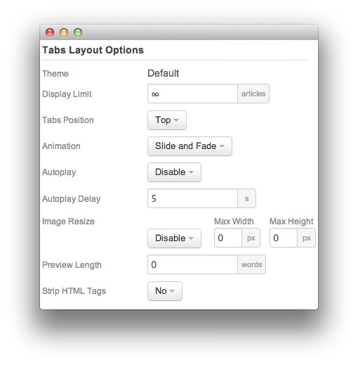
| Theme | Default |
| Display Limit | ∞ |
| Tabs Position | Top |
| Animation | Slide and Fade |
| Autoplay | Disable |
| Autoplay Delay | 5 |
| Preview Length | 0 |
| Image Resize | Disable |
| Strip HTML Tabs | No |
Advanced
| Option | Setting |
|---|---|
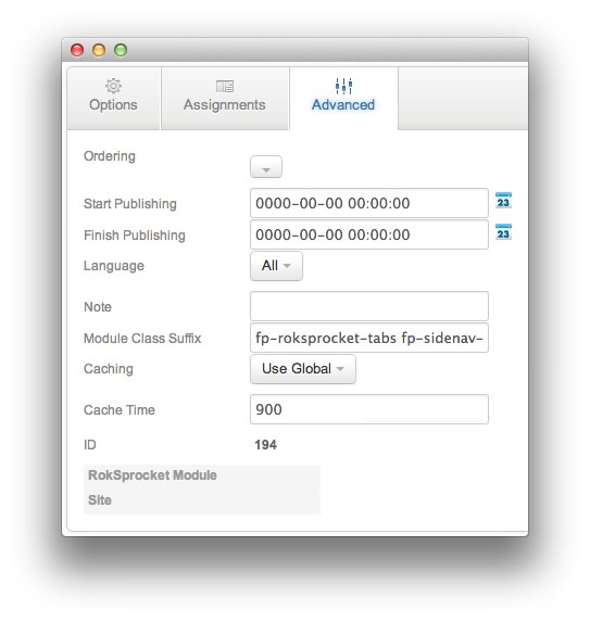
| Module Class Suffix | fp-roksprocket-tabs fp-sidenav-spacing |
Found errors? Think you can improve this documentation? Please edit this page. You can also view the history of this page.