Creating Responsive Content
Your guide to creating responsive content for your Joomla site.
Introduction
Building a responsive template is a long and detailed process that involves coordinating all of your site's elements in a way that makes for a perfect storm allowing smooth and seemingly seamless transitions between the largest desktop browser windows to the smallest mobile devices.
There are several design choices we take into consideration when building our demos in order to demonstrate exactly what our templates are capable of, and set our users up for the best possible experience with them.
Before we get into some of the tricks we use to make our demo content look the way it does, you might want to check out these blog posts outlining our take on responsive design.
- Responsive Design: Part 1 - RocketTheme's Plan
- Responsive Design: Part 2 - RocketTheme's Solution
- Responsive Design: Part 3 - RocketTheme's Extensions
Our responsive templates are only part of a properly-executed responsive site. Your content should be set up for success with various browser widths. Any content with fixed sizes could have a detrimental impact on how your page loads on various screens. Everything from your text to your images should be able to scale up or down at will.
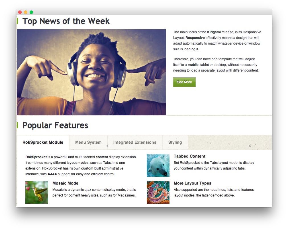
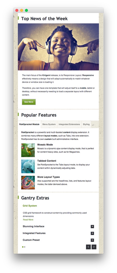
NOTE: The explanation and the screenshots used in this tutorial are based on the Kirigami template. These methods can be applied to any other responsive RocketTheme template.
Responsive Images
There are two points we need to cover in order to create responsive images.
Do Not Fix the Width and/or Height of Your Images
First, you must not have fixed width and height attributes specified for any images placed on your site. A max width or height is fine, but locking any image in to a particular size will likely break your site's responsive features.
Here is an example of an image set in a way that will break the responsive layout:
<img src="/path/to/your/image.jpg" width="600" height="200" alt="image" />
Doing this locks the image at 600px by 200px, regardless of the size of the screen used to view it. To combat this issue, we provide a custom class called .rt-image which you can wrap your image in.
<div class="rt-image">
    <img src="/path/to/your/image.jpg" alt="image" />
</div>
Doing this will ensure that the image is responsive and will scale proportionally with the rest of your content.
Image Width and Container Width
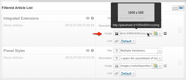
The image's width should be matched for the container at the largest width. Let's see how we get the best width for the images in "RokSprocket Features" module.
Before cropping and resizing the actual image, we can use a placeholder image to create the large image. Placehold.it is one service which offers a quick and simple image placeholder. In the sample below, the image has a width/height of 1000px by 500px.
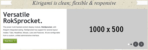
Below, we will take a look at how a 1000px x 500px image appears in the browser.
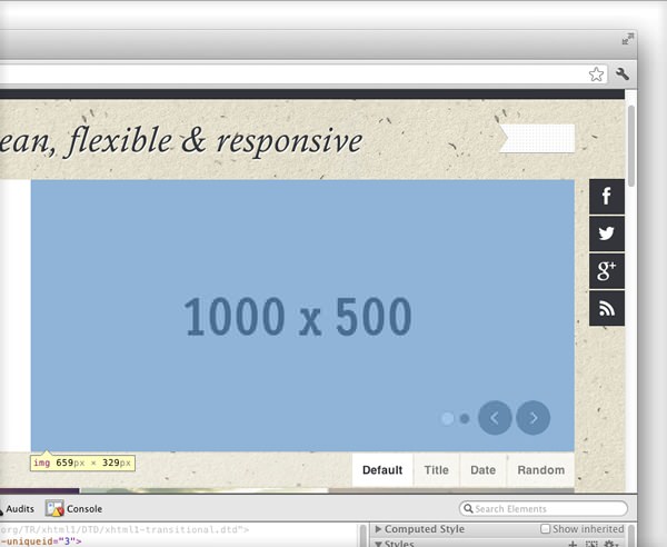
Now, you can resize the browser for two screen size breakdowns. You can also use the Chrome Developer Toolbar to check the image width. In this example, a Large Display (>= 1200px width) displays the image at 659px.
Scaling down your browser's width to 767px or below initiates the smartphone stage of the site's responsiveness. The image width in this case becomes 478px.
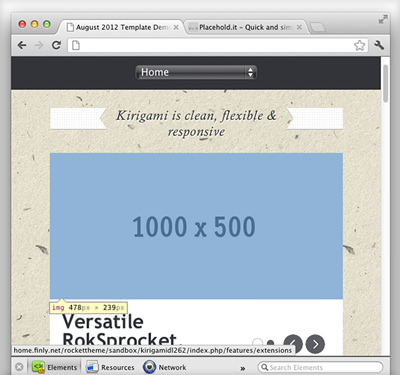
From the result above, we will take the largest width, 659px. So, we can now resize and crop the actual image to the 659px width. For the height, you may adjust it to fit the article description. In our demo, the height of the image is 350px. This does not mean all of your images should be cropped or resized to a width of 659px, though doing so will certainly improve the optimization of your site as it'll only require users to download the image file at a size it will actually be presented at.
Custom Responsive Grids
We have some responsive grid classes that you can use to create custom width for your content.
When using these classes, you should first define in the code that you want to create a percent-based block, then you define the percentage of that block.
You repeat this process until your blocks equal 100% for any given row. In Mobile view, these blocks will stack on top of each other while in Tablet or Desktop view, these blocks will scale responsively.
If you want some spacing or a margin between your blocks, use the Spacer class.
Example: HTML for two blocks at a 60/40 split with a margin between them:
<div class="gantry-width-block gantry-width-60">
<div class="gantry-width-spacer">
...
</div>
</div>
<div class="gantry-width-block gantry-width-40">
<div class="gantry-width-spacer">
...
</div>
</div>
<div class="clear"> </div>
Here are the classes we have created for this. You can, of course, add your own for a custom layout.
/* Demo Responsive Grid */

.gantry-width-block {
    display:block;
    float:left
}

.gantry-width-spacer {
    margin:15px
}

.gantry-width-20 {
    width:20%
}

.gantry-width-25 {
    width:25%
}

.gantry-width-30 {
    width:30%
}

.gantry-width-33 {
    width:33.33%
}

.gantry-width-40 {
    width:40%
}

.gantry-width-50 {
    width:50%
}

.gantry-width-60 {
    width:60%
}

.gantry-width-66 {
    width:66.66%
}

.gantry-width-70 {
    width:70%
}

.gantry-width-75 {
    width:75%
}

.gantry-width-80 {
    width:80%
}
Here is an example of this method in action. Mouse-over the numbered callouts to see the class used for each area of the example.
-
 1gantry-width-block gantry-width-602gantry-width-block gantry-width-403gantry-width-block gantry-width-504gantry-width-block gantry-width-50
In small tablets, larger and standard smartphones view, those blocks will be stacked by the following.
.gantry-width-20, .gantry-width-25, .gantry-width-30, .gantry-width-33, .gantry-width-40, .gantry-width-50, .gantry-width-60, .gantry-width-66, .gantry-width-70, .gantry-width-75, .gantry-width-80 {width: 100%;}
Below is the same content area as before in mobile view, demonstrating how the modules maintain a full, responsive layout when in mobile mode without the class restrictions.
NOTE: The specific scripting noted above applies to the following RocketTheme templates: Fracture, Graffito, Metropolis, Cerulean, Leviathan, Lumiere, Chapelco, Afterburner2, Alerion, Hexeris, Oculus, Stratos, Praxis, Corvus, Acacia, Spectral, Paradigm, Hadron, Anacron, Epsilon, Lexicon, and Vermilion. All Gantry 4 templates produced after Vermilion follow the class name scheme below.
Templates produced after Vermilion use Flexbox, which uses containers rather than blocks. Here is an example of the method used in these newer templates:
<div class="gantry-row">
<div class="gantry-width-container">
<div class="gantry-width-33">
<div class="gantry-width-spacer">
<span>Lorem ipsum dolor sit amet, consectetur adipisicing elit. Eumipsam tenetur adipisci ipsa, necessitatibus accusantium iusto officiis et quisquam quos error totam cupiditate hic itaque, expedita possimus, repellat unde? Repellendus.
</span>
</div>
</div>
<div class="gantry-width-33">
<div class="gantry-width-spacer">
<span>Lorem ipsum dolor sit amet, consectetur adipisicing elit. Eumipsam tenetur adipisci ipsa, necessitatibus accusantium iusto officiiset quisquam quos error totam cupiditate hic itaque, expedita possimus,repellat unde? Repellendus.
</span>
</div>
</div>
<div class="gantry-width-33">
<div class="gantry-width-spacer">
<span>Lorem ipsum dolor sit amet, consectetur adipisicing elit. Eum ipsam tenetur adipisci ipsa, necessitatibus accusantium iusto officiiset quisquam quos error totam cupiditate hic itaque, expedita possimus,repellat unde? Repellendus.
</span>
</div>
</div>
</div>
</div>
<div class="clear"> </div>
You can find a useful guide to Flexbox here.
gantry-width Classes and Numbering System
Each responsive Gantry template made by RocketTheme comes with a set of gantry-width classes defined in the gantry-core.less file. The number following gantry-width- in the class name (as used by RocketTheme) generally refers to the percentage of the total width of the container that particular div takes up.
As an example, if you have gantry-width-30 and gantry-width-70 sitting in the same content row, the first div will take up 30% of the total width while the second takes the remaining 70%. This could be different, depending on how the class is defined.
In the case of gantry-width-33, the width:33.33% setting was used in order to make it more accurate to a true third of the total page width.
Gantry 5 Grid Classes
See the official documentation here: http://docs.gantry.org/gantry5/advanced/responsive-content
In Gantry 5 you can use the normal classes and HTML markup available in the core Gantry code. These classes are g-container, g-grid, g-block, and g-content. The g-block wrapper will allow you to also set a specific width with the size-xxx class between 5 and 100. Inside of g-content you can optionally set a spacer with <div class="spacer"></div>.
As g-container is often already set by the Gantry 5 Section you typically would not need to use it in your custom code. g-container will define your max-width based on your Section settings of either Fullwidth - Boxed, Fullwidth - Flushed, or Boxed.
Examples
Basic:
<div class="g-grid">
    <div class="g-block size-xxx">
          <div class="g-content">
              ...
          </div>
    </div>
</div>
xxx = 5 to 100
blocks within a grid should generally add up to 100
2 blocks 50/50
<div class="g-grid">
    <div class="g-block size-50">
          <div class="g-content">
              ...
          </div>
    </div>
    <div class="g-block size-50">
          <div class="g-content">
              ...
          </div>
    </div>
</div>
3 blocks, 60, 22, 18
<div class="g-grid">
    <div class="g-block size-60">
          <div class="g-content">
              ...
          </div>
    </div>
    <div class="g-block size-22">
          <div class="g-content">
              ...
          </div>
    </div>
    <div class="g-block size-18">
          <div class="g-content">
              ...
          </div>
    </div>
</div>
2 content blocks with a spacer in-between
<div class="g-grid">
    <div class="g-block size-40">
          <div class="g-content">
              ...
          </div>
    </div>
    <div class="g-block size-20">
          <div class="g-content">
              <div class="spacer"></div>
          </div>
    </div>
    <div class="g-block size-40">
          <div class="g-content">
              ...
          </div>
    </div>
</div>
Responsive Utility Classes
We have a quick guide set up to assist in the understanding of responsive support classes which you can use to make content on your site appear or disappear depending on the size of the browser window being used to display it. This allows you to trim around the edges where a little too much (or too little) content can make your site appear either too cluttered or bare.
These classes are not just for whole modules. They can be used to cut out content as it appears in a single block of text, or even some images. By adding <span class="hidden-phone"></span> to an area of text you wish to have hidden on smartphones and other small-screen devices but present elsewhere, you can trim this content out without losing the whole module. Otherwise, the content might be a bit crushed in the smaller screen and appear stretched (pictured below).
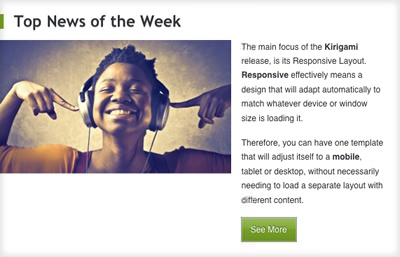
Below is an example paragraph you might find in an article.
<p>The main focus of the <strong>Kirigami</strong> release, is its Responsive Layout. <span class="hidden-tablet"><strong>Responsive</strong> effectively means a design that will adapt automatically to match whatever device or window size is loading it.</span></p>
The result: A leaner, more aesthetically pleasing article tease without sacrificing the content on larger-screen devices.