RokSprocket: Tabs Layout Mode
Your Guide to the Tabs RokSprocket Layout Mode for WordPress
Tabs
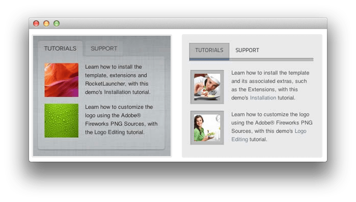 Tabs is a tabbed content display mode, presenting content in dynamically sizing tabs.
-
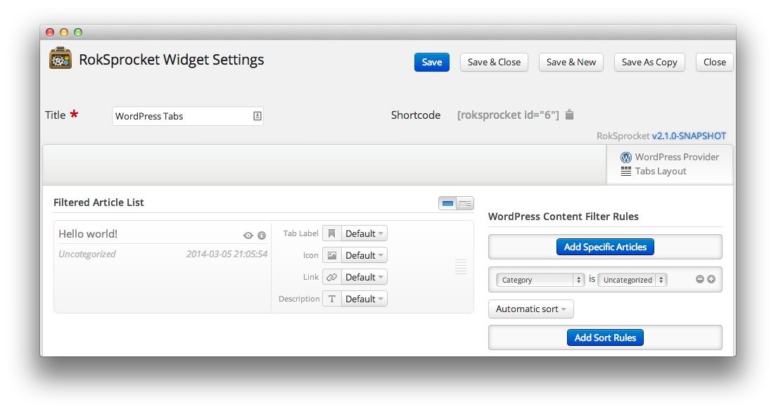 1TitleThis is the title you wish to give the RokSprocket instance. This is only used as a label on the backend, as the widget title will be what appears on the frontend of the site.2Filtered Article List OptionsGives you access to item-specific settings for the posts title, description, image, and link.3Content Filter RulesSets the content filter rules for the widget.
The Title field gives you the ability to set a title for the widget itself. Every widget has to have a title, though you can opt to hide it from public view for a cleaner, more theme integrated look. The Position field right below it gives you the ability to set the position within the theme's layout the widget should appear in.
-
The Filtered Article List gives you access to item-specific settings including:
- Image - This allows you to circumvent the assigned image from the post and replace it with one specifically for the headline.
- Link - If set, the link will show a *Read More** button as well as link the title. On specific themes, it will link the image in the headline, as well.
- Description - Allows you to set a description for the headline. If this is left at Default the introtext from the post is used.
The Content Filter Rules section gives you the ability to determine how the widget will pull content to make up the headlines. For example, you can have the widget pull posts that are within a specific category, contain a particular name or keyword in the title, or choose specific posts. You can also modify how this content is sorted in the widget.
Below the Content Filter Rules section are two options areas specific to the layout mode you have chosen. We have broken down the Tabs Layout Options and Tabs Article Defaults sections below.
-
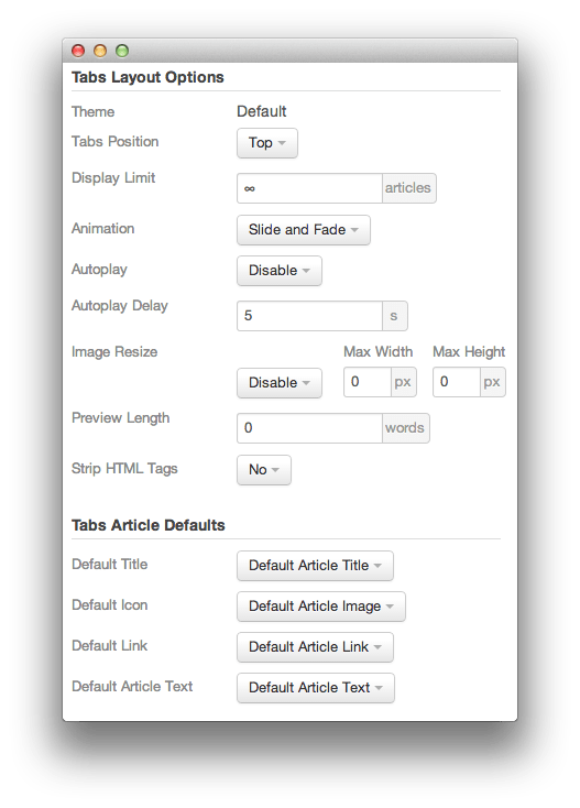 1ThemeThis sets the theme for displaying tabs in the module.2Tabs PositionThis option sets where in the widget the tabs will appear.3Display LimitThis option sets the amount of items that display when rendering. 0 or ∞ indicates unlimited.4AnimationThis dropdown gives you the ability to set the type of animation that happens during transitions from one tab to the next.5AutoplaySets whether you want the widget to start rolling through tabs automatically when the page loads, or to await a command from the visitor.6Autoplay DelaySets the amount of time between cycled tabs in the module. The longer this delay (in seconds), the longer a single post will be featured in the module.7Image ResizeSets the maximum width and/or height of displayed thumbnails.8Preview LengthThis toggle allows you to set the length (in words) of the preview.9Strip HTML TagsThis option removes HTML tags from the description of a post.10Default TitleYou can set a default title for all posts from this field. If this selection is set at Default post Title, then the post's given titles are used.11Default IconDetermines which image the widget will default to when locating an icon for the tab.12Default LinkDetermines which link field the widget will default to when locating a link for the tab.13Default Article TextThis field allows you to set default post text for all tab in the module. If this is not changed from its default, then the post's introductory text is used.
The Theme option sets the theme for displaying tabs in the module. This may not be adjustable, depending on the theme.
Tabs Position sets where in the widget the tabs will appear.
Display Limit sets the amount of items that display when rendering. 0 or ∞ indicates unlimited.
Animation gives you the ability to set the type of animation that happens during transitions from one tab to the next.
Autoplay sets whether you want the widget to start rolling through tabs automatically when the page loads, or to await a command from the visitor.
Autoplay Delay changes the amount of time between cycled tabs in the module. The longer this delay (in seconds), the longer a single post will be featured in the module.
Image Resize Sets the maximum width and/or height of displayed thumbnails.
Preview Length This toggle allows you to set the length (in words) of the preview.
Strip HTML Tags removes or preserves HTML tags in the description of a post.
You can set a default title for all posts from the Default Title field. If this selection is set at Default Article Title, then the post's given titles are used.
Default Icon determines which image the widget will default to when locating an icon for the tab.
Default Link determines which link field the widget will default to when locating a link for the tab.
Default Article Text allows you to set default post text for all features in the widget. If this is not changed from its default, then the post's introductory text is used. You can choose to use post content, an assigned post excerpt, the default article text, or to have nothing appear at all.