Isotope: Popup Grid Particle
Your Guide to Recreating Elements of the Isotope Demo for WordPress
Introduction
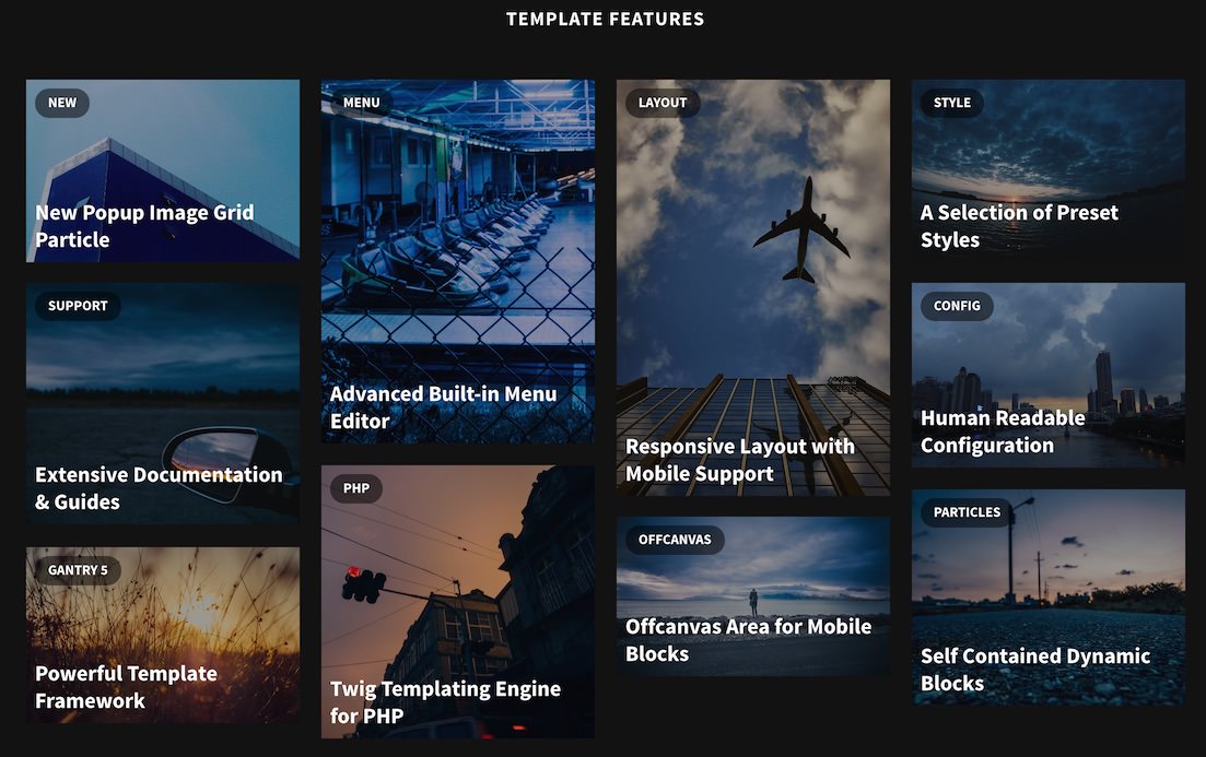
The Popup Grid particle is a beautiful image particle that enables you to create a mosaic of images that, when selected, pop up and present the visitor with additional information.
Here are the topics covered in this guide:
Configuration
Main Options
These options affect the main area of the particle, and not the individual items within.
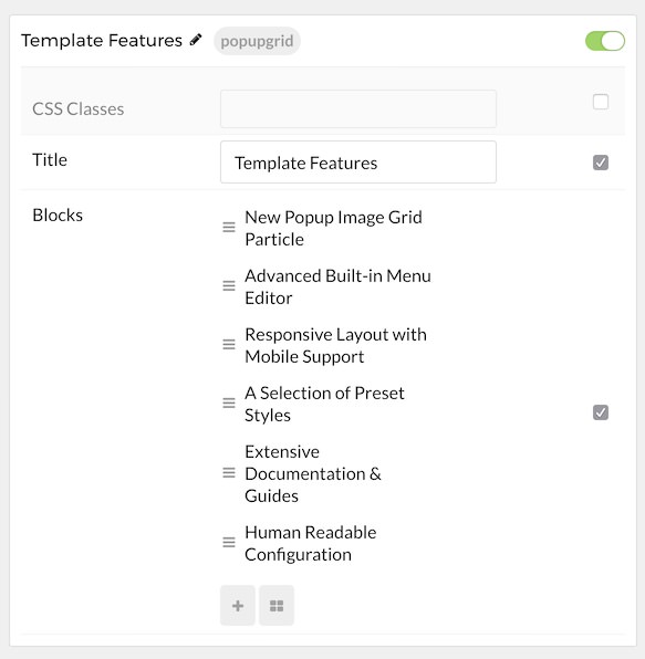
| Option | Description |
|---|---|
| Particle Name | Enter the name you would like to assign to the particle. This only appears in the back end. |
| CSS Classes | Enter the CSS class(es) you want to use in the content of the particle. |
| Title | Enter a title for the particle. |
Item Options
These items make up the individual featured items in the particle.
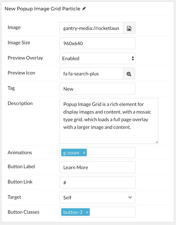
| Option | Description |
|---|---|
| Item Name | Enter the name you would like to assign to the item. This only appears in the back end. |
| Image | Select an image to display in the item. |
| Image Width | Input the image width (in pixels) |
| Image Size | Input the image size (in pixels) in a WidthXHeight format. For example: 460x920
|
| Preview Overlay | Enable or disable the overlay when hovering your cursor over the item. |
| Preview Icon | Select an icon that appears along with the preview overlay. For example: fa fa-search-plus fa-fw fa-2x
|
| Tag | Tag the item. |
| Description | Add a text description that appears when you select the item. |
| Animations | Enter any animations you wish to have apply when you select the item. Options are: g-zoom, g-blur, g-rotate, and g-grayscale. |
| Button Label | Enter any text you wish to have appear in the button. |
| Button Link | Enter the URL you wish to have the button link to. |
| Target | Choose between Self and New Window as the link's target. |
| Button Classes | Add any CSS Class(es) you want to have apply to the button. |
Found errors? Think you can improve this documentation? Please edit this page. You can also view the history of this page.