Galatea
Your Guide to Using the Galatea Theme for Grav
Introduction
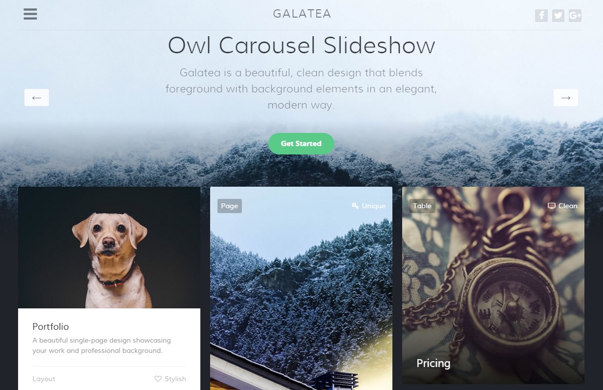
Galatea is a beautiful, clean design that blends foreground with background elements, in an elegant, modern way. The theme features a mobile inspired menu with configurable page push and slidedown animation effects.

New to Gantry 5?
If you are new to Gantry 5, a good place to start would be our dedicated Gantry documentation.
Requirements
- PHP 7.1 or higher
- Grav 1.1.9+
NOTE: Gantry v5.4.1+ is required for Galatea to work correctly. For more details on the Gantry Framework, please visit its Dedicated Website.
Key Features
Included Particles
- Block Content
- Branding
- Copyright
- Custom HTML
- FlexSlider
- Grav Content
- Grid Statistic
- Image Grid
- Info List
- Logo / Image
- Mobile Menu
- Mosaic Grid
- Newsletter
- OffSidebar Toggle
- Owl Carousel
- Pricing Table
- Simple Counter
Theme Features
- Responsive Layout
- 6 Preset Styles
- Block Variations
- Custom Typography
- Unlimited Positions
- Custom Particles
- Mobile Menu
- Coming Soon Page
- Font Awesome Icons
Gantry Core Features
- YAML-based Configuration
- Twig Templating
- Powerful Particle System
- Visual Menu Editor
- MegaMenu Support
- Off-Canvas Panel
- Ajax Admin
- Layout Manager
- Inheritance System
- Fluid Width Option
- Fixed Width Option
- SCSS Support
- Sophisticated Fields
- Unlimited Undo/Redo
- Styles Panel
Particles

The theme features a versatile and diverse catalog of particles, to enrich your site content. New with Galatea is the Owls Carousel particle, alongside theme integrated enhancements for preexisting particle types.
Typography

Typography is an important instrument in not only the site design, but how your content is portrayed and utilised by your visitors. Therefore, Galatea offers a rich selection of elegant typography to provide focus to varying content types.
Responsive

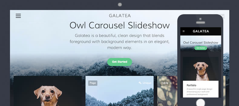
Galatea is a responsive theme which means it adapts to the viewing device's width, such as mobile, tablet or desktop. Mobile modes have a unique menu to aid usability. Support classes can also be used to display or hide various types of content for each device.