Phoenix: Slideshow Particle
Your Guide to Recreating Elements of the Phoenix Demo for Grav
Introduction

The Slideshow particle creates beautiful image slideshows that work perfectly at the top of your page.
Here are the topics covered in this guide:
Configuration
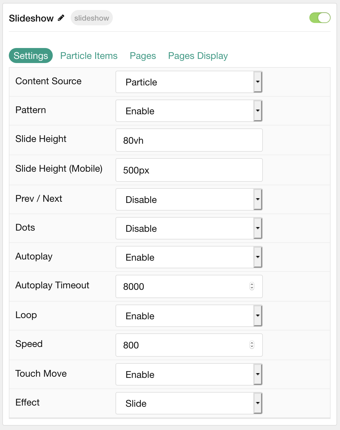
Settings
These options affect the main area of the particle, and not the individual items within. You can set the title of the particle, as well as give it an introductory paragraph here.
| Option | Description |
|---|---|
| Particle Name | This is the name of the particle used for back end management. It does not appear on the front end. |
| Content Source | Choose between Particle and Grav as the Content Source. |
| Pattern | Choose to Enable or Disable the pattern. |
| Slide Height | Enter the desired slide height. |
| Slide Height (Mobile) | Enter the desired slide height on mobile devices. |
| Prev / Next | Choose to Enable or Disable the prev / next navigation. |
| Dots | Choose to Enable or Disable dots navigation for the particle. |
| Autoplay | Choose to Enable or Disable autoplay. |
| Autoplay Timeout | Set the time between each transition during autoplay. |
| Loop | Choose to Enable or Disable looping. |
| Speed | Set the transition speed between slides. |
| Touch Move | Choose to Enable or Disable touch-based control of slide movements. |
| Effect | Choose the animation effect to apply as items transition. |
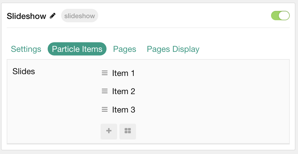
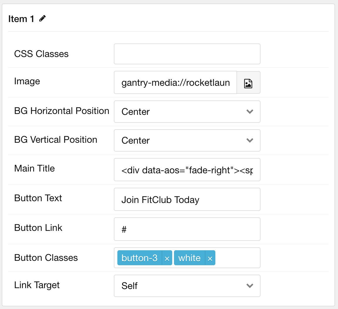
Particle Item Options
These items make up the individual featured items in the particle. Items in this section will only appear if Particle is selected as the Content Source.
| Option | Description |
|---|---|
| Item Name | This is the name of the item. It is used only for backend organization and does not appear. |
| CSS Classes | Enter any CSS class(es) you wish to have apply to the item. |
| Image | Select an image to appear in the particle. |
| BG Horizontal Position | Choose between Left, Center, and Right for the background position. |
| BG Vertical Position | Choose between Top, Center, and Bottom for the background position. |
| Main Title | Enter a larger main title to appear on the front end. |
| Button Text | Enter the text to appear in the button. |
| Button Link | Enter a URL the button will send users to. |
| Button Classes | Enter any CSS class(es) you want to have apply to the button. |
| Button Link Target | Enter a target window for the link. |
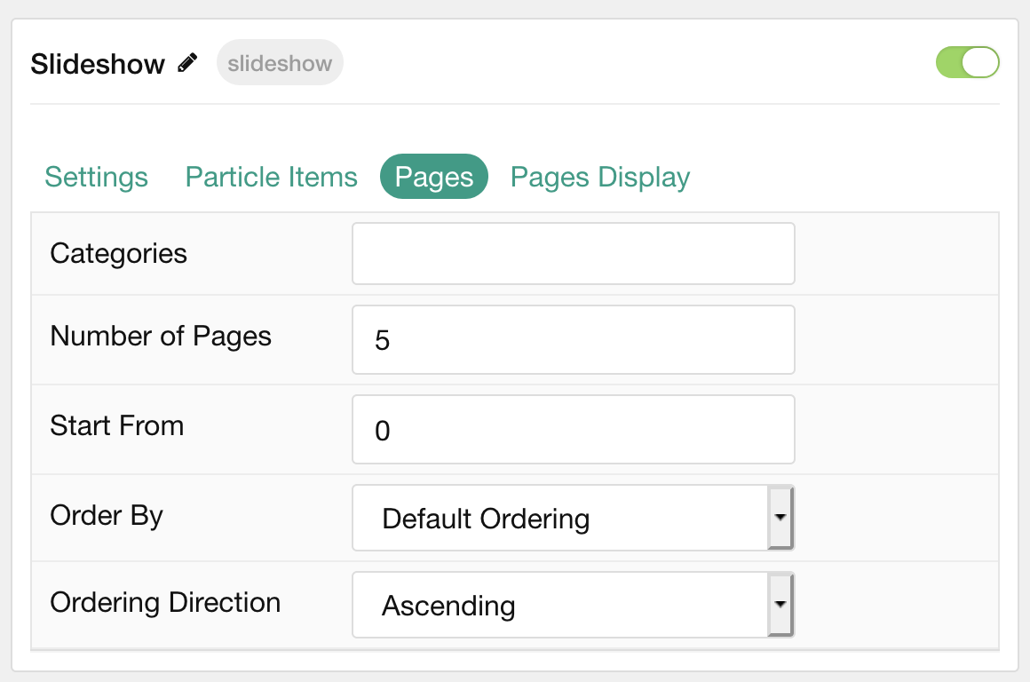
Pages
| Option | Description |
|---|---|
| Categories | Select the categories of pages this particle will display. |
| Number of Pages | Enter the maximum number of pages to display. |
| Start From | Enter offset specifying the first page to return. The default is '0' (the first page). |
| Order By | Choose the type of factor to order by. |
| Ordering Direction | Choose between Ascending and Descending as the page ordering method. |
Display
This section configures how pages are displayed.
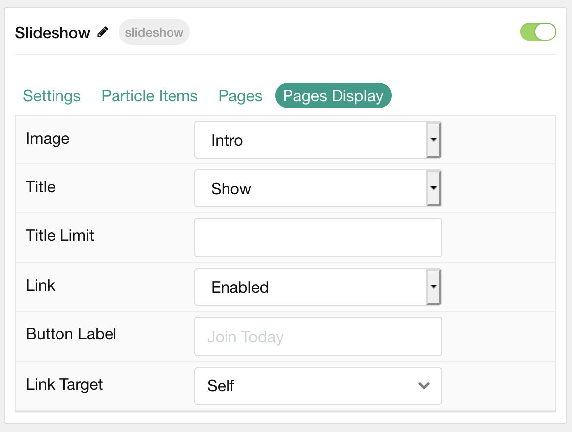
| Option | Description |
|---|---|
| Image | Display the image assigned to the article's Intro, Full or None. |
| Title | Choose to Show or Hide the page's title. |
| Title Limit | Enter a character limit for page's title displayed in this particle. |
| Link | Choose to Enable or Disable the page's link. |
| Button Label | Enter a label to appear in the button. |
| Link Target | Choose which window/tab the link opens to. |
Found errors? Think you can improve this documentation? Please edit this page. You can also view the history of this page.