Topaz: Recreating the Demo - Navigation and Header Sections
Your Guide to Recreating Elements of the Topaz Demo for Grav
- Topaz
- Introduction
- Key Features
- Requirements
- How to Install
- Recreate the Demo
- Theme Particles
- Theme Atoms
- Core Particles
- FAQ
- Theme Tutorials
- Overriding Particle Settings
- Adding a Custom Style Sheet
- Adding a Custom Font
- Customizing the Error Page
- Using the Font Picker
- Using the Color Picker
- Using the Icon Picker
- Creating a New Particle
- Particle YAML Field Types
- Customizing Theme Files
- Creating Layout Presets
- Creating Custom File Overrides
- Theme Font Index
- Useful Plugin Guides
Introduction
-
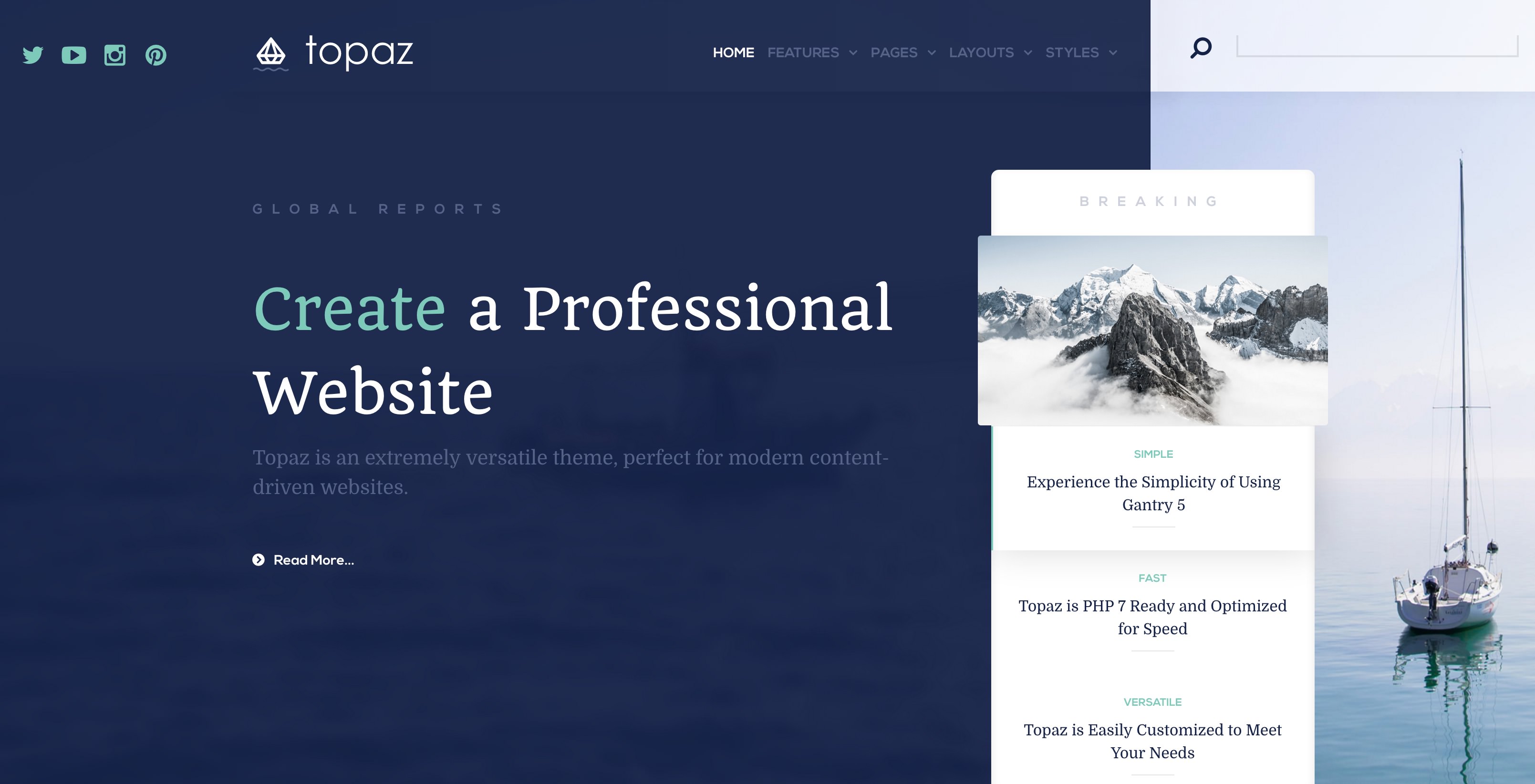 1Logo / Image (Particle)2Social (Particle)3Menu (Particle)4Search (Widget)5Grav Pages (Particle)6Owl Carousel (Particle)
The Navigation and Header sections are both wrapped in the same Container. This is done to support the unique design that encompasses both of these sections on the front page.
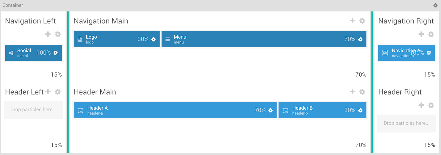
Here is a breakdown of the widget(s) and particle(s) that appear in these sections:
Container
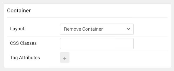
| Option | Setting |
|---|---|
| Layout | Remove Container |
| CSS Classes | Blank |
| Tag Attributes | Blank |
The container wrapping both the Navigation and Header sections allowing the background set in the Header section to sit under both sections on the front page. You can set the two images featured in the background of this section in the Style tab of the Gantry administrator.
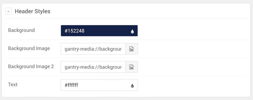
| Option | Setting |
|---|---|
| Background | #152248 |
| Background Image 1 | Custom |
| Background Image 2 | Custom |
| Text | #ffffff |
Navigation Left

The Navigation Left section hosts the Social particle on the front page. You will find the settings used in the section below.
Section Settings
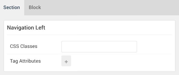
| Option | Setting |
|---|---|
| CSS Classes | Blank |
| Tag Attributes | Blank |
Section Block Settings
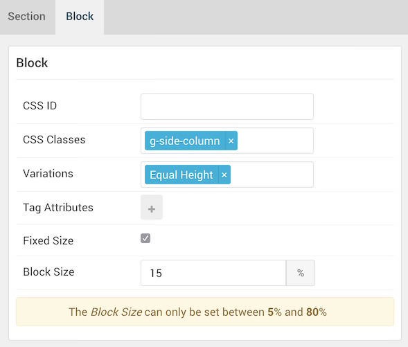
| Option | Setting |
|---|---|
| CSS ID | Blank |
| CSS Classes | g-side-column |
| Variations | Equal Height |
| Tag Attributes | Blank |
| Fixed Size | Checked |
| Block Size | 15% |
Social (Particle)
Particle Settings

| Option | Setting |
|---|---|
| CSS Classes | Blank |
| Tag Attributes | Blank |
Block Settings

| Option | Setting |
|---|---|
| CSS ID | Blank |
| CSS Classes | g-side-column |
| Variations | Equal Height |
| Tag Attributes | Blank |
| Fixed Size | Checked |
| Block Size | 15% |
Navigation Main

The Navigation Main section hosts the Logo and Menu particles on the front page. You will find the settings used in the section below.
Section Settings
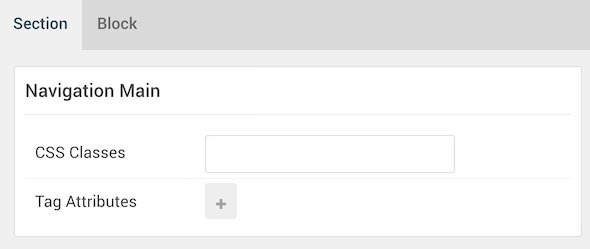
| Option | Setting |
|---|---|
| CSS Classes | Blank |
| Tag Attributes | Blank |
Section Block Settings
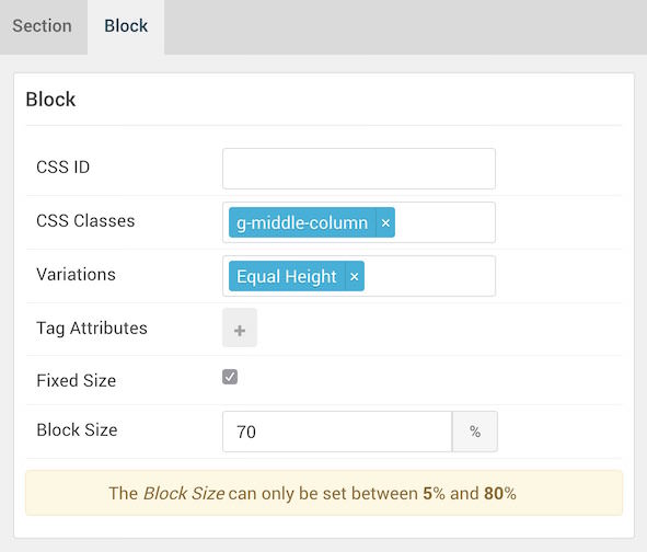
| Option | Setting |
|---|---|
| CSS ID | Blank |
| CSS Classes | g-middle-column |
| Variations | Equal Height |
| Tag Attributes | Blank |
| Fixed Size | Checked |
| Block Size | 70% |
Logo (Particle)
Particle Settings
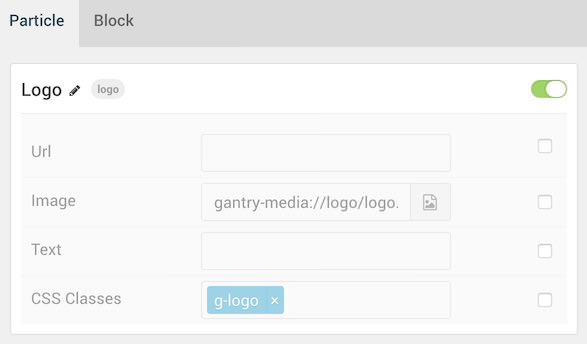
| Option | Setting |
|---|---|
| URL | Blank |
| Image | Custom |
| Text | Blank |
| CSS Classes | g-logo |
Block Settings

| Option | Setting |
|---|---|
| CSS ID | Blank |
| CSS Classes | Blank |
| Variations | Blank |
| Tag Attributes | Blank |
| Fixed Size | Unchecked |
| Block Size | 30% |
Menu (Particle)
Particle Settings
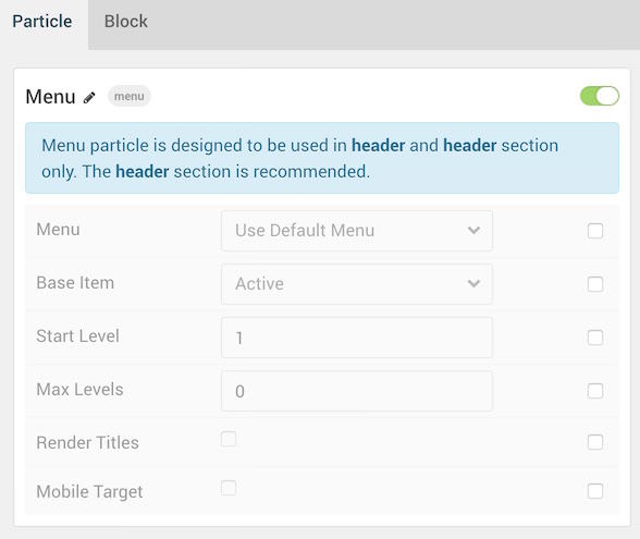
| Option | Setting |
|---|---|
| Menu | Use Default Menu |
| Base Item | Active |
| Start Level | 1 |
| End Level | 0 |
| Render Titles | Unchecked |
| Mobile Target | Unchecked |
Block Settings

| Option | Setting |
|---|---|
| CSS ID | Blank |
| CSS Classes | Blank |
| Variations | Align Right |
| Tag Attributes | Blank |
| Fixed Size | Unchecked |
| Block Size | 70% |
Navigation Right

The Navigation Right section hosts the Search widget within the Navigation A widget position. You will find the settings used in the section below.
Section Settings
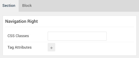
| Option | Setting |
|---|---|
| CSS Classes | Blank |
| Tag Attributes | Blank |
Section Block Settings
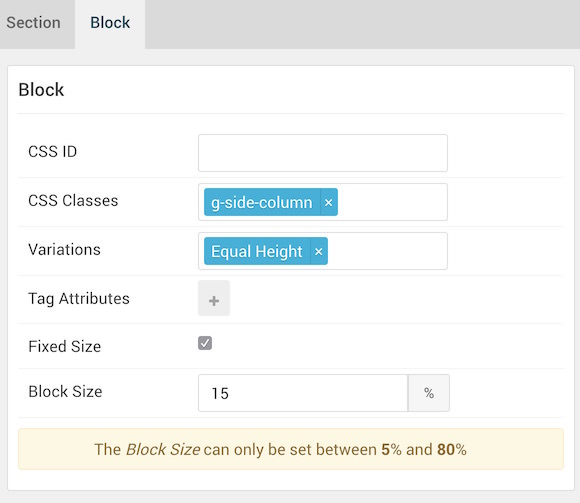
| Option | Setting |
|---|---|
| CSS ID | Blank |
| CSS Classes | g-side-column |
| Variations | Blank |
| Tag Attributes | Blank |
| Fixed Size | Checked |
| Block Size | 15% |
Navigation A (Widget Position)
Particle Settings
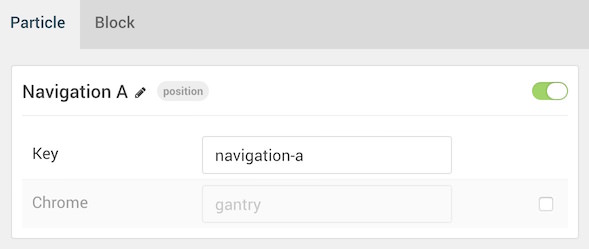
| Option | Setting |
|---|---|
| Key | navigation-a |
| Chrome | gantry |
Block Settings
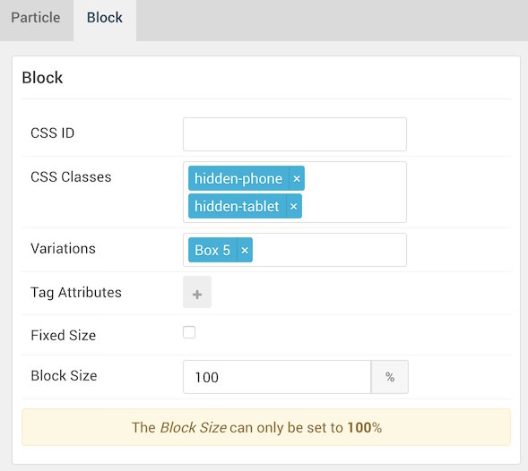
| Option | Setting |
|---|---|
| CSS ID | Blank |
| CSS Classes |
hidden-phone hidden-tablet
|
| Variations | Box 5 |
| Tag Attributes | Blank |
| Fixed Size | Unchecked |
| Block Size | 100% |
Search (Widget)
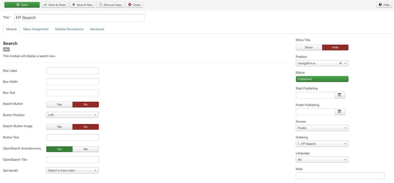
The Search widget is assigned to the Navigation A widget position. You will find its settings below.
| Option | Setting |
|---|---|
| Box Label | Blank |
| Box Width | Blank |
| Box Text | Blank |
| Search Button | No |
| Button Position | Left |
| Search Button Image | No |
| Button Text | Blank |
| OpenSearch Autodiscovery | Yes |
| OpenSearch Title | Blank |
| Set ItemID | No Item Selected |
| Show Title | Hide |
| Position | navigation-a |
| Status | Published |
Header Main
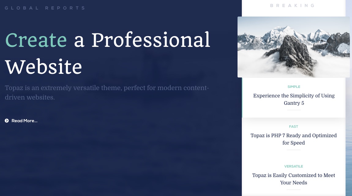
The Header Main section hosts a Grav Pages particle, as well as an Owl Carousel particle, each within individual Header A and Header B widget positions. You will find the settings used in the section below.

The Header Main section sits between the Header Left and Header Right sections. Since these sections have nothing assigned to them in our demo, the Header Main section will appear on the front end to have 100% width on the front end.
Section Settings
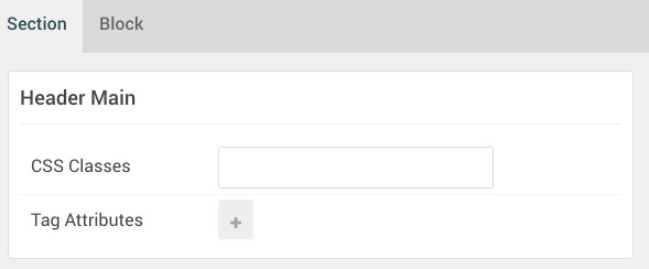
| Option | Setting |
|---|---|
| CSS Classes | Blank |
| Tag Attributes | Blank |
Section Block Settings
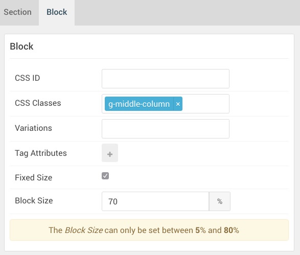
| Option | Setting |
|---|---|
| CSS ID | Blank |
| CSS Classes | g-middle-column |
| Variations | Blank |
| Tag Attributes | Blank |
| Fixed Size | Checked |
| Block Size | 70% |
Header A (Widget Position)
Particle Settings
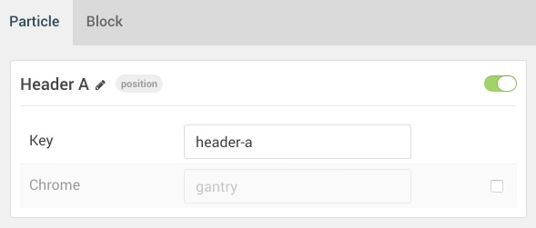
| Option | Setting |
|---|---|
| Key | header-a |
| Chrome | gantry |
Block Settings
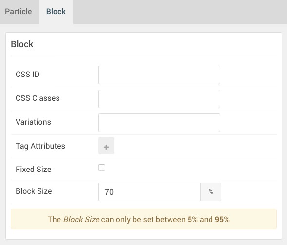
| Option | Setting |
|---|---|
| CSS ID | Blank |
| CSS Classes | Blank |
| Variations | Blank |
| Tag Attributes | Blank |
| Fixed Size | Unchecked |
| Block Size | 70% |
Grav Pages (Particle)
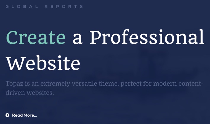
The Grav Pages particle is assigned to the Header A widget position. This is done by creating a Gantry 5 Particle widget and assigning it to the header-a position, then selecting Grav Pages as the Particle in the widget's settings. You will find its settings below.
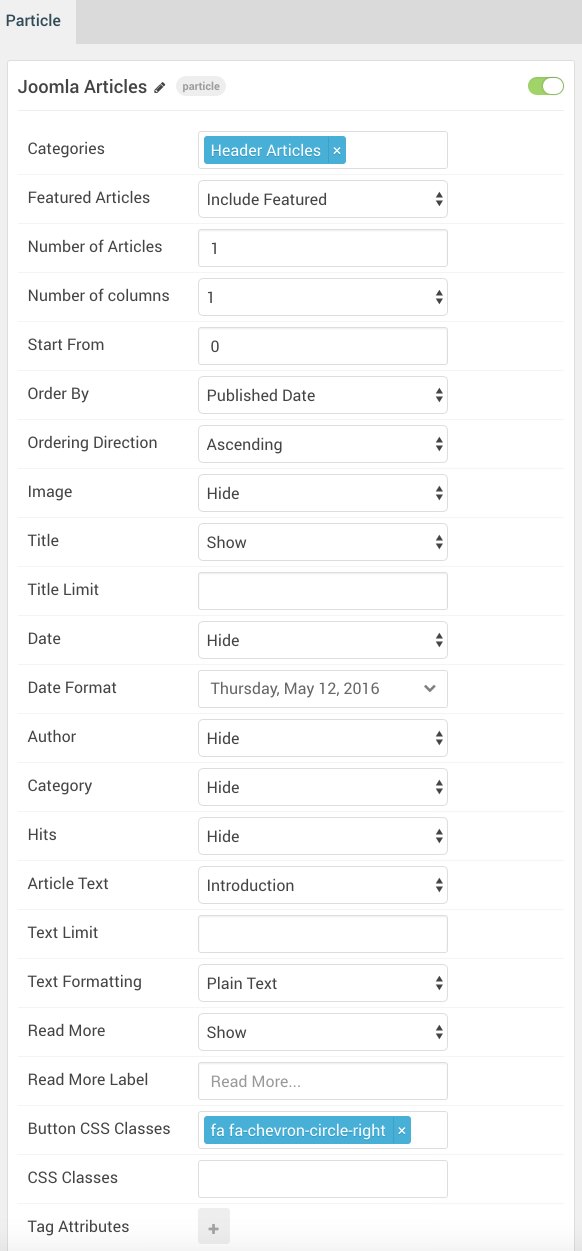
| Option | Setting |
|---|---|
| Categories | Header Pages |
| Featured Pages | Include Featured |
| Number of Pages | 1 |
| Number of Columns | 1 |
| Start From | 0 |
| Order By | Published Date |
| Ordering Direction | Ascending |
| Image | Hide |
| Title | Show |
| Title Limit | Blank |
| Date | Hide |
| Date Format | Weekday, Month Date, Year |
| Author | Hide |
| Category | Hide |
| Hits | Hide |
| Article Text | Introduction |
| Text Limit | Blank |
| Text Formatting | Plain Text |
| Read More | Show |
| Read More Label | Blank |
| Button CSS Classes | fa fa-chevron-circle-right |
| CSS Classes | Blank |
| Tag Attributes | Blank |
Header B (Widget Position)
Particle Settings
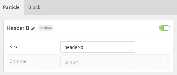
| Option | Setting |
|---|---|
| Key | header-b |
| Chrome | gantry |
Block Settings
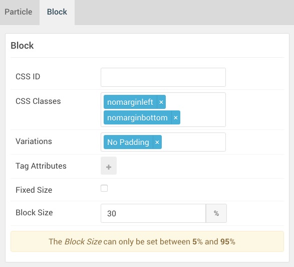
| Option | Setting |
|---|---|
| CSS ID | Blank |
| CSS Classes |
nomarginleft nomarginbottom
|
| Variations | No Padding |
| Tag Attributes | Blank |
| Fixed Size | Unchecked |
| Block Size | 30% |
Owl Carousel (Particle)

The Owl Carousel particle is assigned to the Header B widget position. This is done by creating a Gantry 5 Particle widget and assigning it to the header-b position, then selecting Owl Carousel as the Particle in the widget's settings. You will find its settings below.
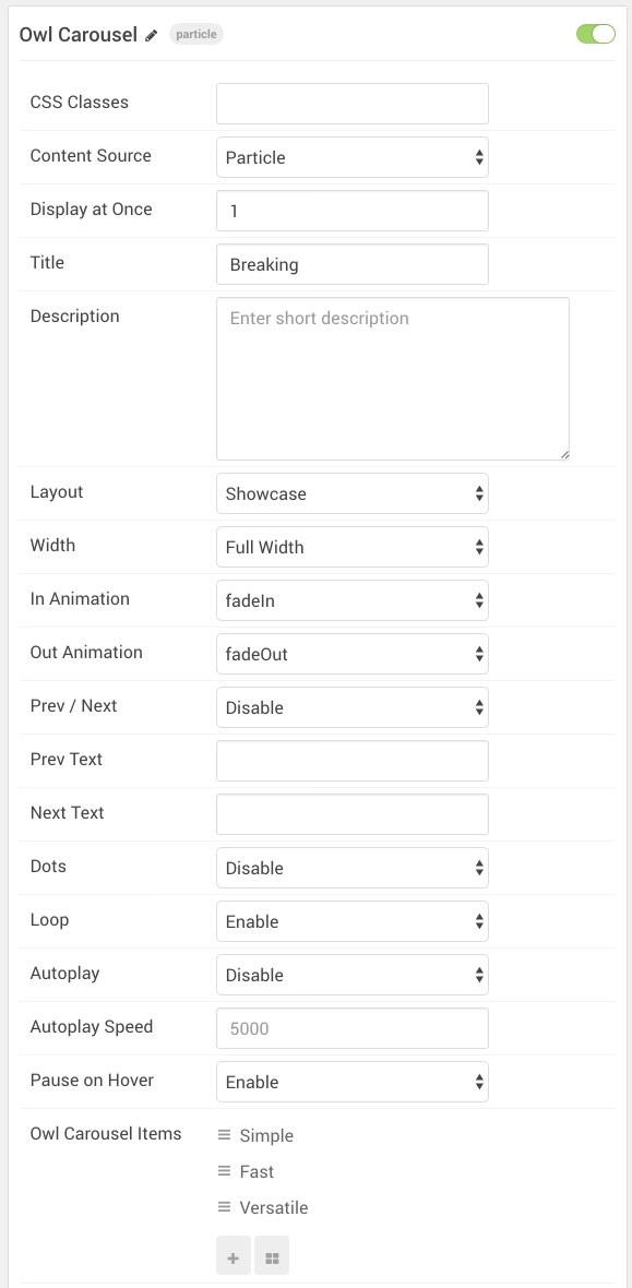
| Option | Setting |
|---|---|
| CSS Classes | Blank |
| Content Source | Particle |
| Display at Once | 1 |
| Title | Breaking |
| Description | Blank |
| Layout | Showcase |
| Width | Full Width |
| In Animation | fadeIn |
| Out Animation | fadeOut |
| Prev Next | Disable |
| Prev Text | Blank |
| Next Text | Blank |
| Dots | Disable |
| Loop | Enable |
| Autoplay | Disable |
| Autoplay Speed | 5000 |
| Pause on Hover | Enable |
| Owl Carousel Item 1 Name | Simple |
| Owl Carousel Item 1 Image | Custom |
| Owl Carousel Item 1 Icon | Blank |
| Owl Carousel Item 1 Title | Simple |
| Owl Carousel Item 1 Subtitle | Experience the Simplicity of Using Gantry 5 |
| Owl Carousel Item 1 Author | Blank |
| Owl Carousel Item 1 Author Image | Blank |
| Owl Carousel Item 1 Description | Blank |
| Owl Carousel Item 1 Link | Blank |
| Owl Carousel Item 1 Link Text | Blank |
| Owl Carousel Item 1 Target | Self |
| Owl Carousel Item 1 Button Classes | Blank |
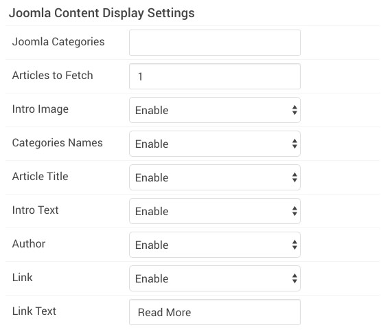
| Option | Setting |
|---|---|
| Grav Categories | Blank |
| Pages to Fetch | 1 |
| Intro Image | Enable |
| Categories Names | Enable |
| Article Title | Enable |
| Intro Text | Enable |
| Author | Enable |
| Link | Enable |
| Link Text | Read More |