What is Responsive Design?
Your Guide to Understanding the Basics of Responsive Design
Introduction
Responsive design makes it possible to create a single site design that gives users a consistent, native user experience across a wide range of devices. Instead of having two individual user interfaces for desktop and mobile users, you have one single design set that adapts automatically, depending on the width of the browser window used to access the page.
It also allows for automatic switching between elements that are optimized for a particular device type. In most responsive sites, smartphone users will see a mobile-friendly menu while desktop users will see the larger, more robust menu system that looks best on a bigger screen. This is made possible by CSS3 media queries, which enable site developers to create custom CSS classes that are triggered by characteristics of the browser, such as its width.
In addition to switching elements on and off, a good responsive design is fluid, and will scale as the window size is adjusted. This ensures that the same great user experience is available for users running browers at virtually any pixel width.
Everything in a responsive design is laid out to be relative, rather than fixed. The layout grid, images, and other media components are placed at a percentage of the browser width..
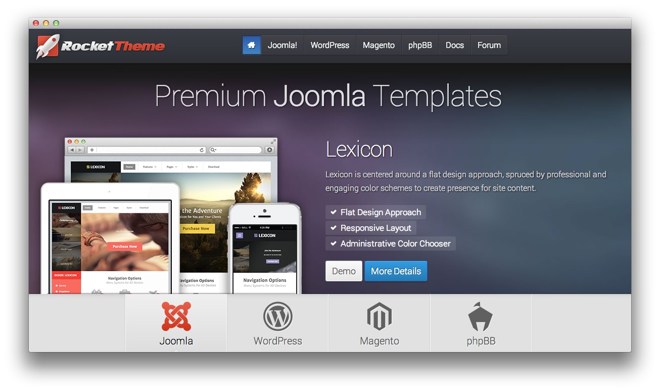
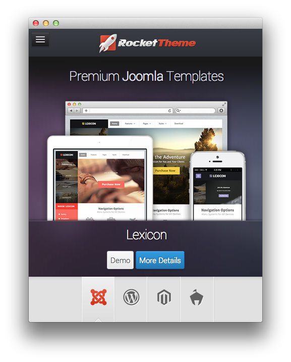
A responsive site is even easier to test since all you need to do to see the difference between the mobile and desktop experience is to resize the browser window. You can do this with the RocketTheme site, and almost every well-made responsive site on the Web.
How RocketTheme Uses Responsive Design
RocketTheme has been creating responsive templates, styles, and themes since January of 2012. The Gantry framework has supported a responsive grid system for both Joomla and WordPress, as well. As of Gantry 4.0, Twitter's Bootstrap responsive grid system has been integrated with Gantry's core featureset.
Responsive Grid
The table below shows the breakdown of screen resolutions and associated devices, and what layout characters are then applied to each.
| Label | Layout width | Column width | Gutter width |
|---|---|---|---|
| Large Display | 1200px and up | 100px | 20px |
| Default | 960px to 1999px | 80px | 20px |
| Portrait Tablets | 768px to 959px | 64px | 20px |
| Phones and Tablets | 767px and belo | Fluid columns, no fixed widths | |
| Phones | 480px | Fluid columns, no fixed widths |
Responsive Support Classes
Another useful available feature, via Bootstrap, is the collection of responsive utility classes that can be used to help tweak layouts by providing a simple method of showing or hiding modules. You can insert the below support classes into your widget custom variation for WordPress or module class suffix to show/hide a widget or module for a particular mode, or add to a specific element in your content.
| Label | Description | Layout Width | Column Width |
|---|---|---|---|
| Smartphones | Standard smartphones | 480px and below | 100% fluid |
| Smartphones to Tablets | Larger smartphones and small tablets | 767px and below | 100% fluid |
| Tablets | Larger tablets | 768px and above | 64px |
| Desktop | Standard desktops and laptops | 960px and above | 80px |
| Large Display | Large desktops and high-resolution laptops | 1200px and above | 100px |
Menus
Because mobile devices such as smartphones and tablets can have issues loading the full-featured menu included on the desktop version of a site, a mobile-specific menu will appear.