Antares: Simple Content Particle
Your Guide to Recreating Elements of the Antares Demo for WordPress
Introduction
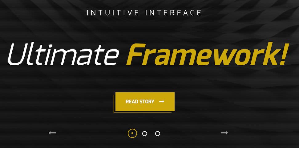
The Simple Content particle makes it easy to create smooth, modern sliders for your website.
Here are the topics covered in this guide:
Configuration
Main Options
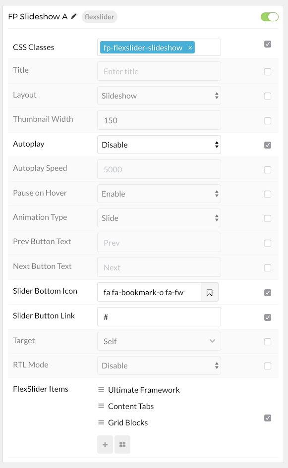
These options affect the main area of the particle, and not the individual items within.
| Option | Setting |
|---|---|
| Particle Name | The name of the particle for organizational use in the backend. |
| CSS Classes | CSS Class(es) you would like to have apply to the particle's content. In the front page of our demo we used: fp-flexslider-slideshow. |
| Title | Title of the particle as it will appear on the front end. |
| Layout | Select a layout style to apply to the particle. Choose Layout, Slideshow, or Showcase. |
| Thumbnail Width | Set the width (in pixels) of the image's thumbnail. |
| Autoplay | Enable or Disable autoplay for the particle. |
| Autoplay Speed | Set the speed (in milliseconds) of the particle's animation. |
| Pause on Hover | Enable or Disable the pause-on-hover effect for the particle. |
| Animation Type | Choose between Slide and Fade animation types. |
| Prev Button Text | Enter text for the previous button. In our demo we used: Prev. |
| Next Button Text | Enter text for the next button. In our demo we used: Next. |
| Slider Button Icon | Select an icon for the button. In our demo we used: fa fa-bookmark-o fa-fw. |
| Slider Button Link | Select a link you would link the bottom to go to. |
| Target | Select the target you want the link go open in. Choose between New Window and Self. |
| RTL Mode | Enable or Disable RTL mode. |
Item Options
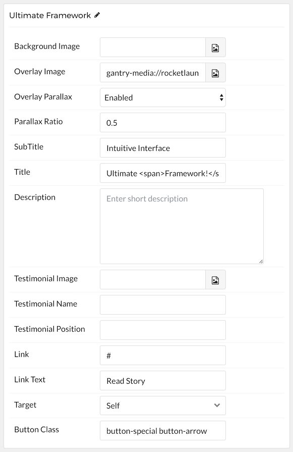
These items make up the individual featured items in the particle.
| Option | Description |
|---|---|
| Name | Enter a name for your item. This only appears on the back end. |
| Background Image | Set a background image for the item. |
| Overlay Image | Set an overlay image for the item. |
| Overlay Parallax | Enable or Disable parallax for the item's overlay. |
| Parallax Ratio | Set the ratio for the parallax. Usually this is 0.5. |
| SubTitle | Enter a subtitle for the item. |
| Title | Enter a title for the item. |
| Description | Enter a description for the item. |
| Testimonial Image | Select a testimonial image for the item. Used in the Testimonial layout type. |
| Testimonial Name | Enter a name for the person giving testimony. Used in the Testimonial layout type. |
| Testimonial Position | Enter a position (job title or employer) for the person giving testimony. Used in the Testimonial layout type. |
| Link | Enter a link for the item. |
| Link Text | Enter text that appears as the link for the item. |
| Target | Select between Self and New Window for the link's target. |
| Button Class | Insert and CSS class(es) you want to have apply to the button. |
Found errors? Think you can improve this documentation? Please edit this page. You can also view the history of this page.