Voxel: Recreating the Demo - Footer
Your Guide to Recreating Elements of the Voxel Theme for WordPress
Footer Section
Here is the widget breakdown for the Footer section:
- Text
- Gantry Divider
- Text
- Text
- Gantry Divider
- Text
- Gantry Divider
- RokGallery
Text
The first Text widget in the section is made a lot like the others. You will need to enter the following in the main text field.
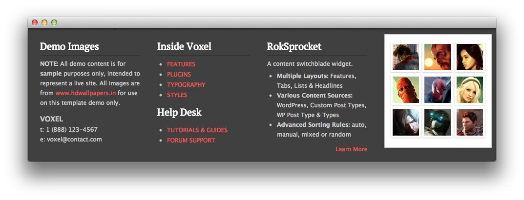
<p><strong>NOTE:</strong> All demo content is for <strong>sample</strong> purposes only, intended to represent a live site. All images are from <a target="_blank" href="http://www.hdwallpapers.in">www.hdwallpapers.in</a> for use on this theme demo only.</p>
<h4 class="smallmarginbottom">VOXEL</h4>
<span>t: 1 (888) 123-4567</span><br />
<span>e: voxel@contact.com</span>
Here is a breakdown of options changes you will want to make to match the demo.
- Set the Title to
Demo Images. - Set the Title Variation to Title 2.
- Enter
nopaddingbottom nopaddingrightin the Custom Variations field. - Leaving everything else at its default setting, select Save.
Gantry Divider
This widget tells WordPress to start a new widget column beginning with the widget placed directly below the divider in the section.
Text
The second Text widget in the section is made a lot like the others. You will need to enter the following in the main text field.
<ul>
  <li><a class="normalfont" href="http://demo.rockettheme.com/wordpress-themes/wp_voxel/theme-features/">FEATURES</a></li>
  <li><a class="normalfont" href="http://demo.rockettheme.com/wordpress-themes/wp_voxel/plugins/">PLUGINS</a></li>
  <li><a class="normalfont" href="http://demo.rockettheme.com/wordpress-themes/wp_voxel/theme-features/typography/">TYPOGRAPHY</a></li>
  <li><a class="normalfont" href="http://demo.rockettheme.com/wordpress-themes/wp_voxel/preset-styles/">STYLES</a></li>
</ul>
Here is a breakdown of options changes you will want to make to match the demo.
- Set the Title to
Inside Voxel. - Set the Title Variation to Title 2.
- Set the Padding Variation option to No Padding Bottom.
- Leaving everything else at its default setting, select Save.
Text
The third Text widget in the section is made a lot like the others. You will need to enter the following in the main text field.
<ul>
<li><a class="normalfont" href="http://demo.rockettheme.com/wordpress-themes/wp_voxel/tutorials/">TUTORIALS & GUIDES</a></li>
<li><a class="normalfont" href="http://www.rockettheme.com/forum/index.php?f=697&rb_v=viewforum" target="_blank">FORUM SUPPORT</a></li>
</ul>
Here is a breakdown of options changes you will want to make to match the demo.
- Set the Title to
Help Desk. - Set the Title Variation to Title 2.
- Enter
nopaddingtop nopaddingbottomin the Custom Variations field. - Leaving everything else at its default setting, select Save.
Text
The fourth Text widget in the section is made a lot like the others. You will need to enter the following in the main text field.
<p class="smallmarginbottom">A content switchblade widget.</p>
<ul>
<li><strong>Multiple Layouts: </strong>Features, Tabs, Lists & Headlines</li>
<li><strong>Various Content Sources: </strong> WordPress, Custom Post Types, WP Post Type & Types</li>
<li><strong>Advanced Sorting Rules: </strong> auto, manual, mixed or random</li>
</ul>
<div class="rt-floatright medmargintop">
<a href="http://demo.rockettheme.com/wordpress-themes/wp_voxel/plugins/">Learn More </a>
</div>
<div class="clear"></div>
Here is a breakdown of options changes you will want to make to match the demo.
- Set the Title to
RokSprocket. - Set the Title Variation to Title 2.
- Enter
nopaddingbottom nopaddingleftin the Custom Variations field. - Leaving everything else at its default setting, select Save.
RokGallery
This RokGallery widget is used to display a Grid of images in order to demonstrate what RokGallery can do to enhance your site's look.
Here is a breakdown of the widget options:
| Option | Setting |
|---|---|
| Title | Blank |
| Link Type | None |
| Show Title | No |
| Show Caption | No |
| Sort By | Order |
| Sort Direction | Ascending |
| Slice Limit | 9 |
| Gallery Style | Light |
| Gallery Layout | Grid Layout |
| Grid Columns | 3 |
| Box Variation | 2 |
| Custom Variations | footer-rokgallery |
This will create the widget, but you will need to actually build the gallery using RokGallery. We go into detail on how to use RokGallery in our official guide.