Denali: Swiper Particle
Your Guide to Recreating Elements of the Denali Demo for Grav
Introduction
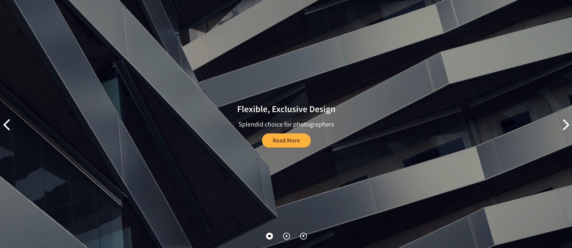
The Swiper particle is an incredibly versatile and modern touch slider available with the Denali theme!
Here are the topics covered in this guide:
Configuration
Settings
These options affect the main area of the particle, and not the individual items within.
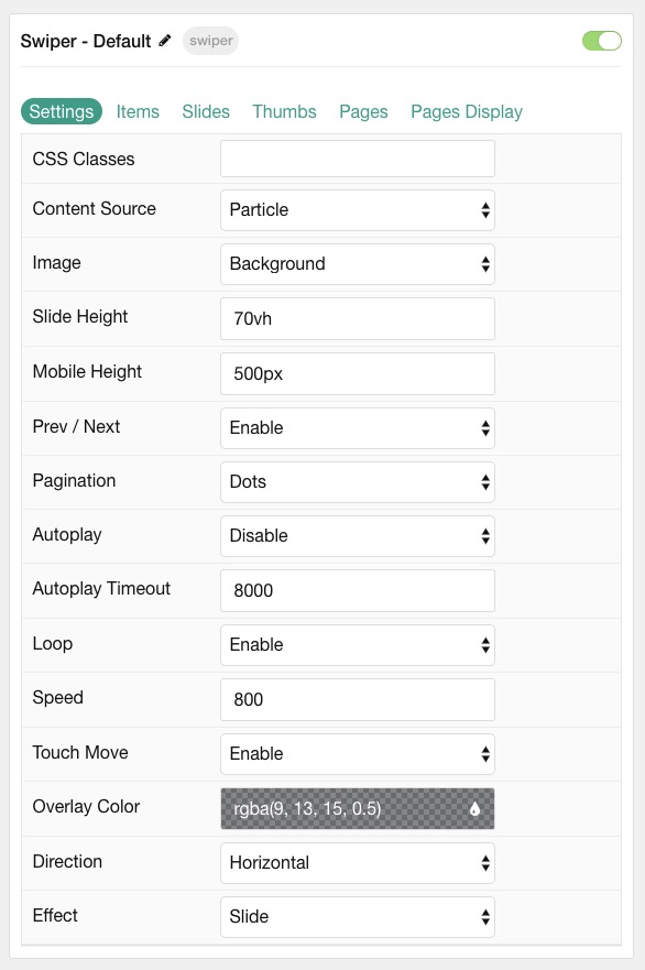
| Option | Description |
|---|---|
| Particle Name | This is the name of the particle used for back end management. It does not appear on the front end. |
| Content Source | Choose between Particle and Grav as the content source for the particle. |
| Image | Choose if the image used should display as a Background or IMG tag. |
| Slide Height | Set the height of each slide. |
| Mobile Height | Set the height of each slide on mobile devices. |
| Prev/ Next | Enable or Disable arrows navigation. |
| Pagination | Choose between Dots, Progress Bar, or None. |
| Autoplay | Enable or Disable autoplay for the particle. |
| Autoplay Timeout | Set the time (in milliseconds) between slides in autoplay mode. |
| Loop | Enable or Disable looping slides. |
| Speed | Set the transition speed (in milliseconds). |
| Touch Move | Enable, Disable, or Mobile Only touch movements. |
| Overlay | Select the color of the overlay for the slider items. |
| Direction | Choose between a Vertical and Horizontal slider animation. |
| Effect | Choose an effect. Options include: Slide, Fade, Flip, or Cover Flow. |
NOTE: For best results when selecting IMG in Image option, set Slide and Mobile Height to 100%.
Particle Item Options
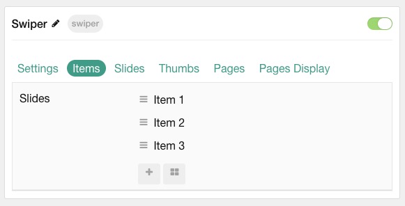
These items make up the individual featured items in the particle. Items in this section will only appear if Particle is selected as the Content Source.
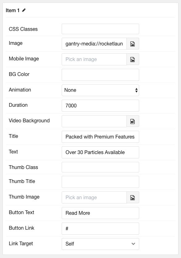
| Option | Description |
|---|---|
| Item Name | This is the name of the item. It is used only for backend management. |
| CSS Classes | Enter any CSS class(es) you wish to have apply to the item. |
| Image | Select an image to appear in the particle. |
| Mobile Image | Select an image to appear in the particle on mobile devices. |
| BG Color | Select the color of the background for each item if image is not used. |
| Animation | Select the animation applied to the image as it is displayed. |
| Duration | Enter the duration (in milliseconds) of the animation. |
| Video Background | Select a video to appear as the background for the slide. |
| Title | Enter a title for the slide. |
| Text | Enter a description for the slide. |
| Thumb Title | If Thumbnails are enabled, enter a title for the Thumb. |
| Button Text | Enter the text for a button. |
| Button Link | Enter the URL for the button. |
| Link Target | Enter the target window for the button link to open in. |
Slides Options
These options are for configuring amount of Slides to display and the space between them in Mobile, Tablet, Desktop, etc. Only available when using the Slide and Cover Flow Effect in Particle settings.
NOTE: Mobile, Tablet, Desktop, Large Desktop breakpoints are determined via your Styles panel -> Breakpoints.
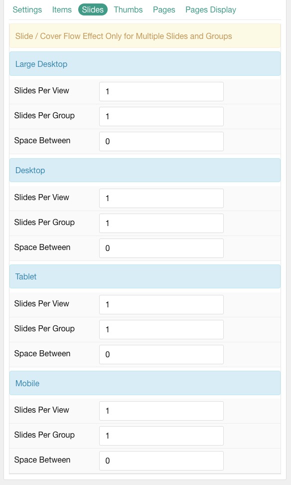
| Option | Description |
|---|---|
| Slides Per View | Number of slides per view. |
| Slides Per Group | Number of slides per transition. |
| Space Between | Amount of space between each thumb (px). |
Thumbs Options
These options are for configuring amount of Thumbs to display and the space between them in Mobile, Tablet, Desktop, etc. Other options include navigation and where you want them to display (top or bottom).
NOTE: Mobile, Tablet, Desktop, Large Desktop breakpoints are determined via your Styles panel -> Breakpoints.
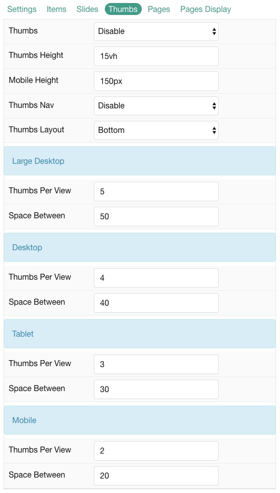
| Option | Description |
|---|---|
| Thumbs | Enable or Disable thumbs. |
| Thumbs Height | Set the height of the thumbs. |
| Mobile Height | Set the height of the thumbs on mobile devices. |
| Thumbs Nav | Enable or Disable thumbs navigation. |
| Thumbs Layout | Display Thumbs on either Top or Bottom of slider. |
| Thumbs Per View | Number of thumbs per view. |
| Space Between | Amount of space between each thumb (px). |
Pages
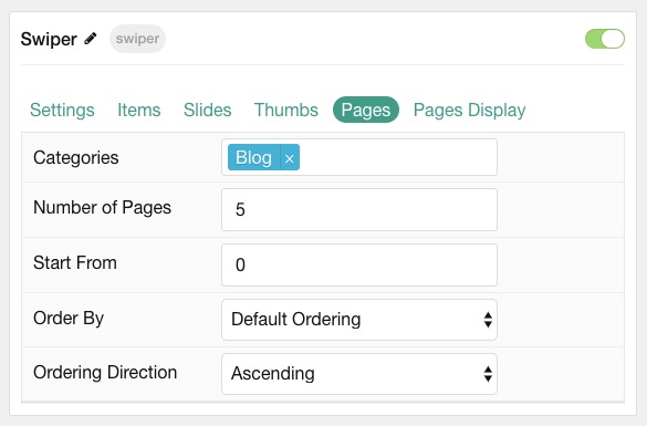
| Option | Description |
|---|---|
| Categories | Select the categories of pages this particle will display. |
| Number of Pages | Enter the maximum number of pages to display. |
| Start From | Enter offset specifying the first page to return. The default is '0' (the first page). |
| Order By | Choose the type of factor to order by. |
| Ordering Direction | Choose between Ascending and Descending as the page ordering method. |
Display
This section configures how pages are displayed.
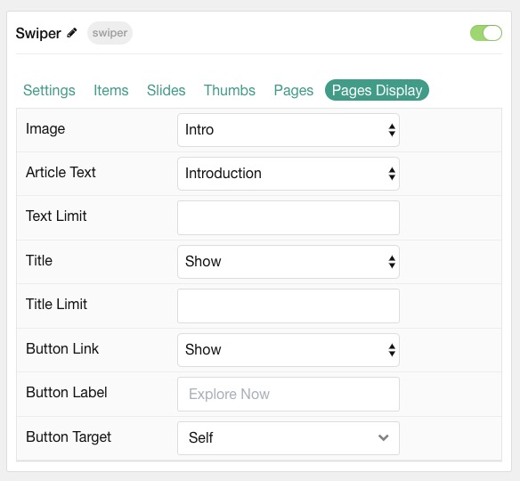
| Option | Description |
|---|---|
| Image | Choose between the Intro, Full, or no image to display with each item. |
| Article Text | Choose between Content, Exerpt, or Hide content text to display. |
| Text Limit | Enter a limit (in characters) of page text to display with each item. |
| Title | Show or Hide the page's title. |
| Title Limit | Enter the maximum number of characters in the title to display. |
| Button Link | Select if the button should link to the page. |
| Button Label | Type in the label for the button. |
| Button Target | Target browser window when the button is clicked. |