RokFeatureTable
Your Guide to Using RokFeatureTable for Joomla
Module Options
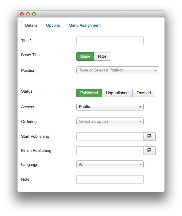
You can access RokFeatureTable's main module settings by navigating to Administrator -> Extensions Manager -> Modules -> RokFeatureTable. Any changes you make here will be reflected in a single occurrence of the RokFeatureTable module on the frontend of your site.
Details
-
 1TitleSets the title for the RokFeatureTable module. This is not a required field.2Show TitleDetermines whether or not the title listed above appears on the frontend of the site, or just on the administrative side.3PositionEnter the name of the position you wish to place the module in here.4StatusDetermines whether your module is visible to the public, unpublished, or trashed.5AccessSets which user types have access to the module.6OrderingDetermines the ordering rule applied to the module.7Start PublishingSelect the date and time you wish to start publishing the module.8Finish PublishingSelect the date and time you wish to end publishing the module.9LanguageSets the language for the module.10NoteAdd any notes you wish to have displayed on the administrative side of your site relating to the module here.
Title: Sets the title for the RokFeatureTable module. This is not a required field.
Show Title: Determines whether or not the title listed above appears on the frontend of the site, or just on the administrative side.
Position: Enter the name of the position you wish to place the module in here.
Status: Determines whether your module is visible to the public, unpublished, or trashed.
Access: Sets which user types have access to the module.
Ordering: Determines the ordering rule applied to the module.
Start Publishing: Select the date and time you wish to start publishing the module.
Finish Publishing: Select the date and time you wish to end publishing the module.
Language: Sets the language for the module.
Note: Add any notes you wish to have displayed on the administrative side of your site relating to the module here.
Options
-
 1Built-in CSSRokFeatureTable comes with a default style that integrates well with many Joomla templates. If you want to use your own, or if the template you are using supports a custom style, you might want to set this param to No.2Highlight ColumnThis option sets the column number you wish to have highlighted by default. This is typically a column or product you wish to bring attention to.3Prefix Cell ClassnamesThis option allows you to turn off or on the inclusion of prefixes for any class names used in the table cells.4Preset TemplatesRokFeatureTables has the ability to import predefined templates to the /modules/mod_rokfeaturetable/templates directory. RokFeatureTable comes with two predefined templates as examples: Browsers and Price Table.5Layout SetupThis area of the page sets the size and content of the feature table. It is the most important part of the module setup process. More details about this page are located in the Table Layout section below.
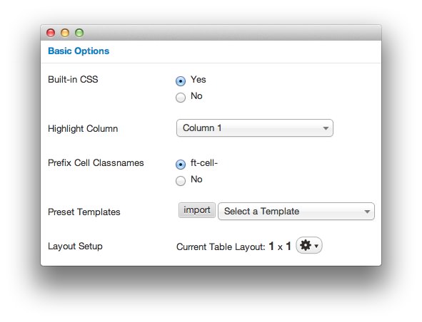
Built-in CSS RokFeatureTable comes with a default style that integrates well with many Joomla templates. If you want to use your own, or if the template you are using supports a custom style, you might want to set this param to No.
Highlight Column This option sets the column number you wish to have highlighted by default. This is typically a column or product you wish to bring attention to.
Prefix Cell Classnames This option allows you to turn off or on the inclusion of prefixes for any class names used in the table cells.
Preset Templates RokFeatureTables has the ability to import predefined templates to the /modules/mod_rokfeaturetable/templates directory. RokFeatureTable comes with two predefined templates as examples: Browsers and Price Table.
Layout Setup This area of the page sets the size and content of the feature table. It is the most important part of the module setup process. More details about this page are located in the Table Layout section below.
Table Layout
You can access the table layout options via the module properties menu featured above. This tool allows you to create and fill your feature table with information that includes everything from basic text to custom CSS classes, subline text, links, and styles.
-
 1ColumnsYou can add or remove columns to your feature table. Columns can be individually highlighted to emphasize the included content.2RowsEach column can have an independent number of rows. You can add or remove rows using the + or - controls. Each row within a column acts as a single cell.3ClassYou can use the class control to add a unique CSS class to the cell.4SublineThis option allows you to add a sub-line of text to the cell. This is useful for disclaimers or extra information.5LinkYou can have a particular cell link to a specific URL.6StyleThis option allows you to assign custom style rules to the cell.
Columns You can add or remove columns to your feature table. Columns can be individually highlighted to emphasize the included content.
Rows Each column can have an independent number of rows. You can add or remove rows using the + or - controls. Each row within a column acts as a single cell.
Class You can use the class control to add a unique CSS class to the cell.
Subline This option allows you to add a sub-line of text to the cell. This is useful for disclaimers or extra information.
Link You can have a particular cell link to a specific URL.
Style This option allows you to assign custom style rules to the cell.
Custom Templates
Creating custom templates is very easy. You just need your favorite text editor and some knowledge of syntax. Below is an example of a custom template that we are going to cover on all its aspects.
name::padding-top:10px;|Firefox
name-sub::Gecko Engine
name-classes::class2 class3
button-text::Download
button-text-sub::free
button-text-link::http://www.mozilla.com/en-US/firefox/all.html
---
name::padding-top:10px;|Chrome
name-sub::WebKit Engine
name-classes::class2 class3
button-text::Download
button-text-sub::free
button-text-link::http://www.google.com/chrome
---
name::padding-top:10px;|Safari
name-sub::WebKit Engine
name-classes::class2 class3
button-text::Download
button-text-sub::free
button-text-link::http://www.apple.com/safari/download/
---
name::padding-top:10px;|Opera
name-sub::Presto Engine
name-classes::class2 class3
button-text::Download
button-text-sub::free
button-text-link::http://www.opera.com/browser/
Each Column is separated by 3 dashes ---, so every time you are done writing rows, to 'switch' to another column, just add ---.
To create a row, or even better, a cell, you start typing the class name of the reference followed by two colons ::. Let's ignore all the columns and let's just take as reference the first one. Even without knowing the syntax, yet, you can easily tell all the columns and rows are equals, what makes them difference are just the values, but not the structure.
name::padding-top:10px;|Firefox
name-sub::Gecko Engine
name-classes::class2 class3
button-text::Download
button-text-sub::free
button-text-link::http://www.mozilla.com/en-US/firefox/all.html
So, as said earlier, we started writing a cell name::padding-top:10px;|Firefox. This translated means: "Create a cell, use as referenced class name 'name', add some in-line styling padding-top:10px; and use Firefox as text of the cell.
In the case that you want that cell to have a subline, the next line of the code would contain something like: name-sub::Gecko Engine. As you can see, 'name' has been kept for referencing to the 'name' cell, but we added a new keyword -sub. That is what lets RokFeatureTable know that our second line in the code needs to be a subline of 'name'. Translation: "In the cell that has 'name' as reference class add a subline with the text 'Gecko Engine'".
Now, let's say we want our cell to have additional classes. To do so, follow the same rules of '-sub', we write: name-classes::class2 class3, which translates to: "In the cell that has 'name' as reference class, I also need other classnames: class2 and class3".
What follows is not prefixed by any 'name' anymore. That means we are done with the 'name' cell and we are switching to a new one, 'button-text'.
Everything is exactly as in 'name' cell, except we have a new keyword, -link.
NOTE: All the referenced cells allow HTML syntax, if instead of just plain "Firefox" (in the example above), we wanted a bold, red and italic "Firefox" (Firefox) this is how we would have written our cell: name::padding-top:10px;|<strong style="color:red;"><em>Firefox</em></b>