RokNavMenu: Setup Guide
Your Guide to Using RokNavMenu for Joomla
Introduction
There is not a whole lot that needs to be done out of the box to set RokNavMenu up on a RocketTheme template. A lot of what RokNavMenu adds to Joomla is done on the backend by taking the standard Joomla menus and adding additional features and details you can customize to meet your specific needs.
In this tutorial, we will take a look at some of the options available to you through RokNavMenu, as well as some of the most important options you should be aware of when setting up a new site.
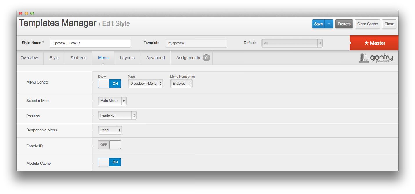
Gantry Menu Options
In order to make our templates easy to use, we baked RokNavMenu in and made many of the core controls accessible using the Templates Manager. The Menu tab gives you direct access to options that impact the main menu for your site. This includes: Where it appears on the page, the responsive menu type, and more.
-
 1ShowEnabling this option enables the main menu on the frontend. If this is turned off, the menu will not appear as assigned.2TypeThis option allows you to select the menu type. Types such as Dropdown and Splitmenu change the way the menu works on the frontend. Some templates may include Fusion in lieu of Dropdown, and others may also offer Spicemenu.3Menu NumberingEnabling or disabling menu numbering is done via this option. This option is not present in all templates.4Select a MenuThe Joomla menu you select here will be the source for the main menu.5PositionThis is where you select a module position to assign the main menu to.6Responsive MenuFor smartphones and tablets, this option determines how the menu will appear.7Enable IDYou can enable or disable the default Joomla menu ID through this setting.8Module CacheThis setting turns on or off default module caching for the menu.
Show: Enabling this option enables the main menu on the frontend. If this is turned off, the menu will not appear as assigned.
Type: This option allows you to select the menu type. Types such as Dropdown and Splitmenu change the way the menu works on the frontend. Some templates may include Fusion in lieu of Dropdown, and others may also offer Spicemenu.
Menu Numbering: Enabling or disabling menu numbering is done via this option. This option is not present in all templates.
Select a Menu: The Joomla menu you select here will be the source for the main menu.
Position: This is where you select a module position to assign the main menu to.
Responsive Menu: For smartphones and tablets, this option determines how the menu will appear.
Enable ID: You can enable or disable the default Joomla menu ID through this setting.
Module Cache: This setting turns on or off default module caching for the menu.
Menu Item Options
Individual menu items can be edited from Admin -> Menu -> Menu Name -> Menu Item. In the Advanced Settings area of the editing page, you will find a set of options for each supported menu type. Typically, this includes Dropdown and Splitmenu. Here, you can refine how a menu item appears in a RokNavMenu menu.
NOTE: These options will only appear if the RokExtender extension (part of RokNavMenu) is enabled. Also, these settings will only appear when a Gantry template that supports these options has been set as the default template. When switching to another template, these options may have to be reconfigured for the new template.
Dropdown Menu Options
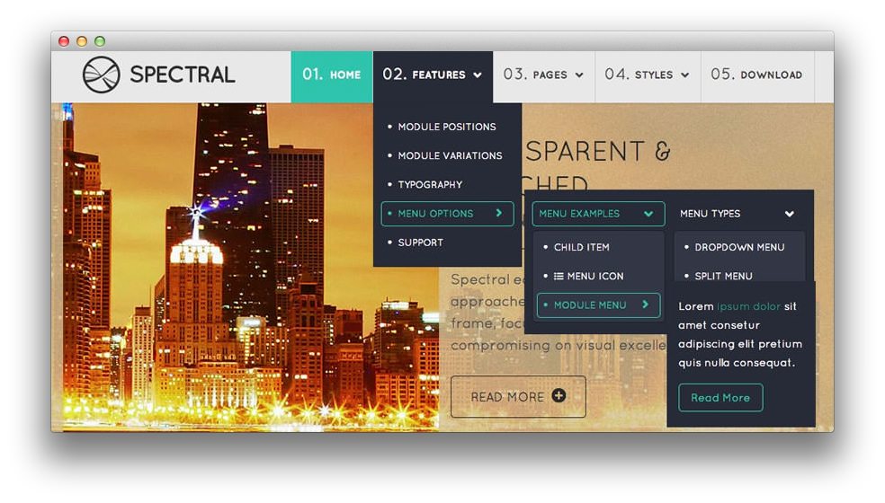
The Dropdown Menu is an advanced CSS driven dropdown menu system. It offers advanced structural features such as multiple columns, inline icons and text, inline modules and positions, custom column widths, item distribution and menu offset. All of these are configurable for each menu item.
-
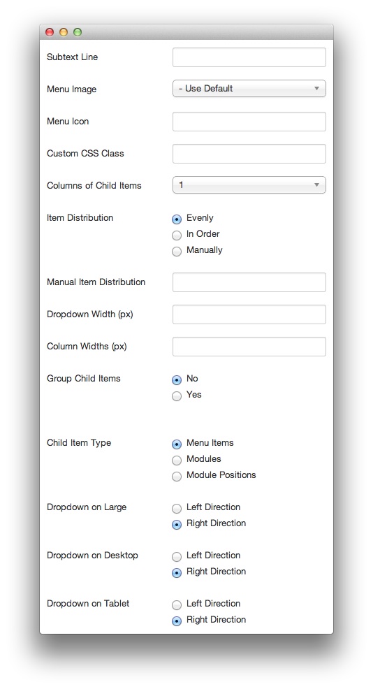 1Subtext LineYou can post a second line here.2Menu ImageThe image that appears in association with the menu.3Menu IconYou can opt to use an icon from Font Awesome to add a visual element to the menu item using this field. For example:
icon-bitcoin.4Custom CSS ClassThis field allows you to add a custom CSS class to the menu item.5Columns of Child ItemsThis setting gives you the ability to choose to have one or more columns for child items.6Item DistributionYou can choose to distribute child items Evenly, In Order, or Manually. As an example, seven items in three columns distributed Evenly is: 3,2,2. If these were done In Order, it would be 3,3,1.7Manual Item DistributionThis is the comma-separated count of rows in each column. Example: 3,2,2.8Drop-Down WidthThis is the width of any dropdown column (in pixels).9Column WidthsFor multiple columns, this is the width (in pixels) of each column. Example: 100,150,300.10Group Child ItemsYou can select whether or not to group children under the menu item rather than as a submenu.11Child Item TypeAllows you to select the type of child item. This can be Menu Items, Modules, or Module Positions. Modules and module positions allow you to embed modules within the menu itself.12Dropdown on LargeEnables you to determine the direction a dropdown menu section drops on a large screen.13Dropdown on DesktopEnables you to determine the direction a dropdown menu section drops on a desktop screen.14Dropdown on TabletEnables you to determine the direction a dropdown menu section drops on a tablet-sized browser window.
Subtext Line You can post a second line here
Menu Image The image that appears in association with the menu.
Menu Icon You can opt to use an icon from Font Awesome to add a visual element to the menu item using this field. For example:
icon-bitcoin.Custom CSS Class This field allows you to add a custom CSS class to the menu item.
Columns of Child Items This setting gives you the ability to choose to have one or more columns for child items.
Item Distribution You can choose to distribute child items Evenly, In Order, or Manually. As an example, seven items in three columns distributed Evenly is: 3,2,2. If these were done In Order, it would be 3,3,1.
Manual Item Distribution This is the comma-separated count of rows in each column. Example: 3,2,2.
Drop-Down Width This is the width of any dropdown column (in pixels).
Column Widths For multiple columns, this is the width (in pixels) of each column. Example: 100,150,300.
Group Child Items You can select whether or not to group children under the menu item rather than as a submenu.
Child Item Type Allows you to select the type of child item. This can be Menu Items, Modules, or Module Positions. Modules and module positions allow you to embed modules within the menu itself.
Dropdown on Large Enables you to determine the direction a dropdown child menu section drops to on a large screen.
Dropdown on Desktop Enables you to determine the direction a dropdown child menu section drops to on a desktop screen.
Dropdown on Tablet Enables you to determine the direction a dropdown child menu section drops to on a tablet-sized browser window.
Splitmenu Options
Splitmenu is a static menu system that displays 1st level items in the main horizontal menu and further children in the Sidebar.
-
 1Subtext LineYou can post a second line here.2Menu IconYou can opt to use an icon from Font Awesome to add a visual element to the menu item using this field.3Custom CSS ClassThis field allows you to add a custom CSS class to the menu item.
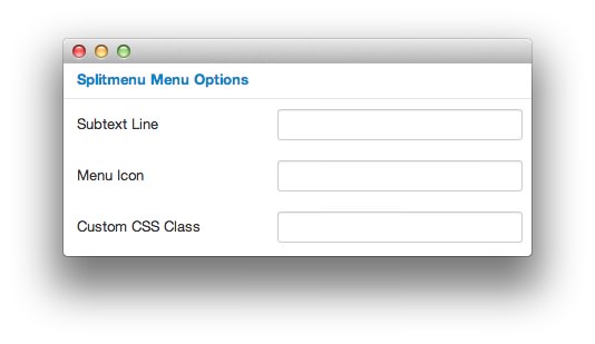
Subtext Line: You can post a second line here.
Menu Icon: You can opt to use an icon from Font Awesome to add a visual element to the menu item using this field.
Custom CSS Class: This field allows you to add a custom CSS class to the menu item.
RokNavMenu Module Options
We designed RokNavMenu to work with most templates, even ones that do not include the Gantry framework. While you might not be able to take advantage of the Templates Manager setup for the main menu in these instances, you can still use styled RokNavMenu modules to extend the features and functionality of the core Joomla menu.
To create a new RokNavMenu module, you need to navigate to Administrator -> Extensions -> Module Manager -> New and select RokNavMenu as the module type. Here, you can configure the menu module to meet your needs.
Details
-
 1TitleEvery module must have a title. This title should be easy to remember should you need to adjust the menu settings in the future.2Show TitleAllows you to show or hide the title assigned above.3PositionThis is the position you wish to have the RokNavMenu module appear.4StatusThe module can be Published (live), Unpublished (hidden), or Trashed.5AccessAllows you to determine who has access to the module. If this is your main menu, it should be Public.6OrderingSelects the ordering option for the module.7Start PublishingAllows you to set the module to be moved to a Published status at a specific date.8Finish PublishingAllows you to set the module to be moved to an Unpublished status at a specific date.9LanguageAssign a language to the module.10NoteAn optional note that appears in the module list (todo tasks, etc.) This note only appears on the backend.
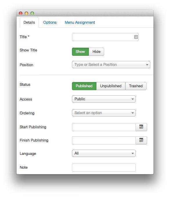
Title: Every module must have a title. This title should be easy to remember should you need to adjust the menu settings in the future.
Show Title: Allows you to show or hide the title assigned above.
Position: This is the position you wish to have the RokNavMenu module appear.
Status: The module can be Published (live), Unpublished (hidden), or Trashed.
Access: Allows you to determine who has access to the module. If this is your main menu, it should be Public.
Ordering: Selects the ordering option for the module.
Start Publishing: Allows you to set the module to be moved to a Published: status at a specific date.
Finish Publishing: Allows you to set the module to be moved to an Unpublished: status at a specific date.
Language: Assign a language to the module.
Note: An optional note that appears in the module list (todo tasks, etc.) This note only appears on the backend.
Basic Options
-
 1Select MenuSelects a menu to assign to the module. (Example: Main Menu)2Limit LevelsAllows you to choose whether or not to limit the levels that appear in this menu.3Start LevelThis is the level to start rendering the menu at. If you set the Start and End levels to the same level, and set the Show Sub-Menu Items option to Yes, only one level will appear in the menu.4End LevelThis is the level to stop rendering the menu at.5Show Sub-Menu ItemsAllows you to make sub-menu items available through an expanded menu.6ThemesThis is the theme you wish to have the menu rendered in. For example: Fusion, Dropdown, or Splitmenu.
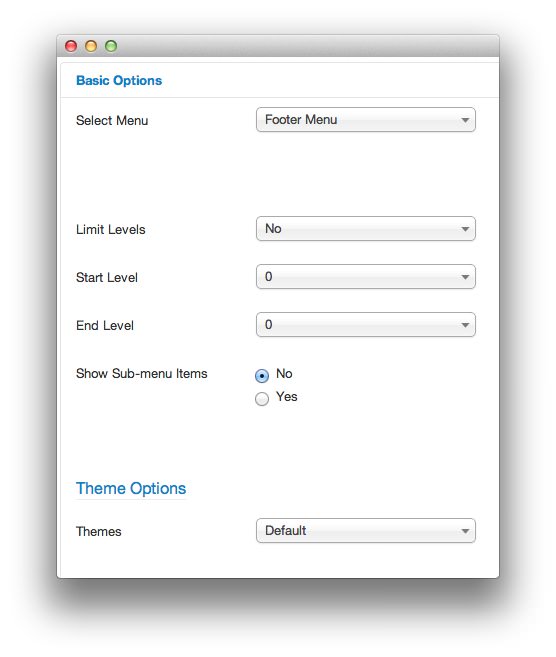
Select Menu: Selects a menu to assign to the module. (Example: Main Menu)
Limit Levels: Allows you to choose whether or not to limit the levels that appear in this menu.
Start Level: This is the level to start rendering the menu at. If you set the Start and End levels to the same level, and set the Show Sub-Menu Items option to Yes, only one level will appear in the menu.
End Level: This is the level to stop rendering the menu at.
Show Sub-Menu Items: Allows you to make sub-menu items available through an expanded menu.
Themes: This is the theme you wish to have the menu rendered in. For example: Fusion, Dropdown, or Splitmenu.
Advanced Options
-
 1Menu Tag IDThis is an optional ID attribute to assign to the root UL tag of the menu.2Menu Class SuffixThis is a suffix to be applied to the CSS class of the menu items.3Target PositionJavaScript values to position the popup window. Example:
top=50,left=50,width=200,height=3004Module Class SuffixA suffix to be applied to the CSS class of the module. This allows for individual module styling.5CachingSelect whether to cache the content of this module.6Cache TimeThis is the time between module recachings.7Module TagThe HTML tag for the module.8Bootstrap SizeThis option specifies how many columns the module will use.9Header TagThis is the HTML tag for the header/title. It affects how the title of the module appears, if the title is set to Show.10Header ClassThe CSS class for the header/title.11Module StyleUse this option to override the template's style for its position.
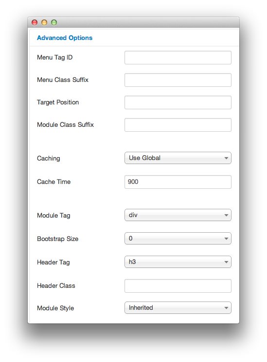
Menu Tag ID: This is an optional ID attribute to assign to the root UL tag of the menu.
Menu Class Suffix: This is a suffix to be applied to the CSS class of the menu items.
Target Position: JavaScript values to position the popup window. Example:
top=50,left=50,width=200,height=300Module Class Suffix: A suffix to be applied to the CSS class of the module. This allows for individual module styling.
Caching: Select whether to cache the content of this module.
Cache Time: This is the time between module recachings.
Module Tag: The HTML tag for the module.
Bootstrap Size: This option specifies how many columns the module will use.
Header Tag: This is the HTML tag for the header/title. It affects how the title of the module appears, if the title is set to Show.
Header Class: The CSS class for the header/title.
Module Style: Use this option to override the template's style for its position.