Fracture
Your Guide to Using the Fracture Template for Joomla
Introduction
Fracture, the September 2012 template release, is the first RocketTheme template to be built on the Gantry4 Framework, which features a responsive layout core, a rejuvenated administrative interface and optimized coding. The template focuses on a clean and minimal design with a unique overlay system for stunning results.
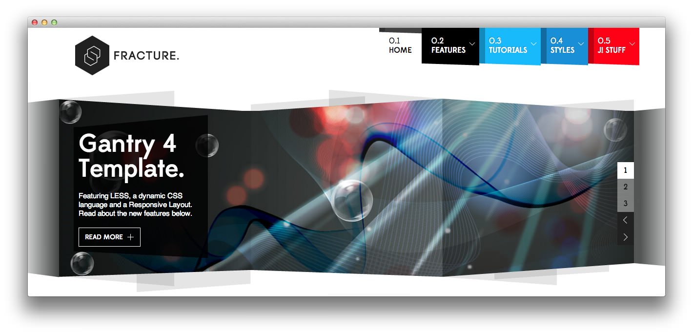
The template also uses LESS, a dynamic stylesheet language, that extends CSS with dynamic behaviour. RokSprocket further benefits from custom styling, adding rich focus to a conservative design backdrop.
NOTICE: Fracture is a Joomla 3.x Template.
Requirements
- Apache 2.2+ or Microsoft IIS 7
- PHP 5.3.10+ (PHP 5.5+ Recommended)
- MySQL 5.1+
- Joomla 3.4
NOTE: Gantry v4.1.35 is required for Fracture to work correctly. For more details on the Gantry Framework, please visit its dedicated website.
Key Features
- Joomla 2.5.x / 3.x.x Compatible
- Responsive Layout
- 8 Preset Styles
- 84 Module Positions
- 9 Styled and 25 Structural Module Suffixes
- RokSprocket Responsive Layout Integrated
- Styled Support for Responsive K2 Layout
- Powerful Gantry 4 Framework
- Custom Content Typography
- Fusion MegaMenu & Splitmenu
- Load Transitions
- FF, Safari, Chrome, Opera, IE8+ Compatible
- HTML5, CSS3, LESS CSS
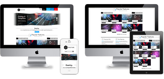
Responsive Layout
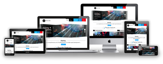 Fracture's responsive grid system is designed for desktop, tablet and smartphone systems, each with minor modifications to ensure compatibility in each mode.
We use the responsive layout based on Twitter's Bootstrap Framework, with its collection of utility classes, to provide a great degree of flexibility for a responsive design.
The table below shows the breakdown of screen resolutions and associated devices, and which layout characters are then applied to each.
| Label | Description | Layout Width | Column Width |
|---|---|---|---|
| Smartphones | Standard smartphones | 480px and below | 100% fluid |
| Smartphones to Tablets | Larger smartphones and small tablets | 767px and below | 100% fluid |
| Tablets | Larger tablets | 768px and above | 64px |
| Desktop | Standard desktops and laptops | 960px and above | 80px |
| Large Display | Large desktops and high-resolution laptops | 1200px and above | 100px |
Responsive Layout for RokSprocket
 Fracture comes with the RokSprocket extension that are built to work with a responsive layout and support mobile touch events, such as 'swipe'.
Powered by Gantry 4 Framework
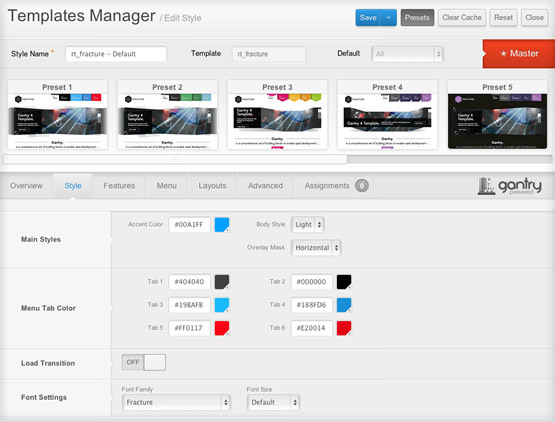 Fracture is the first RocketTheme template built to be built on the Gantry4 Framework with a new, faster administration UI. One of the other exciting new features is the ability to use LESS CSS to make developing templates easier, more flexible, and overall, more enjoyable.
K2 (Third Party) Responsive Layout
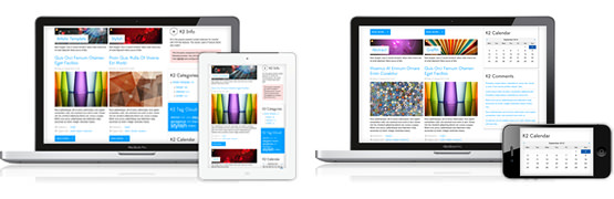 K2 is the popular powerful content extension for Joomla! with CCK-like features. Fracture also comes with the K2 extension that is built to work with the responsive layout.