Aurora: Vertical Slider Particle
Your Guide to Recreating Elements of the Aurora Demo for WordPress
Introduction
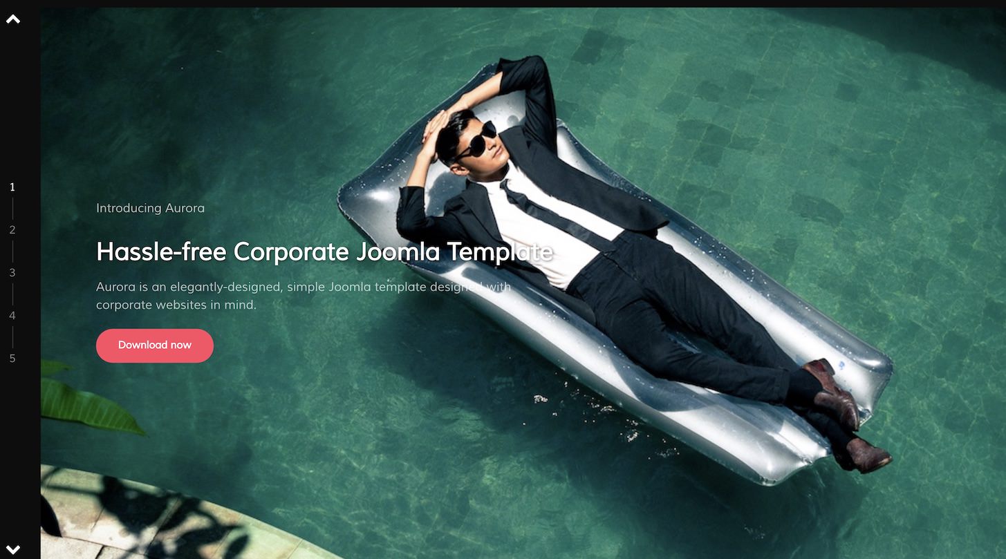
The Vertical Slider particle is an excellent way to showcase your featured content on the front page of your website. Content can be added manually or through the CMS.
Here are the topics covered in this guide:
Configuration
Settings
These options affect the main area of the particle, and not the individual items within. You can set the title of the particle, as well as give it an introductory paragraph here.
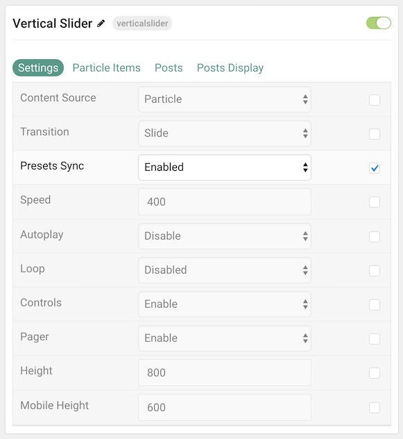
| Option | Description |
|---|---|
| Particle Name | This is the name of the particle used for back end management. It does not appear on the front end. |
| Content Source | Choose between Particle and WordPress as the Content Source. |
| Transition | Select a type of transition between items. |
| Preset Sync | Enable or Disable preset synchronization. |
| Speed | Enter duration (in milliseconds) of the transition.Height |
| Autoplay | Enable or Disable autoplay. |
| Loop | Enable or Disable looping of items. |
| Controls | Enable or Disable the navigation controls. |
| Pager | Enable or Disable the Pager. |
| Height | Set a height for the particle. |
| Mobile Height | Set a mobile height for the particle. |
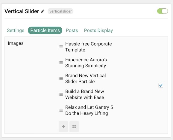
Particle Item Options
These items make up the individual featured items in the particle. Items in this section will only appear if Particle is selected as the Content Source.
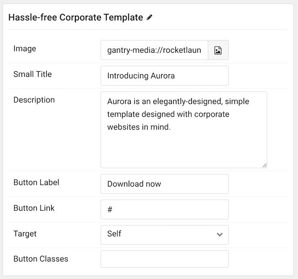
| Option | Description |
|---|---|
| Item Name | This is the name of the item. This only appears in the back end. |
| Image | Select an image for the item. |
| Small Title | Enter a small title to appear on the front end. |
| Description | Enter a text description for the item. |
| Button Label | Enter a label to appear on the button. |
| Button Link | Enter a URL you would like the item to link to. |
| Target | Choose the target tab you would like the URL to open to. |
| Button Classes | Enter any CSS class(es) you wish to have apply to the button. |
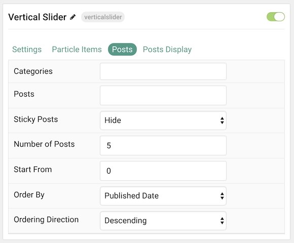
Posts
| Option | Description |
|---|---|
| Categories | Select the categories of posts this particle will display. |
| Posts | Select the number of posts you would like the particle to fetch. |
| Sticky Posts | Choose to Show or Hide sticky posts. |
| Number of Posts | Enter the maximum number of posts to display. |
| Start From | Enter offset specifying the first post to return. The default is '0' (the first post). |
| Order By | Choose the type of factor to order by. |
| Ordering Direction | Choose between Ascending and Descending as the post ordering method. |
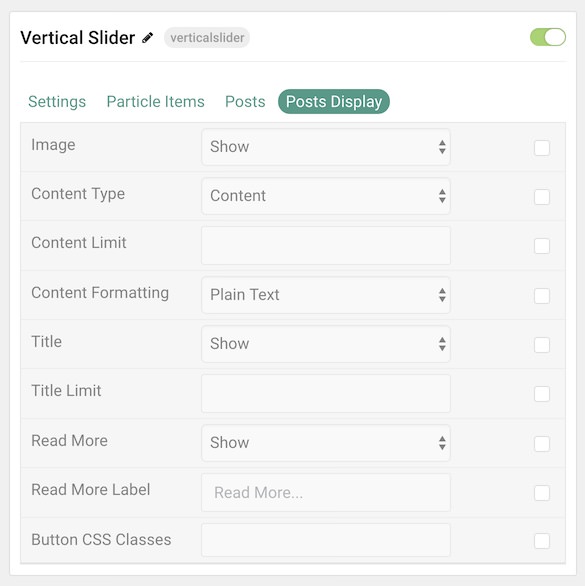
Display
This section configures how posts are displayed.
| Option | Description |
|---|---|
| Image | Display the image assigned to the post's Intro, Full or None. |
| Content Type | Choose which text to pull from the post. Choices include: Content, Excerpt, and Hide. |
| Content Limit | Set a limit (in characters) of the text to appear in the item. |
| Content Formatting | Choose between plain text and HTML as the text format. |
| Title | Show or Hide the post's title. |
| Title Limit | Enter the maximum number of characters in the title to display. |
| Read More | Show or Hide the read more link. |
| Read More Label | Add a text label for the read more link. |
| Button CSS Classes | Add any CSS class(es) you wish to have apply to the button. |
Found errors? Think you can improve this documentation? Please edit this page. You can also view the history of this page.