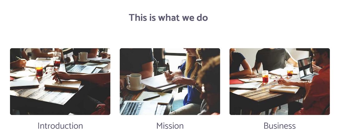
Flux: Block Content Particle
Your Guide to Recreating Elements of the Flux Demo for WordPress
Introduction

The Block Content particle is a great way to create a clean and simple content block with images and text.
Here are the topics covered in this guide:
Configuration
Main Options
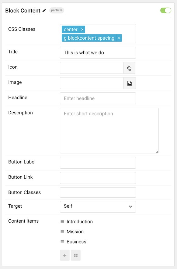
These options affect the main area of the particle, and not the individual items within. For example, if you want to display content that includes a title, headline, image, and link you can do so here, but if you want to display numerous individual items, each with their own text, images, and/or links, you can do so using the Block Items collection feature.

| Option | Description |
|---|---|
| CSS Classes | Enter the CSS class(es) you want to use in the content of the particle. |
| Title | Enter the title of the particle, as it will appear on the front end. |
| Icon | Set the icon that appears next to the title. |
| Image | Set a main image that appears separate from any Block Item images. |
| Headline | Enter a headline you want to appear on the front end. |
| Description | Enter the text you wish to have appear as the description for the particle. This text appears below the title and headline. |
| Button Label | Customize the text you want to have appear in the link button. |
| Button Link | Customize the link you want the link button to go to. |
| Button Classes | Add CSS class(es) you would like to have apply to the button. |
| Target | Set the target for the button. You can choose between Self which opens the link in the current tab or New Window which opens links in a new tab. |
NOTE: The CSS class
g-blockcontent-spacingis used in our demo to create spacing. If you are unhappy with the look of your particle, try this class.
Item Options
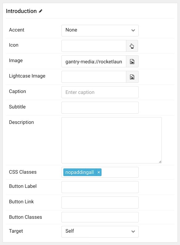
These items make up the individual featured items in the particle. They sit apart from the particle's title, headline, image, and description. Each item can have its own properties, including images and written content.

| Option | Description |
|---|---|
| Item Name | The item name becomes the title of the content block item. |
| Accent | Select an accent color used for the item. |
| Icon | Select the icon you would like to have appear with the title area in the block item. |
| Image | Select the image you would like to have displayed with the item. |
| RokBox Image | If you would like to have a popup appear with a larger version of the image when the image is clicked, this is where you assign the larger image. |
| Caption | Add a caption for the image here. |
| Subtitle | Add a subtitle for the item here. |
| Description | Enter a description for the item here, appears as paragraphed text. |
| CSS Classes | Enter any CSS classes you would like to have apply just to this item. |
| Button Label | Enter the text you would like to have appear as the button link. |
| Button Link | Enter the url you want that link to go to. |
| Button Classes | Enter any CSS classes you want to have apply just to the button. |
| Target | Set the target for the button. You can choose between Self which opens the link in the current tab or New Window which opens links in a new tab. |