Iridescent: Recreating the Demo - Services Page
Your Guide to Recreating Elements of the Iridescent Demo for WordPress
Introduction
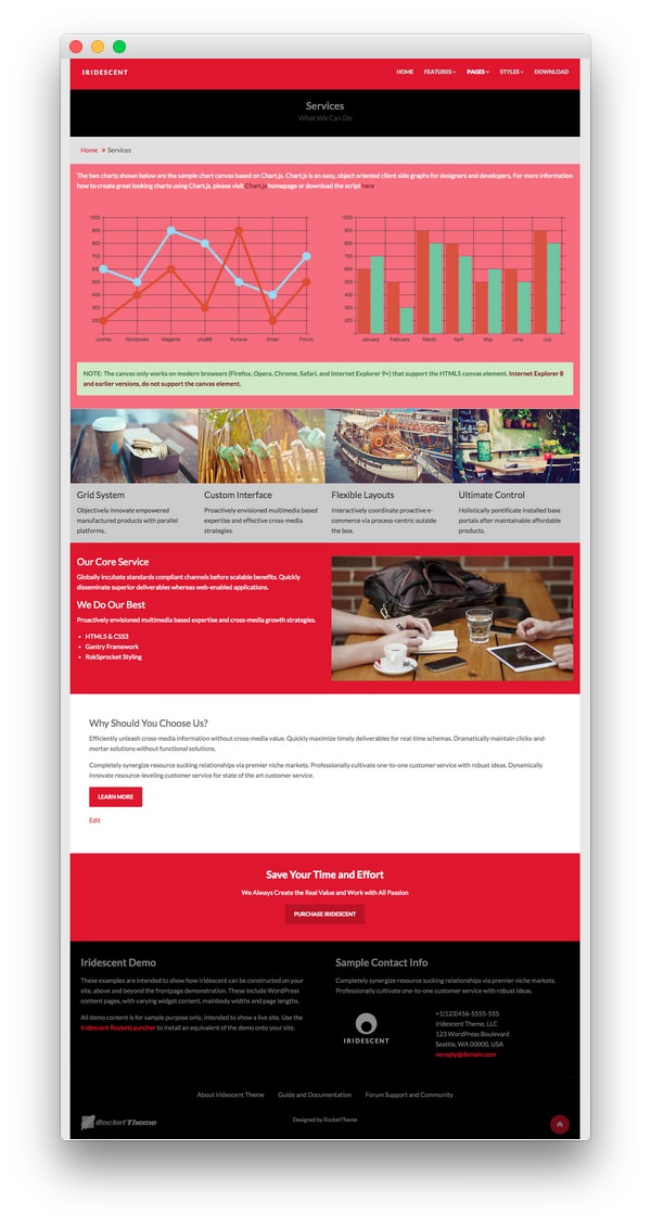
The Services example page demonstrates how you can create a beautiful page with the Iridescent theme. Here is some information to help you replicate this page as it appears in the demo.
Theme Override Options
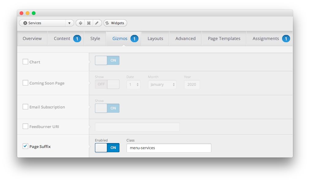
The Services page is a regular Page. To recreate the layout the way it appears in our demo, enter menu-services in the Page Suffix field in the Gizmos page inside the Iridescent theme settings. This suffix is tied to a class in the demo.less file that sets the page up so it appears the way it does in the demo.
In order for this to work, you should have the Page Suffix option set to On in Admin > Iridescent > Gizmos. You will likely need to create a theme override specifically for the page before assigning that suffix to it. For more information on creating theme overrides, visit our Gantry Documentation.
Mainbody
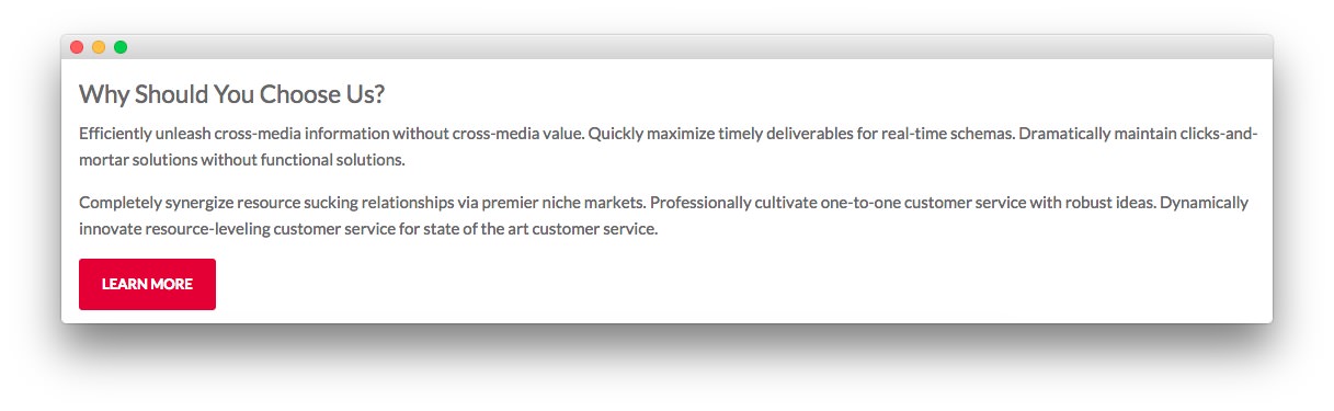
The page's content body is set in the Services page. You will find the content used in the page below.
<h3>Why Should You Choose Us?</h3>

<p>Efficiently unleash cross-media information without cross-media value. Quickly maximize timely deliverables for real-time schemas. Dramatically maintain clicks-and-mortar solutions without functional solutions.</p>

<p>Completely synergize resource sucking relationships via premier niche markets. Professionally cultivate one-to-one customer service with robust ideas. Dynamically innovate resource-leveling customer service for state of the art customer service.</p>

<p><a href="http://www.rockettheme.com/wordpress-themes/iridescent" class="readon">Learn More</a></p>
Widgets
Below is a brief rundown of the widgets used to make up the demo page. Widgets in the Header and Copyright positions are outlined in the main demo replication area of this guide.
-
 1Showcase - Text2Breadcrumbs3Main Top - Text4Main Top - Text5Expanded Top - Text6Mainbody7Extension - Text8Bottom - Text9Bottom - Text
- Showcase - Text
- Breadcrumbs
- Main Top - Text
- Main Top - Text
- Expanded Top - Text
- Mainbody
- Extension - Text
- Bottom - Text
- Bottom - Text
Showcase Section
Here is the widget breakdown for the Showcase section:
Text
This section of the page is a standard text widget. You will need to enter the following in the main text field.
Here is a breakdown of options changes you will want to make to match the demo.
| Option | Setting |
|---|---|
| Title | Services[span class="rt-title-tag"]What We Can Do[/span] |
| Widget Variations | RT-Center, No Margin All |
| Custom Variations | rt-title-large rt-nomodulecontent rt-top-large-padding |
Leaving everything else at its default setting, select Save.
Breadcrumbs Section
Gantry Breadcrumbs
The Gantry Breadcrumbs widget gives you the ability to present page-aware breadcrumbs on the page. All you need to do to add them is to drag the Gantry Breadcrumbs widget from the Available Widgets area to the Breadcrumbs widget position.
Main Top Section
-
 1Text 12Text 2
Here is the widget breakdown for the Main Top section:
Text 1
This section of the page is a standard text widget. You will need to enter the following in the main text field.
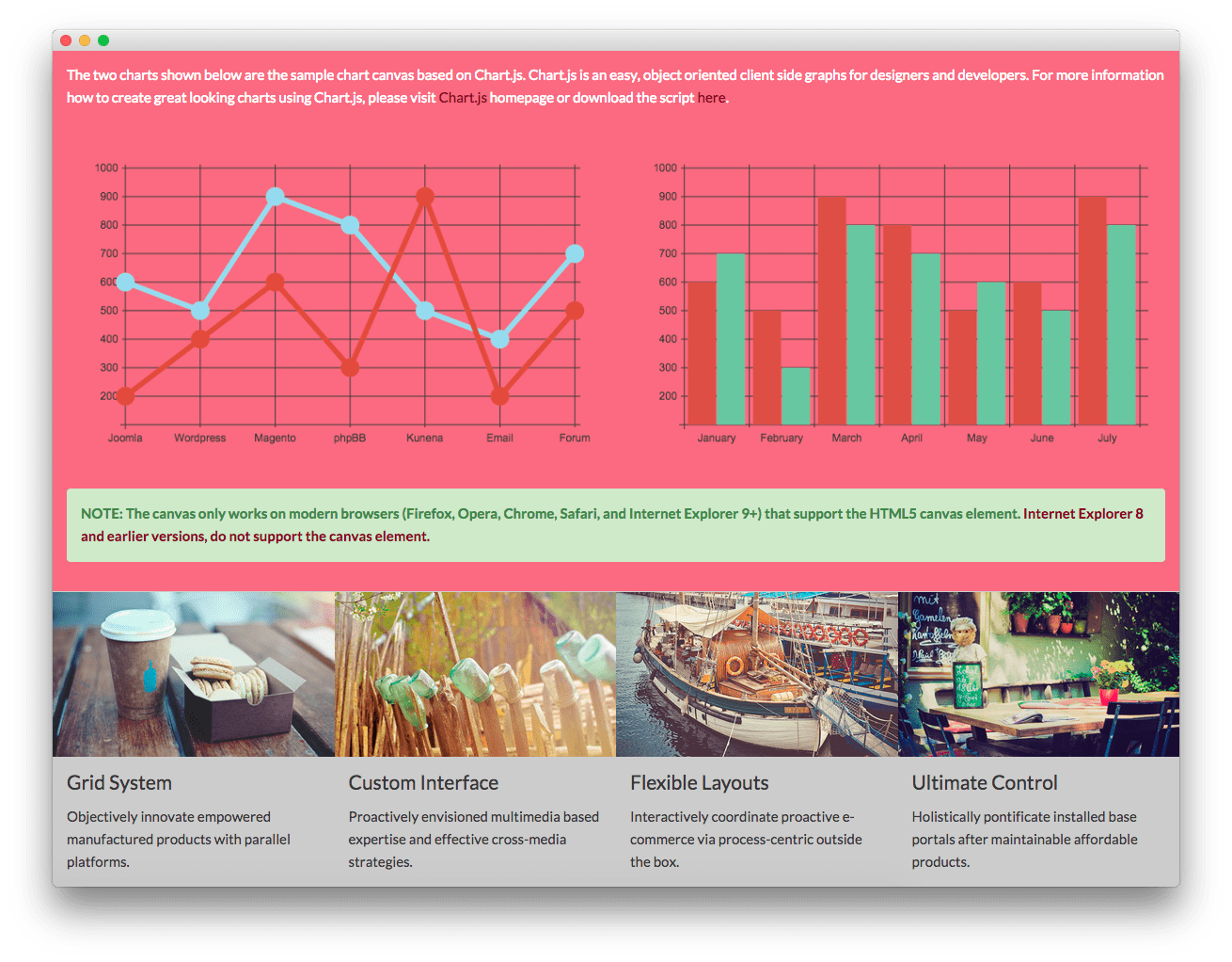
<p>The two charts shown below are the sample chart canvas based on Chart.js. Chart.js is an easy, object oriented client side graphs for designers and developers. For more information how to create great looking charts using Chart.js, please visit <a href="http://www.chartjs.org/">Chart.js</a> homepage or download the script <a href="https://github.com/nnnick/Chart.js">here</a>.</p>

<br />

<div class="gantry-row">
    <div class="gantry-width-container">
    <div class="gantry-width-50">
        <div class="gantry-width-spacer">
            <canvas id="myChart-a" width="600" height="320"></canvas>

            <script type="text/javascript">
                var lineChartData = {
                    labels : ["Joomla","Wordpress","Magento","phpBB","Kunena","Email","Forum"],
                    datasets : [
                        {
                            fillColor : "transparent",
                            strokeColor : "#97DBF2",
                            pointColor : "#97DBF2",
                            pointStrokeColor : "#97DBF2",
                            data : [600,500,900,800,500,400,700]
                        },
                        {
                            fillColor : "transparent",
                            strokeColor : "#DE4E33",
                            pointColor : "#DE4E33",
                            pointStrokeColor : "#DE4E33",
                            data : [200,400,600,300,900,200,500]
                        },
                    ]
                },
                options = {
                    //Boolean - If we want to override with a hard coded scale
                    scaleOverride : true,

                    //** Required if scaleOverride is true **
                    //Number - The number of steps in a hard coded scale
                    scaleSteps : 9,
                    //Number - The value jump in the hard coded scale
                    scaleStepWidth : 100,
                    //Number - The scale starting value
                    scaleStartValue : 100,

                    //String - Scale label font colour
                    scaleFontColor : "#383838",

                    //String - Colour of the scale line
                    scaleLineColor : "#383838",

                    //String - Colour of the grid lines
                    scaleGridLineColor : "#383838",

                    //Boolean - Whether the line is curved between points
                    bezierCurve : false,

                    //Number - Radius of each point dot in pixels
                    pointDotRadius : 8,

                    //Number - Pixel width of point dot stroke
                    pointDotStrokeWidth : 5,

                    //Number - Pixel width of dataset stroke
                    datasetStrokeWidth : 6,

                    //Boolean - Whether to fill the dataset with a colour
                    datasetFill : true,

                }

                //Get the context of the canvas element we want to select
                var ctx = document.getElementById("myChart-a").getContext("2d");
                var newChartA = new Chart(ctx).Line(lineChartData, options);

            </script>
        </div>
    </div>

    <div class="gantry-width-50">
        <div class="gantry-width-spacer">
            <canvas id="myChart-b" width="600" height="320"></canvas>

            <script type="text/javascript">
                var barChartData = {
                    labels : ["January","February","March","April","May","June","July"],
                    datasets : [
                        {
                            fillColor : "#D95240",
                            strokeColor : "#D95240",
                            data : [600,500,900,800,500,600,900]
                        },
                        {
                            fillColor : "#6FC6A0",
                            strokeColor : "#6FC6A0",
                            data : [700,300,800,700,600,500,800]
                        }
                    ]
                },
                options = {
                    //Boolean - If we want to override with a hard coded scale
                    scaleOverride : true,

                    //** Required if scaleOverride is true **
                    //Number - The number of steps in a hard coded scale
                    scaleSteps : 9,
                    //Number - The value jump in the hard coded scale
                    scaleStepWidth : 100,
                    //Number - The scale starting value
                    scaleStartValue : 100,

                    //String - Scale label font colour
                    scaleFontColor : "#383838",

                    //String - Colour of the scale line
                    scaleLineColor : "#383838",

                    //String - Colour of the grid lines
                    scaleGridLineColor : "#383838"
                }

                //Get the context of the canvas element we want to select
                var ctx = document.getElementById("myChart-b").getContext("2d");
                var newChartB = new Chart(ctx).Bar(barChartData, options);

            </script>
        </div>
    </div>
</div>
</div>

<div class="clear"></div><br />

<p class="success">NOTE: The canvas only works on modern browsers (Firefox, Opera, Chrome, Safari, and Internet Explorer 9+) that support the HTML5 canvas element. <a target="_blank" href="http://www.w3schools.com/html/html5_canvas.asp">Internet Explorer 8 and earlier versions, do not support the canvas element.</a></p>
Here is a breakdown of options changes you will want to make to match the demo.
| Option | Setting |
|---|---|
| Widget Variations | Box 2, No Margin All |
Leaving everything else at its default setting, select Save.
Text 2
This section of the page is a standard text widget. You will need to enter the following in the main text field.
<div class="gantry-width-container">
    <div class="gantry-width-25">
    <img src="http://(Your Site URL)/wp-content/rockettheme/rt_iridescent_wp/pages/services/img-02.jpg" alt="image" />
    <div class="gantry-width-spacer">
        <h4>Grid System</h4>
        <p>Objectively innovate empowered manufactured products with parallel platforms.</p>
    </div>
</div>

<div class="gantry-width-25">
        <img src="http://(Your Site URL)/wp-content/rockettheme/rt_iridescent_wp/pages/services/img-03.jpg" alt="image" />
    <div class="gantry-width-spacer">
        <h4>Custom Interface</h4>
        <p>Proactively envisioned multimedia based expertise and effective cross-media strategies.</p>
    </div>
</div>

<div class="gantry-width-25">
    <img src="http://(Your Site URL)/wp-content/rockettheme/rt_iridescent_wp/pages/services/img-04.jpg" alt="image" />
    <div class="gantry-width-spacer">
        <h4>Flexible Layouts</h4>
        <p>Interactively coordinate proactive e-commerce via process-centric outside the box.</p>
    </div>
</div>

<div class="gantry-width-25">
    <img src="http://(Your Site URL)/wp-content/rockettheme/rt_iridescent_wp/pages/services/img-05.jpg" alt="image" />
    <div class="gantry-width-spacer">
        <h4>Ultimate Control</h4>
        <p>Holistically pontificate installed base portals after maintainable affordable products.</p>
    </div>
</div>
</div>

<div class="clear"></div>
Here is a breakdown of options changes you will want to make to match the demo.
| Option | Setting |
|---|---|
| Widget Variations | Box 3, No Padding All, No Margin All |
Leaving everything else at its default setting, select Save.
Expanded Top Section
Here is a breakdown for the Expanded Top section:
Text
This section of the page is a standard text widget. You will need to enter the following in the main text field.
<div class="gantry-row">
<div class="gantry-width-container">
<div class="gantry-width-50">
<div class="gantry-width-spacer">
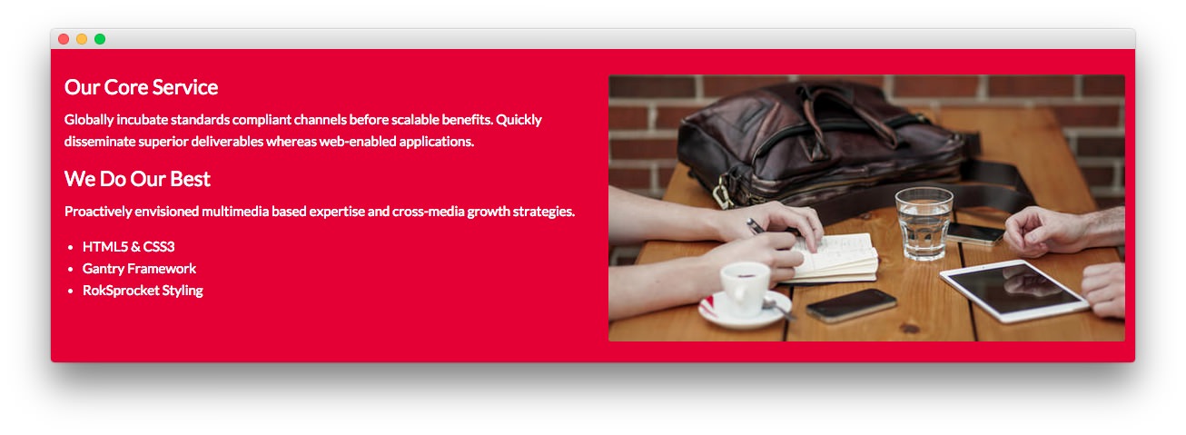
<h3>Our Core Service</h3>
<p>Globally incubate standards compliant channels before scalable benefits. Quickly disseminate superior deliverables whereas web-enabled applications.</p>
<div class="hidden-tablet">
<h3>We Do Our Best</h3>
<p>Proactively envisioned multimedia based expertise and cross-media growth strategies.</p>
<ul>
<li>HTML5 & CSS3</li>
<li>Gantry Framework</li>
<li>RokSprocket Styling</li>
</ul>
</div>
</div>
</div>
<div class="gantry-width-50">
<div class="gantry-width-spacer">
<span class="rt-image"><img src="http://(Your Site URL)/wp-content/rockettheme/rt_iridescent_wp/pages/services/img-01.jpg" alt="image" /></span>
</div>
</div>
</div>
</div>
<div class="clear"></div>
Here is a breakdown of options changes you will want to make to match the demo.
| Option | Setting |
|---|---|
| Widget Variations | Box 1, No Margin All |
| Custom Variations | rt-title-center |
Leaving everything else at its default setting, select Save.
Extension Section
Here is a breakdown for the Extension section:
Text
This section of the page is a standard text widget. You will need to enter the following in the main text field.
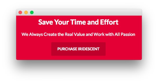
<p>We Always Create the Real Value and Work with All Passion</p>

<p><a href="/www.rockettheme.com/wordpress-themes/iridescent" class="readon">Purchase Iridescent</a></p>
Here is a breakdown of options changes you will want to make to match the demo.
| Option | Setting |
|---|---|
| Title | Save Your Time and Effort |
| Widget Variations | RT-Center |
Leaving everything else at its default setting, select Save.
Bottom Section
-
 1Text 12Text 2
Here is a breakdown of the widgets in the Bottom section:
- Text
- Gantry Divider
- Text
Text 1
This section of the page is a standard text widget. You will need to enter the following in the main text field.
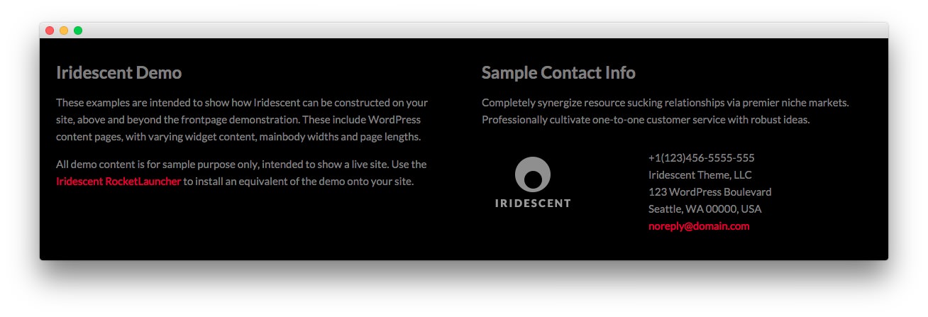
<p class="hidden-phone">These examples are intended to show how Iridescent can be constructed on your site, above and beyond the frontpage demonstration. These include WordPress content with varying widgetized content, mainbody widths and page lengths.</p>

<p class="nomarginbottom">All demo content is for sample purpose only, intended to show a live site. Use the <a href="http://www.rockettheme.com/wordpress/themes/iridescent">Iridescent RocketLauncher</a> to install an equivalent of the demo onto your site.</p>
Here is a breakdown of options changes you will want to make to match the demo.
| Option | Setting |
|---|---|
| Title | Iridescent Demo |
| Custom Variations | rt-phone-center |
Leaving everything else at its default setting, select Save.
Gantry Divider
This widget tells WordPress to start a new widget column beginning with the widget placed directly below the divider in the section.
Text 2
This section of the page is a standard text widget. You will need to enter the following in the main text field.
<p>Completely synergize resource sucking relationships via premier niche markets. Professionally cultivate one-to-one customer service with robust ideas.</p>

<div class="gantry-width-container">
    <div class="gantry-width-40">
        <div class="gantry-width-spacer">
            <img src="http://(Your Site URL)/wp-content/rockettheme/rt_iridescent_wp/pages/pages-overview/logo.png" alt="image" />
        </div>
    </div>

    <div class="gantry-width-60">
        <div class="gantry-width-spacer">
            <span class="rt-intro-text">+1(123)456-5555-555</span><br />
            <span>Iridescent Theme, LLC</span><br />
            <span>123 WordPress Boulevard</span><br />
            <span>Seattle, WA 00000, USA</span><br />
            <span><a href="#">noreply@domain.com</a></span>
        </div>
    </div>
</div>
<div class="clear"></div>
Here is a breakdown of options changes you will want to make to match the demo.
| Option | Setting |
|---|---|
| Title | Sample Contact Info |
| Custom Variations | rt-phone-center |
Leaving everything else at its default setting, select Save.