Nuance
Your Guide to Using the Nuance Theme for WordPress
Introduction

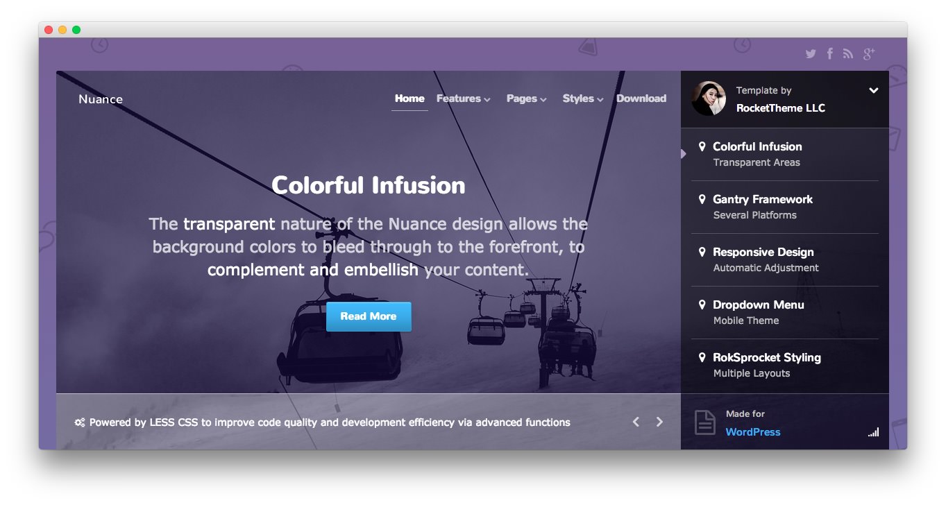
Nuance is a truly multi-purposed design, suitable for corporate, creative or other web environments. The transparent nature of the theme allows the background colors to bleed through to the forefront, to complement and embellish your content.
Requirements
- Apache 2.x or Microsoft IIS 7
- PHP 5.4+
- MySQL 5.0.4 or higher
- WordPress 5.x
- Gantry Framework
NOTE: Gantry v4.1.15 is required for Nuance to work correctly. For more details on the Gantry Framework, please visit its Dedicated Website.
Key Features
- Responsive Layout
- 6 Preset Styles
- Content Animations
- 89 Widget Positions
- 1200 Fixed Option
- 8 Styled Widget Variations
- Structural Widget Variations
- 960 Fixed Option
- Dropdown-Menu and Split-Menu
- Custom Typography
- Custom Logo Option
- Mobile Menu
- Social Buttons Option
- Chart.js
- Coming Soon Page
Responsive Layout
A responsive layout adapts automatically to the viewing device's width, such as mobile, tablet or desktop, without the need for a separate layout or content. Mobile modes have a unique menu to aid usability. 960px and 1200px fixed layout options are also available.
| Label | Description | Layout Width | Column Width |
|---|---|---|---|
| Smartphones | Standard smartphones | 480px and below | 100% fluid |
| Smartphones to Tablets | Larger smartphones and small tablets | 767px and below | 100% fluid |
| Tablets | Larger tablets | 768px and above | 64px |
| Desktop | Standard desktops and laptops | 960px and above | 80px |
| Large Display | Large desktops and high-resolution laptops | 1200px and above | 100px |
Found errors? Think you can improve this documentation? Please edit this page. You can also view the history of this page.