Topaz: Block Content Particle
Your Guide to Recreating Elements of the Topaz Demo for WordPress
Introduction

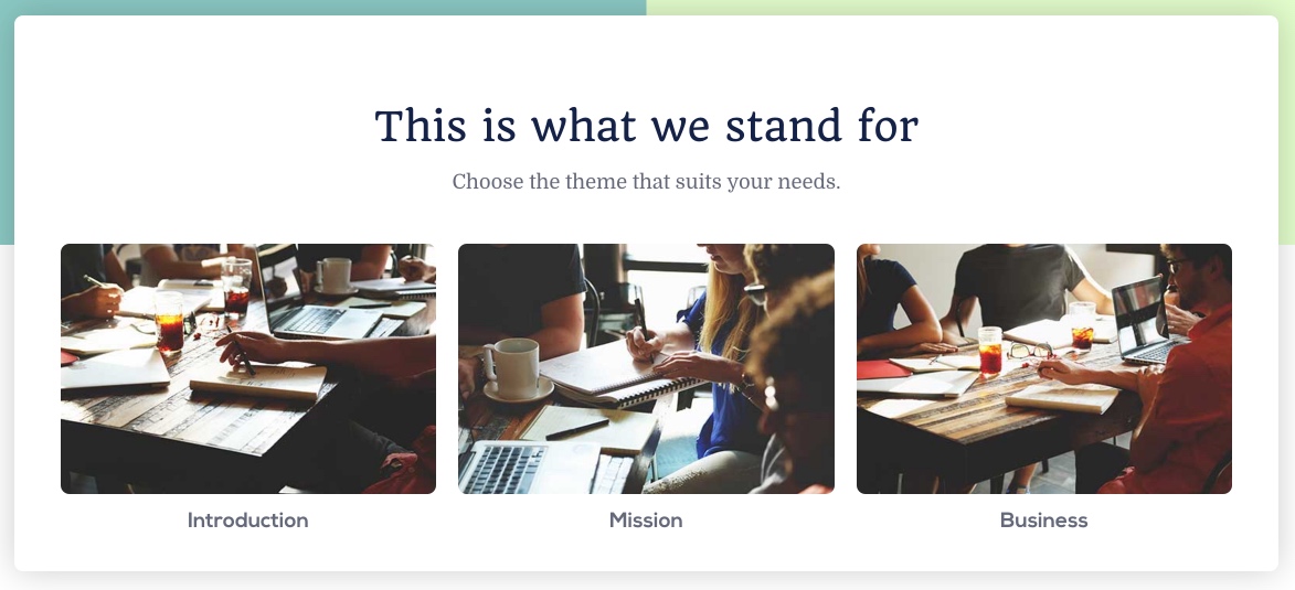
The Block Content particle is a great way to create a clean and simple content block with images and text.
Here are the topics covered in this guide:
Layout
Block Content items have a simple, yet robust layout that enables you to add a lot of different types of content in a single item. Each item spans both sides - or pages if you prefer - of the particle's layout. There is, of course, a difference in how this content is sourced depending on whether you are using items created in the particle's settings panel, or from the CMS.
Particle Content
-
 1Particle - Title2Particle - Description3Item - Title4Item - Image
Configuration
Main Options
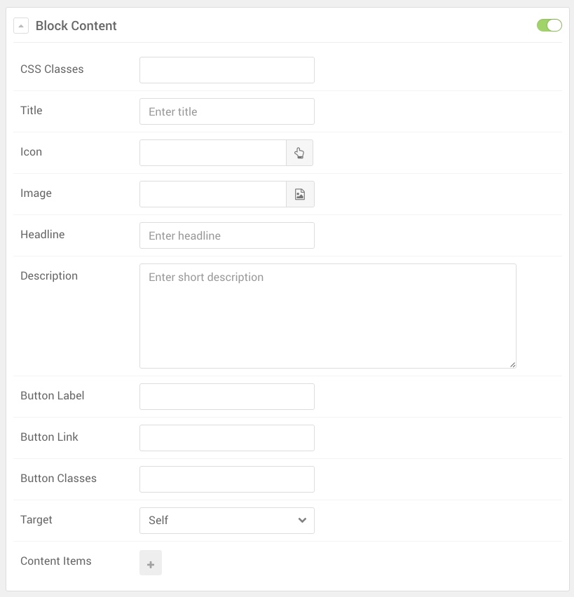
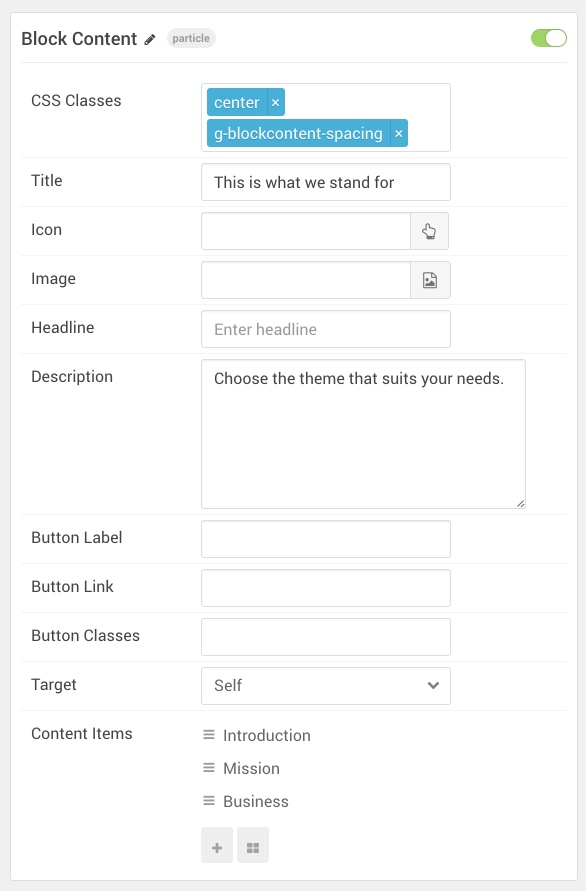
These options affect the main area of the particle, and not the individual items within. For example, if you want to display content that includes a title, headline, image, and link you can do so here, but if you want to display numerous individual items, each with their own text, images, and/or links, you can do so using the Block Items collection feature.

| Option | Description |
|---|---|
| CSS Classes | Enter the CSS class(es) you want to use in the content of the particle. |
| Title | Enter the title of the particle, as it will appear on the front end. |
| Icon | Set the icon that appears next to the title. |
| Image | Set a main image that appears separate from any Block Item images. |
| Headline | Enter a headline you want to appear on the front end. |
| Description | Enter the text you wish to have appear as the description for the particle. This text appears below the title and headline. |
| Button Label | Customize the text you want to have appear in the link button. |
| Button Link | Customize the link you want the link button to go to. |
| Button Classes | Add CSS class(es) you would like to have apply to the button. |
| Target | Set the target for the button. You can choose between Self which opens the link in the current tab or New Window which opens links in a new tab. |
Item Options
These items make up the individual featured items in the particle. They sit apart from the particle's title, headline, image, and description. Each item can have its own properties, including images and written content.

| Option | Description |
|---|---|
| Title | Enter the title for the block item. |
| Icon | Select the icon you would like to have appear with the title area in the block item. |
| Image | Select the image you would like to have displayed with the item. |
| RokBox Image | If you would like to have a popup appear with a larger version of the image when the image is clicked, this is where you assign the larger image. |
| Caption | Add a caption for the image here. |
| Subtitle | Add a subtitle for the item here. |
| Description | Enter a description for the item here, appears as paragraphed text. |
| CSS Classes | Enter any CSS classes you would like to have apply just to this item. |
| Button Label | Enter the text you would like to have appear as the button link. |
| Button Link | Enter the url you want that link to go to. |
| Button Classes | Enter any CSS classes you want to have apply just to the button. |
| Target | Set the target for the button. You can choose between Self which opens the link in the current tab or New Window which opens links in a new tab. |