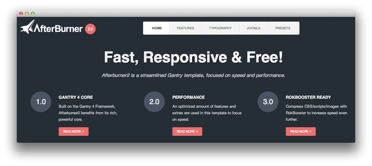
Afterburner2
Your Guide to Using the Afterburner2 Template for Joomla
Introduction
Afterburner2 is an experiment in how streamlined a Gantry Framework Template can be, whilst still being visually enticing and usable on a live site. Although many extras have been removed, styling for major elements, such as the Joomla core, is still abundant.

The template has a simple, CSS based dropdown menu system, module variations, multiple preset styles, configurable responsive modes, and advanced typography styling, whilst still maintaing a speed-centric and performance edge.
NOTICE: Afterburner2 is a Free/GPL Joomla 3.x Template.
Requirements
- Apache 2.2+ or Microsoft IIS 7
- PHP 5.3.10+ (PHP 5.5+ Recommended)
- MySQL 5.1+
- Joomla 3.4
NOTE: Gantry v4.1.35 is required for Afterburner2 to work correctly. For more details on the Gantry Framework, please visit its dedicated website.
Key Features
- Free/GPL Template
- Joomla Joomla 3.x Compatible
- Fixed 960px/1200px & Responsive Layout options
- 3 Preset Styles
- 37 Module Positions
- 1 Styled & Numerous Structural Module Suffixes
- Powerful Gantry 4 Framework
- Simple CSS Dropdown Menu
- FF, Safari, Chrome, Opera, IE8+ Compatible
- HTML5, CSS3, LESS CSS
Speed and Optimization
Afterburner2 is a fully functional Gantry template, even with responsive capabilities. Therefore, speed and optimization developments are relative to the Gantry Framework and its offerings, versus a Joomla template more generally.
| Afterburner2 | + RokBooster | Gantry | + RokBooster | |
|---|---|---|---|---|
| Requests | 12 | 5 | 18 | 7 |
| Time | 428ms | 342ms | 555ms | 375ms |
| Size | 510KB | 173KB | 604KB | 219KB |
Requests: Requests are the number of items that are loaded on a page. Reducing the number of requests improves performance. With RokBooster enabled, which we recommend once you have finished development, the total requests are 5: 1 CSS, 1 Javascript, 1 Font, 1 Image and Text/HTML data; an incredibly low count.
Time: The time, in milliseconds, for the page to finish loading all requests. In local tests, the template with RokBooster enabled is about 1/3 of a second.
Size: The size, in kilobytes, of all requested item. Smaller file sizes lead to speedier loading. The necessary files have been optimized to reduce their overall footprint, for example, the logo is only 1.5KB, the only image file loaded by Afterburner2. With RokBooster enabled, the footprint is 173KB which is a significant reduction.
Responsive Layout

Afterburner2's responsive grid system is designed for desktop, tablet and smartphone systems, each with minor modifications to ensure compatibility in each mode.
We use the responsive layout based on Twitter's Bootstrap Framework, with its collection of utility classes, to provide a great degree of flexibility for a responsive design.
| Label | Description | Layout Width | Column Width |
|---|---|---|---|
| Smartphones | Standard smartphones | 480px and below | 100% fluid |
| Smartphones to Tablets | Larger smartphones and small tablets | 767px and below | 100% fluid |
| Tablets | Larger tablets | 768px and above | 64px |
| Desktop | Standard desktops and laptops | 960px and above | 80px |
| Large Display | Large desktops and high-resolution laptops | 1200px and above | 100px |