Corvus
Your Guide to Using the Corvus Template for Joomla
Introduction
Corvus is content centric template, built with rich media and text blocks, on a foundation of detailed design elements. The template spruces up your site with easily configurable items.
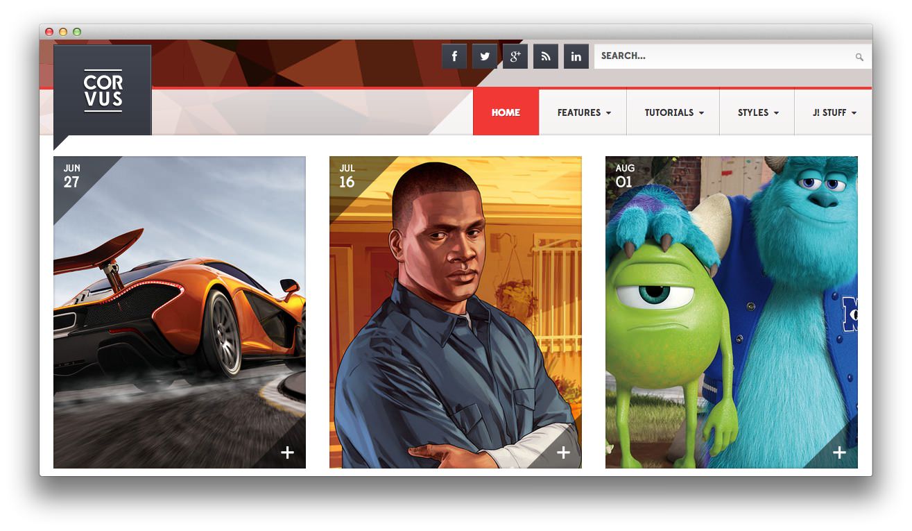
Corvus features integrated styling that works with RokSprocket to create a more seamless user experience. It is also built on the powerful Gantry framework, which adds an array of additional features to improve site management and performance.
NOTICE: Corvus is a Joomla 3.x Template.
Requirements
- Apache 2.2+ or Microsoft IIS 7
- PHP 5.3.10+ (PHP 5.5+ Recommended)
- MySQL 5.1+
- Joomla 3.4
NOTE: Gantry v4.1.35 is required for Corvus to work correctly. For more details on the Gantry Framework, please visit its dedicated website.
Key Features
- Joomla 3.x Compatible
- Responsive Layout
- 8 Preset Styles
- 76 Module Positions
- 10 Styled & Numerous Structural Module Suffixes
- RokSprocket Integrated Styling
- Optimized for RokBooster
- Styled Support for Responsive K2 Layout
- Powerful Gantry 4 Framework
- DropDown Menu & Splitmenu
- Custom Content Typography
- FF, Safari, Chrome, Opera, IE8+ Compatible
- HTML5, CSS3, LESS CSS
Responsive Layout
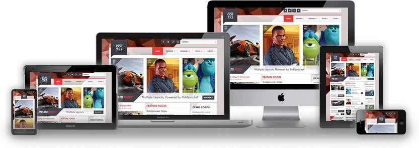 Corvus' responsive grid system is designed for desktop, tablet and smartphone systems, each with minor modifications to ensure compatibility in each mode.
The table below shows the breakdown of screen resolutions and associated devices, and which layout characters are then applied to each.
| Label | Description | Layout Width | Column Width |
|---|---|---|---|
| Smartphones | Standard smartphones | 480px and below | 100% fluid |
| Smartphones to Tablets | Larger smartphones and small tablets | 767px and below | 100% fluid |
| Tablets | Larger tablets | 768px and above | 64px |
| Desktop | Standard desktops and laptops | 960px and above | 80px |
| Large Display | Large desktops and high-resolution laptops | 1200px and above | 100px |
Responsive Layout for RokSprocket
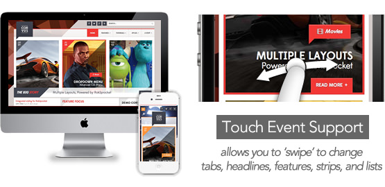 Corvus comes with the RokSprocket extension that are built to work with a responsive layout and support mobile touch events, such as 'swipe'.
K2 (Third Party) Responsive Layout
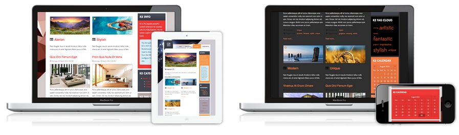 K2 is the popular powerful content extension for Joomla! with CCK-like features. Corvus also comes with the K2 extension that is built to work with the responsive layout.