Lexicon: Recreating the Demo - Mobile Sidemenu
Your Guide to Recreating Elements of the Lexicon Demo for Joomla
Mobile Sidemenu
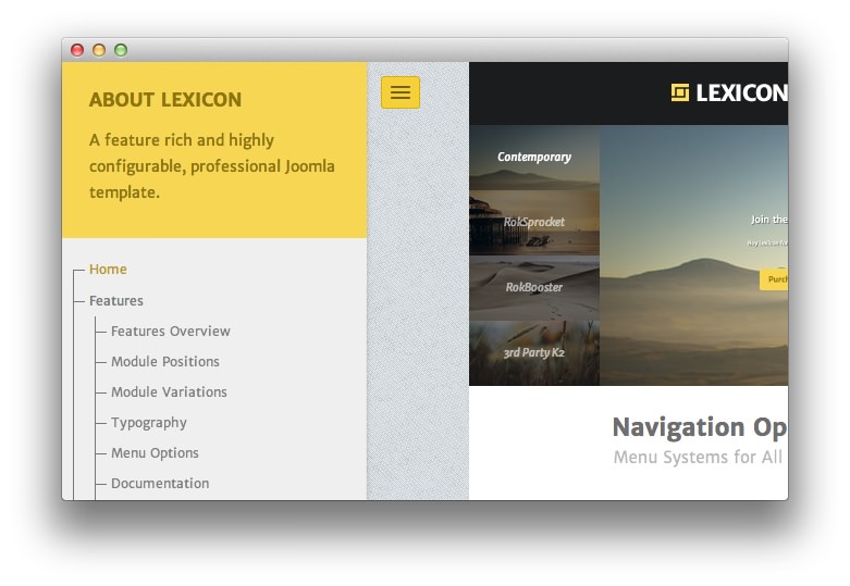
This area of the front page is a Custom HTML module. You will find the settings used in our demo below.
The module position mobile-sidemenu assigns the module to appear above the main menu on smartphones and other devices with thinner browser windows.
Any mod_custom (Custom HTML) modules are best handled using either RokPad or no editor as a WYSIWYG editor can cause issues with any code that exists in the Custom Output field.
Options
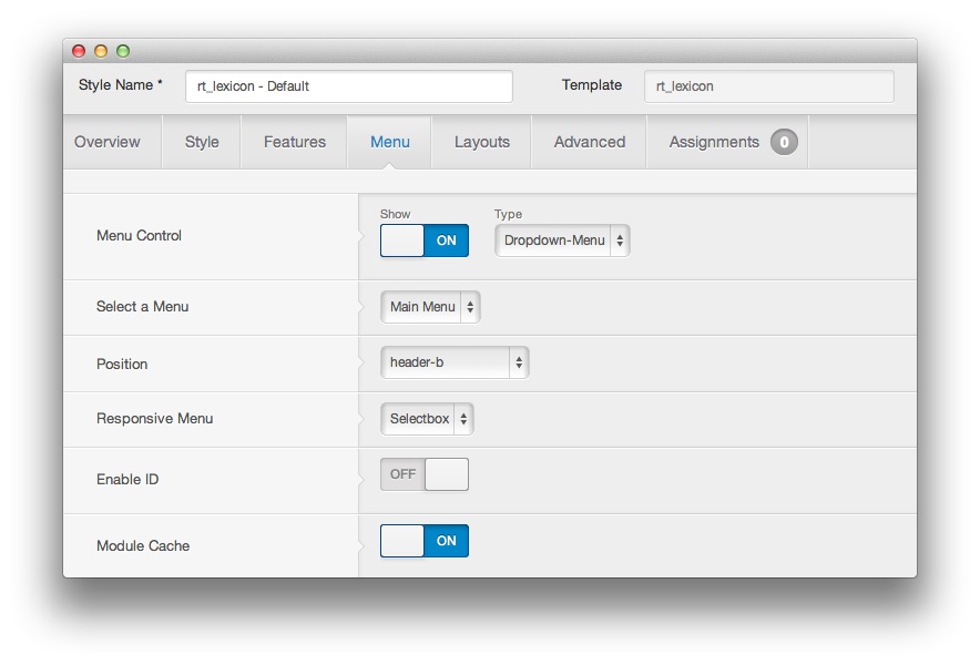
There are two layout options for the mobile menu available in Lexicon. You can choose either Panel or Selectbox as the Responsive Menu setting by navigating to Administrator -> Extensions -> Template Manager -> Lexicon -> Menu.
The image used at the top of this page is a Panel responsive menu. You will find the Selectbox menu below.
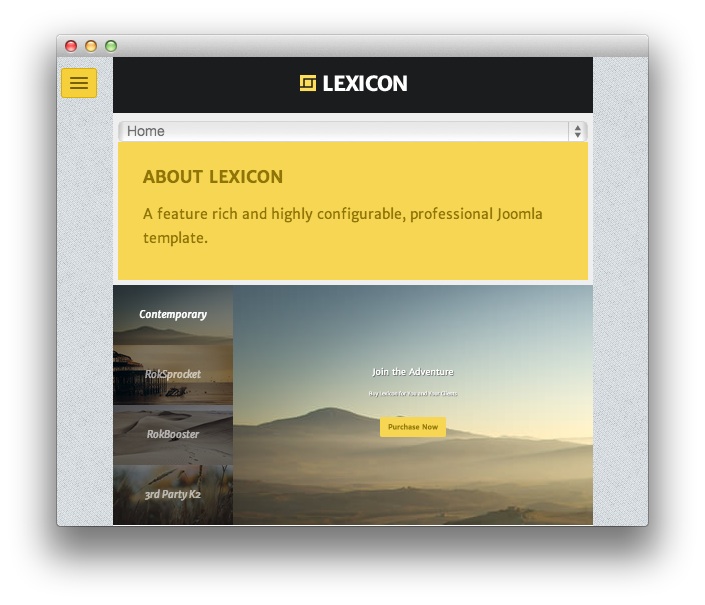
Neither of these options require any changes in the module settings to function.
Details
| Option | Setting |
|---|---|
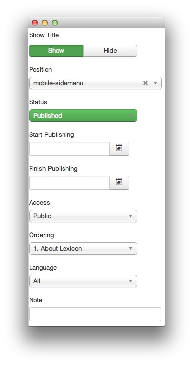
| Title | About Lexicon |
| Show Title | Show |
| Position | mobile-sidemenu |
| Status | Published |
| Access | Public |
Custom Output
Enter the following in the Custom Output text editor.
<p>A feature rich and highly configurable, professional Joomla template.</p>
Basic
| Option | Setting |
|---|---|
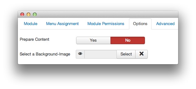
| Prepare Content | No |
| Select a Background Image | Blank |
Advanced
| Option | Setting |
|---|---|
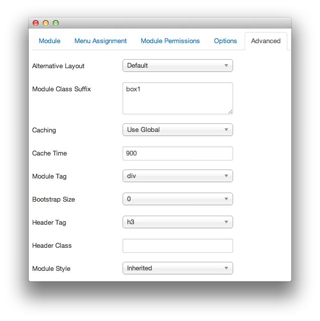
| Module Class Suffix | box1 |