Chimera: Recreating the Demo - Expanded Top
Your Guide to Recreating Elements of the Chimera Theme for WordPress
Expanded Top Section
-
 1RokSprocket (Tabs)2Text
Here is the widget breakdown for the Expanded Top section:
- RokSprocket (Tabs)
- Gantry Divider
- Text
RokSprocket
You will need to do two things to prepare this widget so that it looks similar to the one in the demo.
First, you will need to create the RokSprocket Widget. You can do this by navigating to Administration -> RokSprocket Admin and creating a new Tabs widget.
You can find out more about RokSprocket and how to set up and modify widgets by visiting our RokSprocket documentation.
Simple Content Provider
We used the Simple Content Provider to allow us to make custom tabs without having to build posts on the back-end. In this case, the Tab Label and Description are custom, while the other options are left at default or None settings. You will find the settings used in one of these items below.
Tab Label
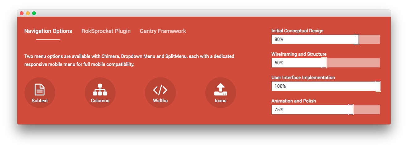
Navigation<span class="hidden-tablet"> Options</span>
Description
<p class="wow zoomIn">Two menu options are available with Chimera, Dropdown
Menu and SplitMenu, each with a dedicated responsive mobile menu for full
mobile compatibility.</p>

<div class="gantry-row rt-center">
    <div class="gantry-width-container">
        <div class="gantry-width-25">
            <div class="gantry-width-spacer">
                <div class="rt-icon-circle wow bounceInUp">
                    <i class="fa fa-file-text-o"></i> <span>Subtext</span>
                </div>
            </div>
        </div>

        <div class="gantry-width-25">
            <div class="gantry-width-spacer">
                <div class="rt-icon-circle wow bounceInUp">
                    <i class="fa fa-sitemap"></i> <span>Columns</span>
                </div>
            </div>
        </div>

        <div class="gantry-width-25">
            <div class="gantry-width-spacer">
                <div class="rt-icon-circle wow bounceInUp">
                    <i class="fa fa-code"></i> <span>Widths</span>
                </div>
            </div>
        </div>

        <div class="gantry-width-25">
            <div class="gantry-width-spacer">
                <div class="rt-icon-circle wow bounceInUp">
                    <i class="fa fa-upload"></i> <span>Icons</span>
                </div>
            </div>
        </div>
    </div>
</div>
Here is a look at the Tabs Layout Options for this widget.
| Option | Setting |
|---|---|
| Theme | Default |
| Display Limit | ∞ |
| Tabs Position | Top |
| Animation | Slide and Fade |
| Autoplay | Disable |
| Autoplay Delay | 5 |
| Image Resize | Disable |
| Preview Length | 0 |
| Strip HTML Tags | No |
You can set the RokSprocket filters to include any category, specific posts, or otherwise you would like to have featured in this widget.
Once you have created this widget, you can add it via the Widgets menu by clicking RokSprocket and dragging it to the appropriate section. When you have done this, you will need to complete the following.
- Select your RokSprocket Tabs widget in the Choose Widget field.
- Enter
fp-roksprocket-tabsin the Custom Variations field. - Leaving everything else at its default setting, select Save.
The widget should now be created and ready for use on the front page of your WordPress site.
Gantry Divider
This widget tells WordPress to start a new widget column beginning with the widget placed directly below the divider in the section.
Text
This section of the page is a standard text widget. You will need to enter the following in the main text field.
<div>Initial Conceptual Design</div>
<div class="progress">
  <div class="progress-bar progress-bar-default" role="progressbar" aria-valuenow="80" aria-valuemin="0" aria-valuemax="100" style="width: 80%">
    <span class="sr-only">80%</span>
  </div>
</div>

<div>Wireframing and Structure</div>
<div class="progress">
  <div class="progress-bar progress-bar-default" role="progressbar" aria-valuenow="50" aria-valuemin="0" aria-valuemax="100" style="width: 50%">
    <span class="sr-only">50%</span>
  </div>
</div>

<div>User Interface Implementation</div>
<div class="progress">
  <div class="progress-bar progress-bar-default" role="progressbar" aria-valuenow="100" aria-valuemin="0" aria-valuemax="100" style="width: 100%">
    <span class="sr-only">100%</span>
  </div>
</div>

<div>Animation and Polish</div>
<div class="progress">
  <div class="progress-bar progress-bar-default" role="progressbar" aria-valuenow="75" aria-valuemin="0" aria-valuemax="100" style="width: 75%">
    <span class="sr-only">75%</span>
  </div>
</div>
Here is a breakdown of options changes you will want to make to match the demo.
- Set the Widget Variations option to RT-Center.
- Leaving everything else at its default setting, select Save.