ROCKETTHEME IS CLOSING ON JUNE 30, 2025. As a thank-you to our community, enjoy 50% off all themes with the promo code THANKYOU before we shut down.
Read our Farewell Blog Post for more details.
Epsilon (Gantry 4 Edition)
Your Guide to Using the Epsilon (Gantry 4 Edition) Theme for WordPress
Introduction

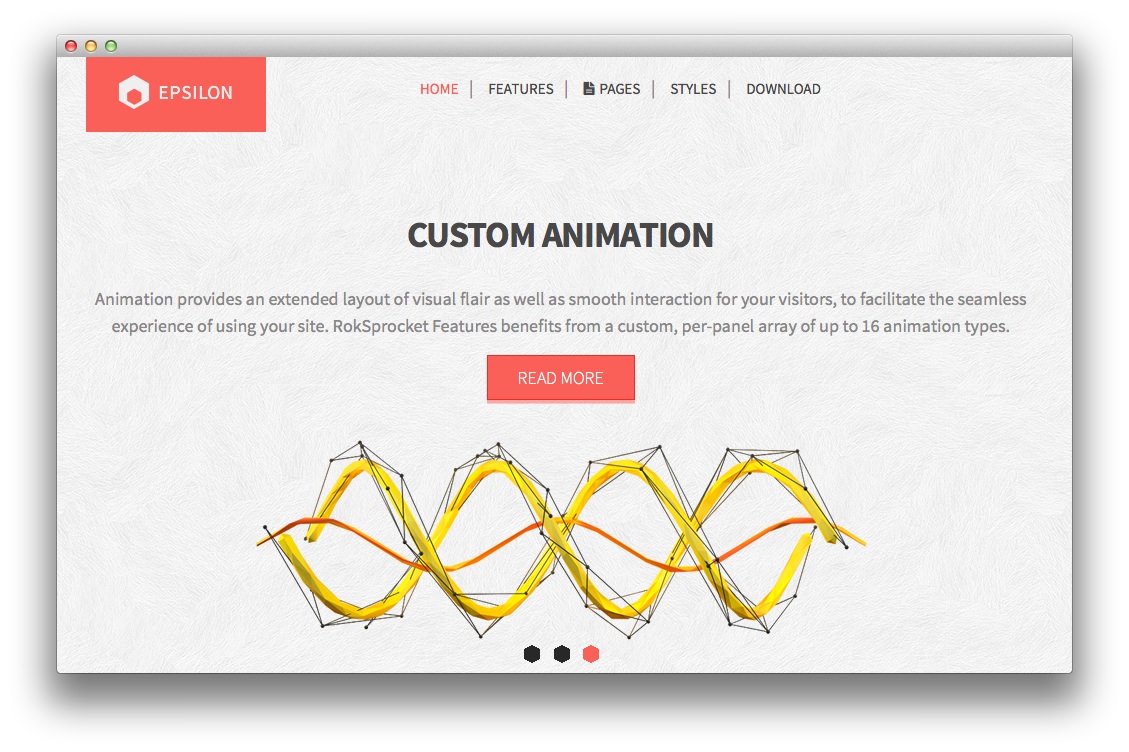
Epsilon is a vibrant, highly adaptable and engaging theme, ideal for a vast selection of possible sites, from community to business. Subtle visual elements in the sectioned design, add character and division to the page, without compromising on content focus.
Requirements
- Apache 2.x or Microsoft IIS 7
- PHP 5.4+
- MySQL 5.0.4 or higher
- WordPress 5.x
- Gantry Framework
NOTE: Gantry v4.1.15 is required for Epsilon to work correctly. For more details on the Gantry Framework, please visit its Dedicated Website.
Key Features
- Responsive Layout
- 6 Preset Styles
- 89 Widget Positions
- 1200 Fixed Option
- 8 Styled Widget Variations
- Structural Widget Variations
- 960 Fixed Option
- Dropdown-Menu and Split-Menu
- Custom Typography
- Custom Logo Option
- Mobile Menu
- Fixed Header
- Social Buttons Option
- Chart.js
- Coming Soon Page
Responsive Layout
A responsive layout adapts automatically to the viewing device's width, such as mobile, tablet or desktop, without the need for a separate layout or content. Mobile modes have a unique menu to aid usability. 960px and 1200px fixed layout options are also available.
| Label | Description | Layout Width | Column Width |
|---|---|---|---|
| Smartphones | Standard smartphones | 480px and below | 100% fluid |
| Smartphones to Tablets | Larger smartphones and small tablets | 767px and below | 100% fluid |
| Tablets | Larger tablets | 768px and above | 64px |
| Desktop | Standard desktops and laptops | 960px and above | 80px |
| Large Display | Large desktops and high-resolution laptops | 1200px and above | 100px |
Found errors? Think you can improve this documentation? Please edit this page. You can also view the history of this page.