Vermilion: Recreating the Demo - Content Top
Your Guide to Recreating Elements of the Vermilion Theme for WordPress
Content Top Section
-
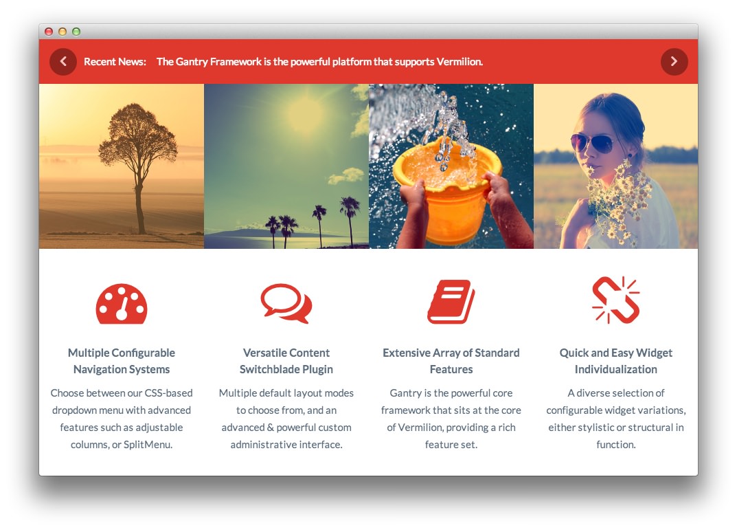 1Text 12Text 23RokSprocket (Tabs)
Here is the widget breakdown for the Content Top section:
- Text
- Text
- RokSprocket (Tabs)
Text 1
This section of the page is a standard text widget. You will need to enter the following in the main text field.
<div class="gantry-row">
    <div class="gantry-width-33">
        <div class="gantry-width-spacer">
            <p class="nomarginbottom"><span class="icon-calendar rt-icon-large"></span></p>
            <span class="rt-circle-number">1</span>
            <h4>Dropdown Menu</h4>
            <p>An advanced CSS based multi-level dropdown system.</p>
        </div>
    </div>
    <div class="gantry-width-33">
        <div class="gantry-width-spacer">
            <p class="nomarginbottom"><span class="icon-briefcase rt-icon-large"></span></p>
            <span class="rt-circle-number">2</span>
            <h4>SplitMenu</h4>
            <p>A static menu with child menu items placed in the sidebar.</p>
        </div>
    </div>
    <div class="gantry-width-33">
        <div class="gantry-width-spacer">
            <p class="nomarginbottom"><span class="icon-plane rt-icon-large"></span></p>
            <span class="rt-circle-number">3</span>
            <h4>Mobile Menus</h4>
            <p>Options for a selectbox or side tree panel menu<span class="hidden-tablet"> for mobile</span>.</p>
        </div>
    </div>
</div>
<div class="clear"></div>
Here is a breakdown of options changes you will want to make to match the demo.
- Set the Title to
Navigation Options[span class="rt-title-tag"]Menu Systems for All Devices[/span]. - Enter
fp-content-top-01 rt-title-largein the Custom Variations field. - Leaving everything else at its default setting, select Save.
Text 2
This section of the page is a standard text widget. You will need to enter the following in the main text field.
<div class="gantry-width-33">
    <img src="http://demo.rockettheme.com/live/wordpress/Vermilion/wp-content/rockettheme/rt_vermilion_wp/home/fp-content-top-02/img-01.jpg" alt="image" />
    <div class="gantry-width-spacer">
        <h4 class="medpaddingtop">Preset Styles</h4>
        <p>An assortment of six default but editable preset style variations.</p>
        <p><a href="#">Learn More</a></p>
    </div>
</div>

<div class="gantry-width-33">
        <img src="http://demo.rockettheme.com/live/wordpress/Vermilion/wp-content/rockettheme/rt_vermilion_wp/home/fp-content-top-02/img-02.jpg" alt="image" />
    <div class="gantry-width-spacer">
        <h4 class="medpaddingtop">Widget Variations</h4>
        <p>Individualize widgetized content using eight stylistic variations.</p>
        <p><a href="http://demo.rockettheme.com/live/wordpress/Vermilion/widget-variations/">Learn More</a></p>
    </div>
</div>

<div class="gantry-width-33">
    <img src="http://demo.rockettheme.com/live/wordpress/Vermilion/wp-content/rockettheme/rt_vermilion_wp/home/fp-content-top-02/img-03.jpg" alt="image" />
    <div class="gantry-width-spacer">
        <h4 class="medpaddingtop">Typography</h4>
        <p>Extensive typographical options to diversify your content.</p>
        <p><a href="http://demo.rockettheme.com/live/wordpress/Vermilion/typography/">Learn More</a></p>
    </div>
</div>

<div class="clear"></div>
Here is a breakdown of options changes you will want to make to match the demo.
- Enter
fp-content-top-02in the Custom Variations field. - Leaving everything else at its default setting, select Save.
RokSprocket
You will need to do two things to prepare this widget so that it looks similar to the one in the demo.
First, you will need to create the RokSprocket Widget. You can do this by navigating to Administration -> RokSprocket Admin and creating a new Tabs widget.
You can find out more about RokSprocket and how to set up and modify widgets by visiting our RokSprocket documentation.
Simple Content Provider
We used the Simple Content Provider to allow us to make custom tabs without having to build posts on the back-end. In this case, the Tab Label and Description are custom, while the other options are left at default or None settings. You will find the settings used in one of these items below.
Tab Label
Display
Description
<div class="gantry-row">
    <div class="gantry-width-25">
        <div class="gantry-width-spacer"><img alt="image" src=
        "http://demo.rockettheme.com/live/wordpress/Vermilion/wp-content/rockettheme/rt_vermilion_wp/home/fp-roksprocket-tabs-content-top/img-01.jpg"></div>
    </div>
    <div class="gantry-width-50">
        <div class="gantry-width-spacer">
            <h4>Tabbed Content Display</h4>
            <p>A layout to display tabbed content, with configurable tab
            positions <span class="hidden-tablet">to the top, bottom, left or
            right</span>.<br>
            <span class="rt-green-text"><strong>Available</strong></span></p>
        </div>
    </div>
    <div class="gantry-width-25">
        <div class="gantry-width-spacer gantry-right gantry-text-right">
            <h4 class="nomarginbottom">Tabs Layout</h4>
            <p class="rt-text-small"><em>RokSprocket</em></p>
            <p><a class="readon" href="#"><span class=
            "hidden-tablet">Learn</span> More</a></p>
        </div>
    </div>
</div>
<div class="clear"></div>
<hr>
<div class="gantry-row">
    <div class="gantry-width-25">
        <div class="gantry-width-spacer"><img alt="image" src=
        "http://demo.rockettheme.com/live/wordpress/Vermilion/wp-content/rockettheme/rt_vermilion_wp/home/fp-roksprocket-tabs-content-top/img-02.jpg"></div>
    </div>
    <div class="gantry-width-50">
        <div class="gantry-width-spacer">
            <h4>Ticker Styled Content</h4>
            <p>The Headlines layout displays content in a news ticket type
            format<span class="hidden-tablet">, rotating through content
            snippets</span>.<br>
            <span class="rt-green-text"><strong>Available</strong></span></p>
        </div>
    </div>
    <div class="gantry-width-25">
        <div class="gantry-width-spacer gantry-right gantry-text-right">
            <h4 class="nomarginbottom">Headlines</h4>
            <p class="rt-text-small"><em>RokSprocket</em></p>
            <p><a class="readon" href="#"><span class=
            "hidden-tablet">Learn</span> More</a></p>
        </div>
    </div>
</div>

<div class="clear"></div>
Here is a look at the Tabs Layout Options for this widget.
| Option | Setting |
|---|---|
| Theme | Default |
| Display Limit | ∞ |
| Tabs Position | Top |
| Animation | Slide and Fade |
| Autoplay | Disable |
| Autoplay Delay | 5 |
| Image Resize | Disable |
| Preview Length | ∞ |
| Strip HTML Tags | No |
You can set the RokSprocket filters to include any category, specific posts, or otherwise you would like to have featured in this widget.
Once you have created this widget, you can add it via the Widgets menu by clicking RokSprocket and dragging it to the appropriate section. When you have done this, you will need to complete the following.
- Select your RokSprocket Tabs widget in the Choose Widget field.
- Set the Widget Variations to Box 3.
- Enter
fp-roksprocket-tabs-content-topin the Custom Variations field. - Leaving everything else at its default setting, select Save.
The widget should now be created and ready for use on the front page of your WordPress site.