Paradigm: Recreating the Demo - Main Top
Your Guide to Recreating Elements of the Paradigm Theme for WordPress
Main Top Section
-
 1Text 12Text 2
Here is the widget breakdown for the Main Top section:
- Text
- Text
Text 1
This section of the page is a standard text widget. You will need to enter the following in the main text field.
<div class="gantry-width-block gantry-width-50">
<div class="gantry-width-spacer">
<div class="rt-maintop-desc">
<div class="module-title">
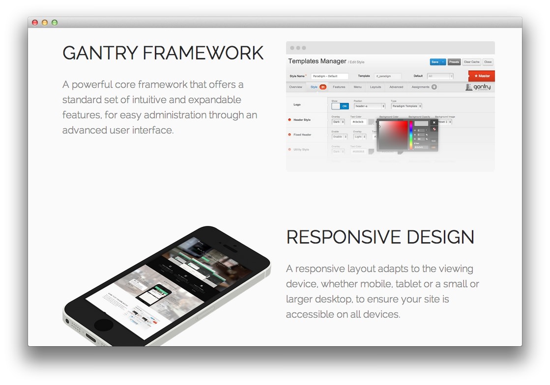
<h2 class="title">Gantry <span class="hidden-tablet">Framework</span></h2>
</div>
<p class="rt-large-text">
A powerful core framework that offers a standard set of<span class="hidden-tablet"> intuitive and expandable</span> features<span class="hidden-tablet">, for easy administration through an advanced user interface</span>.
</p>
</div>
</div>
</div>
<div class="gantry-width-block gantry-width-50">
<div class="gantry-width-spacer">
<img src="http://demo.rockettheme.com/live/wordpress/paradigm/wp-content/rockettheme/rt_paradigm_wp/frontpage/maintop/img1.png" alt="img" />
</div>
</div>
<div class="clear"></div>
Here is a breakdown of options changes you will want to make to match the demo.
- Enter
fp-maintop1 rt-big-titlein the Custom Variations field. - Leaving everything else at its default setting, select Save.
Text 2
This section of the page is a standard text widget. You will need to enter the following in the main text field.
<div class="gantry-width-block gantry-width-50">
    <div class="gantry-width-spacer nomarginbottom">
        <img src="http://demo.rockettheme.com/live/wordpress/paradigm/wp-content/rockettheme/rt_paradigm_wp/frontpage/maintop/img2.png" alt="img" />
    </div>
</div>

<div class="gantry-width-block gantry-width-50">
    <div class="gantry-width-spacer">
        <div class="rt-maintop-desc">
            <div class="module-title">
              <h2 class="title">Responsive <span class="hidden-tablet">Design</span></h2>
            </div>
            <p class="rt-large-text">
                A responsive layout adapts to the viewing device<span class="hidden-tablet">, whether mobile, tablet or a small or larger desktop, to ensure your site is accessible on all devices</span>.
            </p>
        </div>
    </div>
</div>

<div class="clear"></div>
Here is a breakdown of options changes you will want to make to match the demo.
- Switch the Margin Variation option to No Margin Bottom.
- Switch the Padding Variation option to No Padding Bottom.
- Enter
fp-maintop2 rt-big-title hidden-phonein the Custom Variations field. - Leaving everything else at its default setting, select Save.
Found errors? Think you can improve this documentation? Please edit this page. You can also view the history of this page.