Ambrosia: Content Tabs Particle
Your Guide to Recreating Elements of the Ambrosia Demo for Grav
Introduction


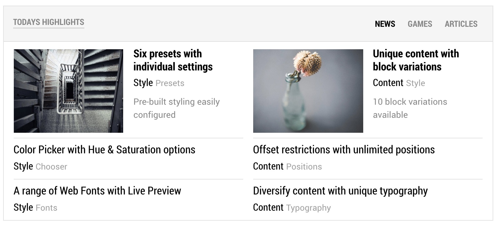
The Content Tabs particle displays content in elegant, easy-to-navigate tabs.
Here are the topics covered in this guide:
Configuration
Main Options
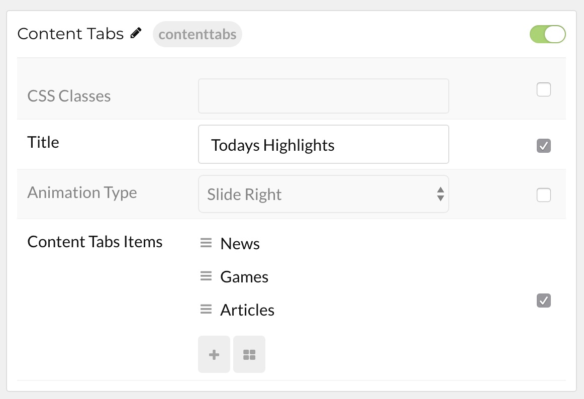
These options affect the main area of the particle, and not the individual items within. You can set the title of the particle, as well as give it an introductory paragraph here.

| Option | Description |
|---|---|
| Particle Name | This is the name of the particle used for back end management. It does not appear on the front end. |
| CSS Classes | Enter any CSS class(es) you wish to have apply to the particle. |
| Title | Enter a title for the particle. This will appear on the front end. |
| Animation Type | You can choose between transition animation types here. |
Item Options
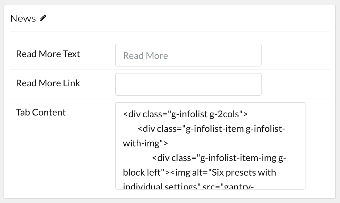
These items make up the individual featured items in the particle. They sit apart from the particle's title and introduction. Each item can have its own properties, including icons and written content.

| Option | Description |
|---|---|
| Item Name | This is the name of the item. This only appears in the back end. |
| Read More Text | Enter any text you want to appear in the item's read me button. |
| Read More Link | Enter the URL you wish the read more button to link to. |
| Tab Content | Content for the tab can be written here. |
Found errors? Think you can improve this documentation? Please edit this page. You can also view the history of this page.