Photon: Recreating the Demo - Expanded Section
Your Guide to Recreating Elements of the Photon Demo for Grav
Introduction
-
 1Content Tabs2Owl Carousel3Simple Content
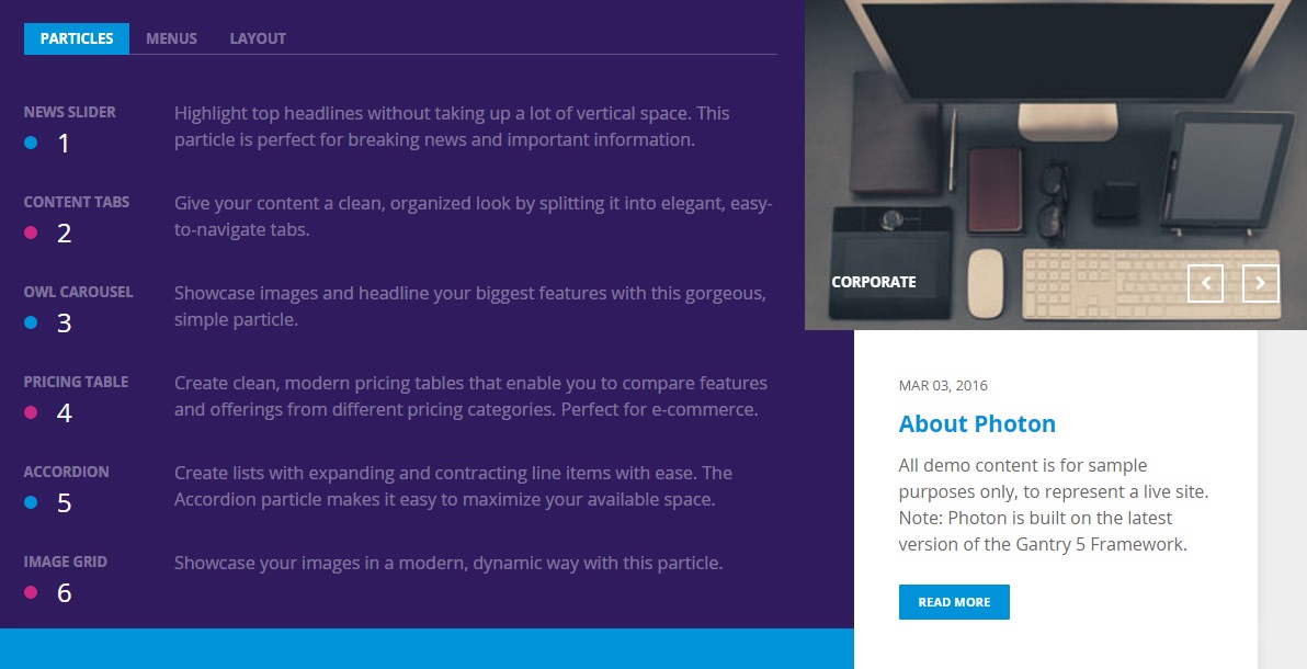
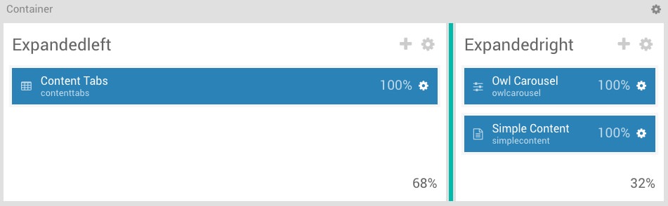
The Showcase section includes three particles: Content Tabs, Owl Carousel, and Simple Content. The Content Tabs particle is assigned to the ExpandedLeft section, while the Owl Carousel and Simple Content particles are assigned to the ExpandedRight section.
Here is a breakdown of the widget(s) and particle(s) that appear in this section:
Container Settings
In this case, two sections are contained within a container. The container acts as a parent section, and the sections as blocks within that parent. Here are the settings used it in the container.
| Option | Setting |
|---|---|
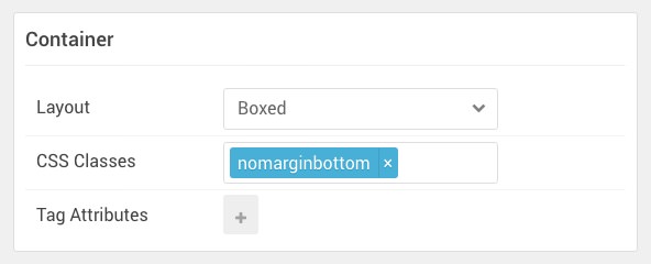
| Layout | Boxed |
| CSS Classes | g-compact |
| Tag Attributes | Blank |
Section Settings
The ExpandedLeft and ExpandedRight sections contain the particles used in our demo. We have included the settings used to create them below.
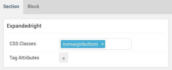
ExpandedLeft
Section Settings
| Option | Setting |
|---|---|
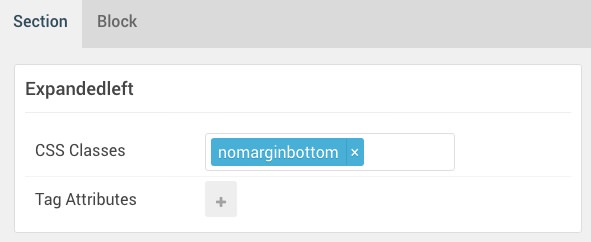
| Name | ExpandedLeft |
| CSS Classes | nomarginbottom |
| Tag Attributes | Blank |
Block Settings
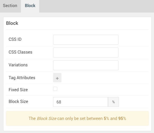
| Option | Setting |
|---|---|
| CSS ID | Blank |
| CSS Classes | Blank |
| Variations | Blank |
| Tag Attributes | Blank |
| Fixed Size | Unchecked |
| Block Size | 68% |
ExpandedRight
Section Settings
| Option | Setting |
|---|---|
| Name | ExapndedRight |
| CSS Classes | nomarginbottom |
| Tag Attributes | Blank |
Block Settings
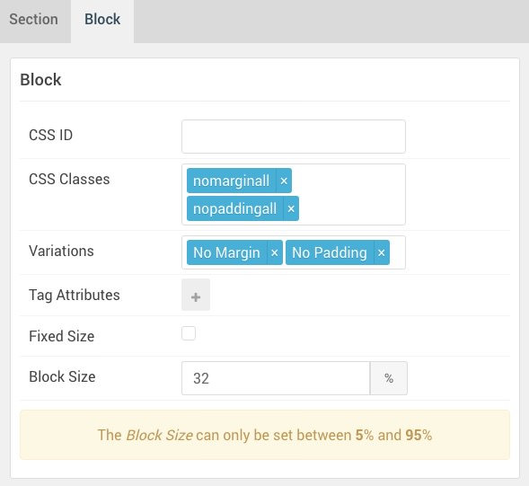
| Option | Setting |
|---|---|
| CSS ID | Blank |
| CSS Classes |
nopaddingall nomarginall
|
| Variations | No Margin, No Padding |
| Tag Attributes | Blank |
| Fixed Size | Unchecked |
| Block Size | 32% |
Content Tabs (Particle)
Particle Settings
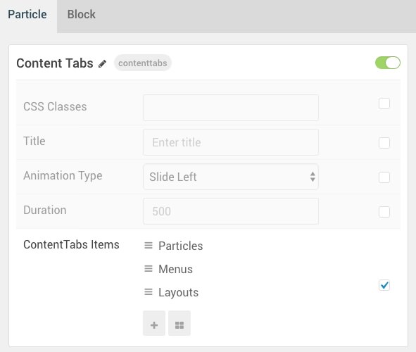
| Option | Setting |
|---|---|
| Particle Name | Content Tabs |
| CSS Classes | Blank |
| Title | Blank |
| Animation Type | Slide Left |
| Duration | 500 |
| Item 1 Name | Particles |
| Item 1 Tab Name | Particles |
| Item 1 Title | Particles |
| Item 1 Subtitle | Blank |
| Item 1 Description | Blank |
| Subitem 1 Name | News Slider |
| Subitem 1 Tag | News Slider |
| Subitem 1 Dot Accent Color | Accent Color 1 |
| Subitem 1 Dot Custom Color | Blank |
| Subitem 1 Subtag Text | 1 |
| Subitem 1 Description | Highlight top headlines without taking up a lot of vertical space. This particle is perfect for breaking news and important information. |
Block Settings
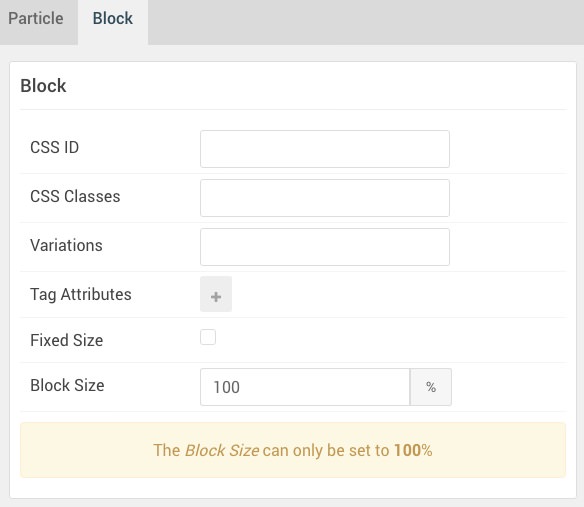
| Option | Setting |
|---|---|
| CSS ID | Blank |
| CSS Classes | Blank |
| Variations | Blank |
| Tag Attributes | Blank |
| Fixed Size | Unchecked |
| Block Size | 100% |
Owl Carousel (Particle)
Particle Settings
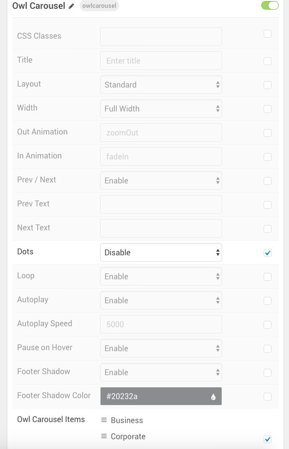
| Option | Setting |
|---|---|
| Particle Name | Owl Carousel |
| CSS Classes | Blank |
| Title | Blank |
| Layout | Standard |
| Width | Full Width |
| Out Animation | zoomOut |
| In Animation | fadeIn |
| Prev / Next | Enable |
| Prev Text | Blank |
| Next Text | Blank |
| Dots | Disable |
| Loop | Enable |
| Autoplay | Enable |
| Autoplay Speed | 5000 |
| Pause on Hover | Enable |
| Footer Shadow | Enable |
| Footer Shadow Color | #20232a |
| Item 1 Name | Business |
| Item 1 Image | Blank |
| Item 1 Icon | Blank |
| Item 1 Title | Business |
| Item 1 Description | Blank |
| Item 1 Link | Blank |
| Item 1 Link Text | Blank |
| Item 1 Target | Self |
| Item 1 Button Class | Blank |
Block Settings
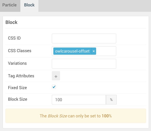
| Option | Setting |
|---|---|
| CSS ID | Blank |
| CSS Classes | owlcarousel-offset |
| Variations | Blank |
| Tag Attributes | Blank |
| Fixed Size | Checked |
| Block Size | 100% |
Simple Content (Particle)
Particle Settings
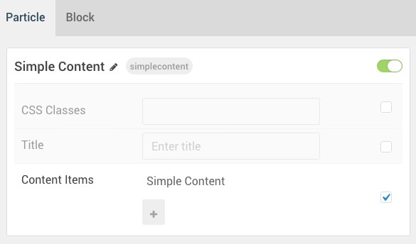
| Option | Setting |
|---|---|
| Particle Name | Simple Content |
| CSS Classes | Blank |
| Title | Blank |
| Item 1 Name | Simple Content |
| Item 1 Layout Style | Standard |
| Item 1 Created Date | MAR 03, 2016 |
| Item 1 Content Title | About Photon |
| Item 1 Author | Blank |
| Item 1 Main Content | Blank |
| Item 1 Read More Label | Read More |
| Item 1 Read More Link | Blank |
| Item 1 Read More Classes | button |
| Item 1 Target | Self |
Leading Content
All demo content is for sample purposes only, to represent a live site.
<br>
Note: Photon is built on the latest version of the Gantry 5 Framework.
Block Settings
| Option | Setting |
|---|---|
| CSS ID | Blank |
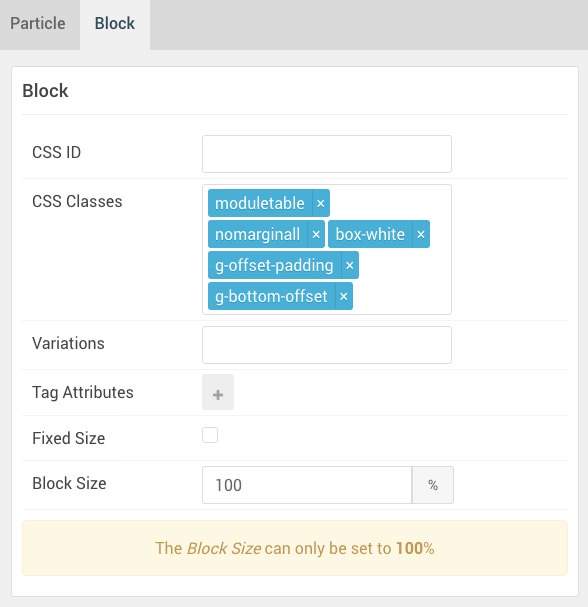
| CSS Classes |
moduletable nomarginall box-white g-offset-padding g-bottom-offset
|
| Variations |
No Margin No Padding
|
| Tag Attributes | Blank |
| Fixed Size | Unchecked |
| Block Size | 100% |
Found errors? Think you can improve this documentation? Please edit this page. You can also view the history of this page.