Photon: Owl Carousel Particle
Your Guide to Recreating Elements of the Photon Demo for Grav
Introduction

The Owl Carousel particle is a diverse particle with multiple layouts, a wide range of features and customization options, and the ability to source content from both the CMS and custom items set up in the particle itself.
The Owl Carousel particle is based on the open source project of the same name by Bartosz Wojciechowski.
Here are the topics covered in this guide:
Configuration
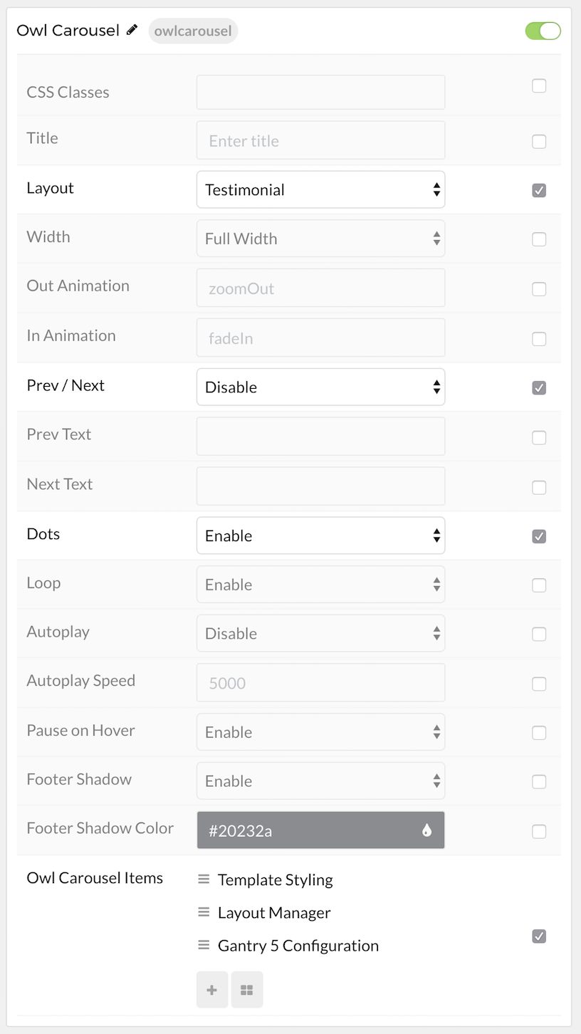
The settings panel for Owl Carousel is filled with options, bells, and whistles you can use to configure your particle. Here is a quick breakdown of the settings you will find in this particle in Photon.
Main Options

| Option | Description |
|---|---|
| CSS Classes | Sets the CSS class for the content of the particle. |
| Title | Sets the title of the particle, as it will appear on the front end. |
| Layout | Choose between the Standard and Testimonial layouts for the particle. This determines how the particle will look, and how content is displayed. |
| Width | Choose between Full Width and Compact to determine how content is displayed. |
| Out Animation | Sets the animation type as content is removed on the front end. fadeOut is a popular option. |
| In Animation | Sets the animation type as content is brought in. fadeIn is a popular option. |
| Prev Next | Enables a previous / next switcher on the front end. |
| Prev Text | Allows you to set text that appears in the Previous switch on the front end. |
| Next Text | Allows you to set text that appears in the Next switch on the front end. |
| Dots | Enables or disables pagination dots. |
| Loop | Enables or disables looping of content, going from finish to start continuously. |
| Autoplay | Enables or disables autoplay, allowing the particle to automatically move through items. |
| Autoplay Speed | Sets the speed at which items are automatically progressed in autoplay. |
| Pause on Hover | Pauses the automatic switching between items in autoplay. |
| Footer Shadow | Enable or disable the appearance of a drop shadow in the footer. |
| Footer Shadow Color | Set the color of the footer shadow here. |
Item Options
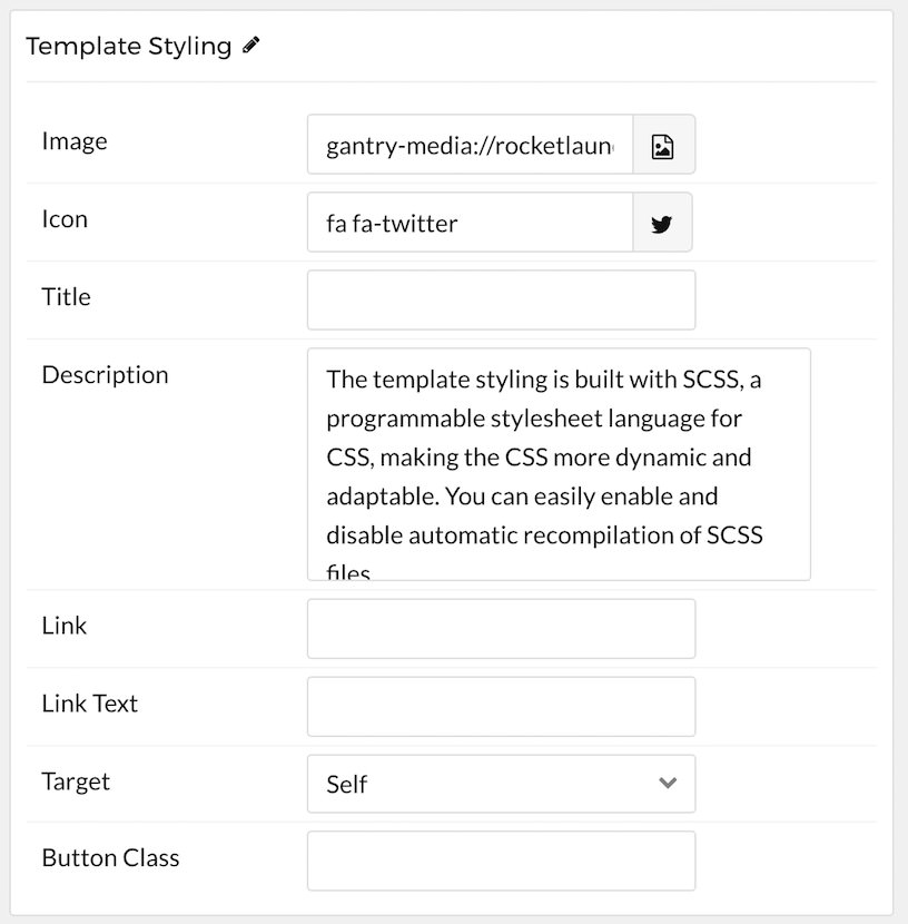
These items only appear on the front end if you select Particle as the Content Source.

| Option | Description |
|---|---|
| Name | Sets the name for the item in the carousel. This is only seen on the back end. |
| Image | Enables you to define an image for the item. This is the primary image that appears most prominently as the item is displayed. |
| Icon | You can use this field to assign an icon to the item that appears with its Title. For example: fa fa-cogwheel fa-fw. |
| Title | Enter a title for the item here. |
| Subtitle | Enter the item's subtitle here. Typically displayed just below the title in a smaller font. |
| Description | This is the main content body of the item. Enter any information you want to have displayed in paragraph form here. |
| Link | This is where you would enter a link you want the item to send visitors to when clicked. |
| Link Text | This text is what the visitor would click to activate the link. |
| Target | Sets how you would like the link to open. You can choose between Self and New Window. Self will open in the current tab, and new window opens a new tab. |
| Button Classes | This field enables you to enter a CSS class you would like to apply to the clickable link's button. |
Found errors? Think you can improve this documentation? Please edit this page. You can also view the history of this page.