Alerion
Your Guide to Using the Alerion Template for Joomla
Introduction
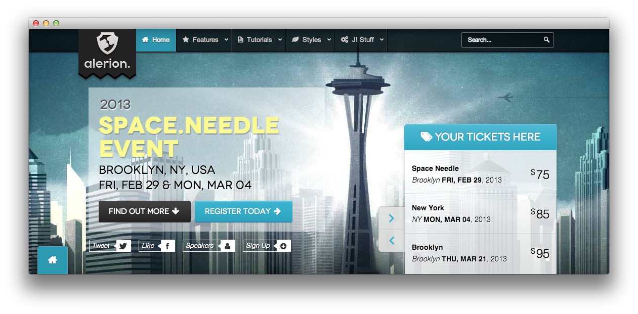
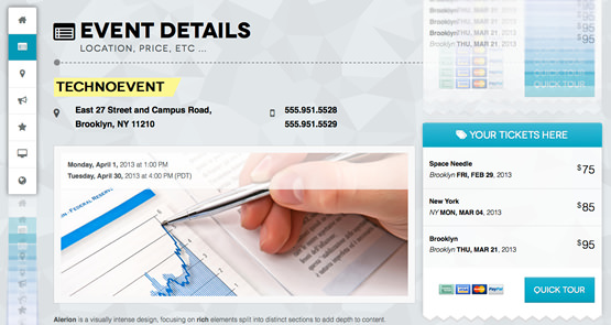
Alerion is a visually intense design, focusing on rich elements split into distinct sections to add depth to content. Additional design features include configurable floating modules and quicknav feature, as well as parallax background effects.
The Gantry Framework provides a standard core of features, such as an advanced template manager; amongst other template features. Further, RokSprocket benefits from Alerion specific integrated styling, for its various layout types.
NOTICE: Alerion is a Joomla 3.x Template.
Requirements
- Apache 2.2+ or Microsoft IIS 7
- PHP 5.3.10+ (PHP 5.5+ Recommended)
- MySQL 5.1+
- Joomla 3.4
NOTE: Gantry v4.1.35 is required for Alerion to work correctly. For more details on the Gantry Framework, please visit its dedicated website.
Key Features
- Joomla 3.x Compatible
- Responsive Layout
- 6 Preset Styles
- QuickNav & Floating Module
- Parallax Background
- 76 Module Positions
- 10 Styled & Numerous Structural Module Suffixes
- RokSprocket Responsive Layout Integrated
- Styled Support for Responsive K2 Layout
- Powerful Gantry 4 Framework
- DropDown Menu & Splitmenu
- FF, Safari, Chrome, Opera, IE8+ Compatible
- HTML5, CSS3, LESS CSS
Responsive Layout
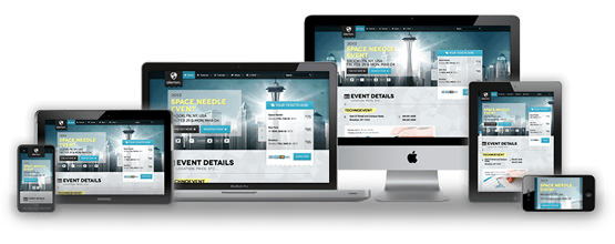 Alerion's responsive grid system is designed for desktop, tablet and smartphone systems, each with minor modifications to ensure compatibility in each mode.
We use the responsive layout based on Twitter's Bootstrap Framework, with its collection of utility classes, to provide a great degree of flexibility for a responsive design.
The table below shows the breakdown of screen resolutions and associated devices, and which layout characters are then applied to each.
| Label | Description | Layout Width | Column Width |
|---|---|---|---|
| Smartphones | Standard smartphones | 480px and below | 100% fluid |
| Smartphones to Tablets | Larger smartphones and small tablets | 767px and below | 100% fluid |
| Tablets | Larger tablets | 768px and above | 64px |
| Desktop | Standard desktops and laptops | 960px and above | 80px |
| Large Display | Large desktops and high-resolution laptops | 1200px and above | 100px |
QuickNav and Floating Module
 QuickNav adds a scrolling menu that follows your viewport as you scroll. You can set an icon with FontAwesome icon format.
The Floating Module feature that allows you to 'bounce' a module between the template sections. You can set a starting position and the end position for the module, as well as the stopping offset point. The stopping offset will stop the module in the exact offset position you would like.
The floating module feature also allows a module position to follow the users viewport.
Parallax Background
 Parallax is apparent motion of a 3D object depending on your perspective. This effect has been transposed into the template, allowing configurable areas to move based on scroll position.