Antares: Recreating the Demo - Feature Section
Your Guide to Recreating Elements of the Antares Demo for Joomla
Introduction
The Feature section includes two particles: Promo Content and Block Content. These particles are placed within the Feature A and Feature B module positions.
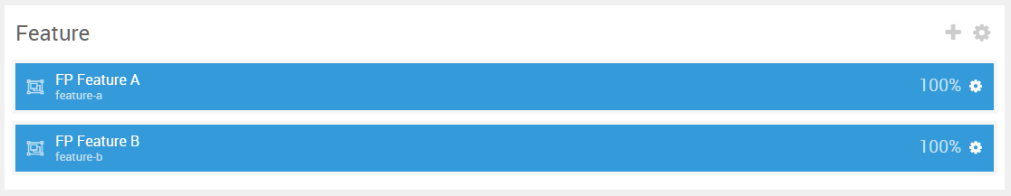
Here is a breakdown of the module(s) and particle(s) that appear in this section:
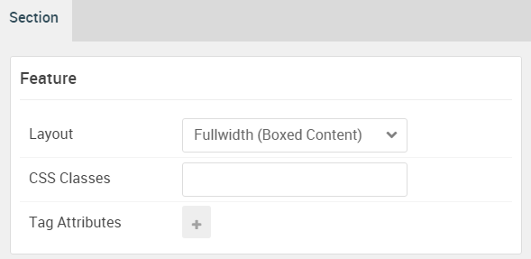
Section Settings
| Option | Setting |
|---|---|
| Layout | Fullwidth (Boxed Content) |
| CSS Classes | Blank |
| Tag Attributes | Blank |
Promo Content (Particle)
The Promo Content particle is a Gantry 5 Particle module placed within the feature-a module position. Adding a particle to a module position can be done by creating a Gantry 5 Particle module, adding the particle using the settings found in the section below, and assigning it to the position.
Module Position Particle Settings
Particle Settings
| Option | Setting |
|---|---|
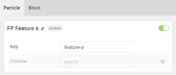
| Particle Name | FP Feature A |
| Key | feature-a |
| Chrome | gantry |
Block Settings
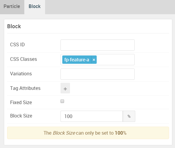
| Option | Setting |
|---|---|
| CSS ID | Blank |
| CSS Classes | fp-feature-a |
| Variations | Blank |
| Tag Attributes | Blank |
| Fixed Size | Unchecked |
| Block Size | 100% |
Promo Content Particle Settings
Particle Settings
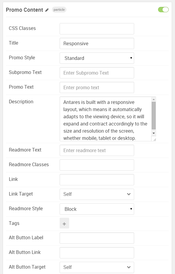
| Option | Setting |
|---|---|
| Particle Name | Promo Content |
| CSS Classes | Blank |
| Title | Responsive |
| Promo Style | Standard |
| Subpromo Text | Blank |
| Promo Text | Blank |
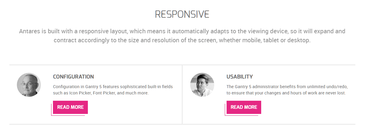
| Description | Antares is built with a responsive layout, which means it automatically adapts to the viewing device, so it will expand and contract accordingly to the size and resolution of the screen, whether mobile, tablet or desktop. |
| Readmore Text | Blank |
| Readmore Classes | Blank |
| Link | Blank |
| Link Target | Self |
| Readmore Style | Block |
| Tags | Blank |
| Alt Button Label | Blank |
| Alt Button Link | Blank |
| Alt Button Target | Self |
| Alt Button Classes | Blank |
Block Content (Particle)
The Block Content particle is a Gantry 5 Particle module placed within the feature-b module position. Adding a particle to a module position can be done by creating a Gantry 5 Particle module, adding the particle using the settings found in the section below, and assigning it to the position.
Module Position Particle Settings
Particle Settings
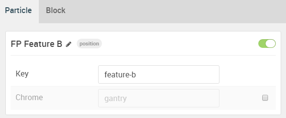
| Option | Setting |
|---|---|
| Particle Name | FP Feature B |
| Key | feature-b |
| Chrome | gantry |
Block Settings
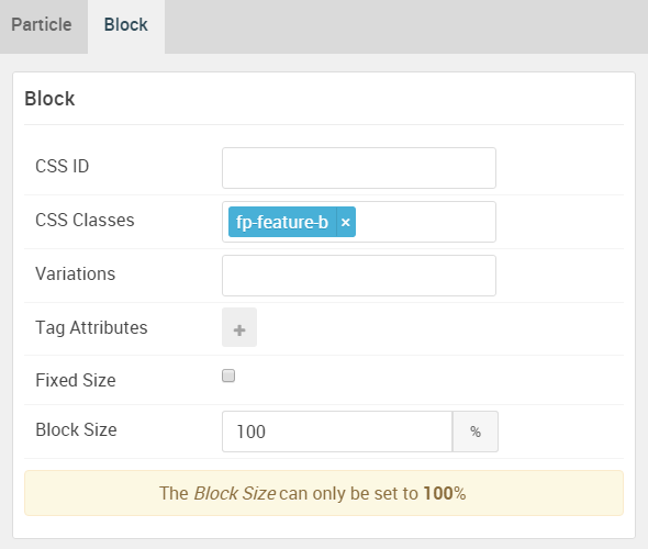
| Option | Setting |
|---|---|
| CSS ID | Blank |
| CSS Classes | fp-feature-b |
| Variations | Blank |
| Tag Attributes | Blank |
| Fixed Size | Unchecked |
| Block Size | 100% |
Block Content Particle Settings
Particle Settings
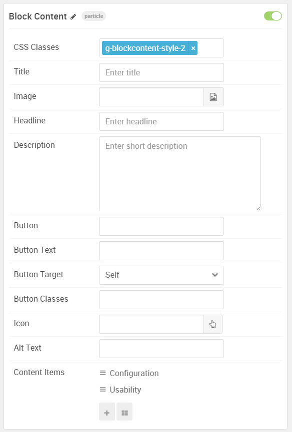
| Option | Setting |
|---|---|
| Particle Name | Block Content |
| CSS Classes | g-blockcontent-style-2 |
| Title | Blank |
| Image | Blank |
| Headline | Blank |
| Description | Blank |
| Button | Blank |
| Button Text | Blank |
| Button Target | Self |
| Button Classes | Blank |
| Icon | Blank |
| Alt Text | Blank |
| Item 1 Name | Configuration |
| Item 1 Title | Configuration |
| Item 1 Icon | Blank |
| Item 1 Image | Blank |
| Item 1 RokBox Image | Blank |
| Item 1 Caption | Blank |
| Item 1 Sub Title | Blank |
| Item 1 Description | Configuration in Gantry 5 features sophisticated built-in fields such as Icon Picker, Font Picker, and much more. |
| Item 1 CSS Classes | Blank |
| Item 1 Button Label | Read More |
| Item 1 Button Link | # |
| Item 1 Button Classes |
button-special button-alt
|