Anacron: Charts
Your Guide to Using Charts in Anacron
Introduction
Anacron supports chart creation and management.
Chart.js support built in to Anacron allows you to create rich and infinitely useful charts within a mod_custom (Custom HTML) module, or injected directly in an article to add a powerful visual element to your written information.
NOTE: This feature is not currently supported in IE8. The Chart.js elements will not display correctly. Newer versions of IE, as well as updated Chrome, Firefox, Safari, Opera, and other popular standard-compliant browser options should work just fine.
Chart.js Support
Anacron introduces built-in support for Chart.js. This element allows you to quickly and easily create dynamic graphs that display information in a variety of ways.
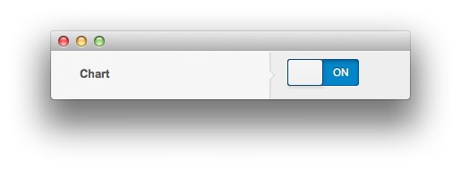
You can toggle this feature on and off by navigating to Administrator -> Extensions -> Template Settings -> Anacron -> Features -> Chart and toggling the option there. If you have a Custom HTML and/or article with the Chart.js code present, and this option is off, nothing will appear in its place and your browser may indicate a JavaScript error.
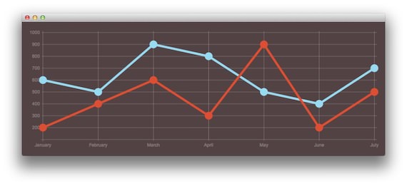
Here is the code block that creates the graph that appears in the above image.
<canvas id="myChart" height="320" width="977"></canvas>
<script type="text/javascript">
    var lineChartData = {
        labels : ["January","February","March","April","May","June","July"],
        datasets : [
            {
                fillColor : "transparent",
                strokeColor : "#97DBF2",
                    pointColor : "#97DBF2",
                    pointStrokeColor : "#97DBF2",
                    data : [600,500,900,800,500,400,700]
                },
                {
                    fillColor : "transparent",
                    strokeColor : "#DE4E33",
                    pointColor : "#DE4E33",
                    pointStrokeColor : "#DE4E33",
                    data : [200,400,600,300,900,200,500]
                }
            ]
        },
        options = {
        //Boolean - If we want to override with a hard coded scale
        scaleOverride : true,
        //** Required if scaleOverride is true **
        //Number - The number of steps in a hard coded scale
        scaleSteps : 9,
        //Number - The value jump in the hard coded scale
        scaleStepWidth : 100,
        //Number - The scale starting value
        scaleStartValue : 100,
        //String - Scale label font colour
        scaleFontColor : "rgba(255,255,255,0.3)",
        //String - Colour of the scale line
        scaleLineColor : "rgba(255,255,255,0.3)",
        //String - Colour of the grid lines
        scaleGridLineColor : "rgba(255,255,255,0.3)",
        //Boolean - Whether the line is curved between points
        bezierCurve : false,
        //Number - Radius of each point dot in pixels
        pointDotRadius : 8,
        //Number - Pixel width of point dot stroke
        pointDotStrokeWidth : 5,
        //Number - Pixel width of dataset stroke
        datasetStrokeWidth : 6,
        //Boolean - Whether to fill the dataset with a colour
        datasetFill : true,
    }
    //Get the context of the canvas element we want to select
    var ctx = document.getElementById("myChart").getContext("2d");
    var myNewChart = new Chart(ctx).Line(lineChartData, options);
</script>
You can find extensive documentation listing the different elements found here on the official website.