Epsilon: Recreating the Demo - FP RokSprocket Tabs
Your Guide to Recreating Elements of the Epsilon Demo for Joomla
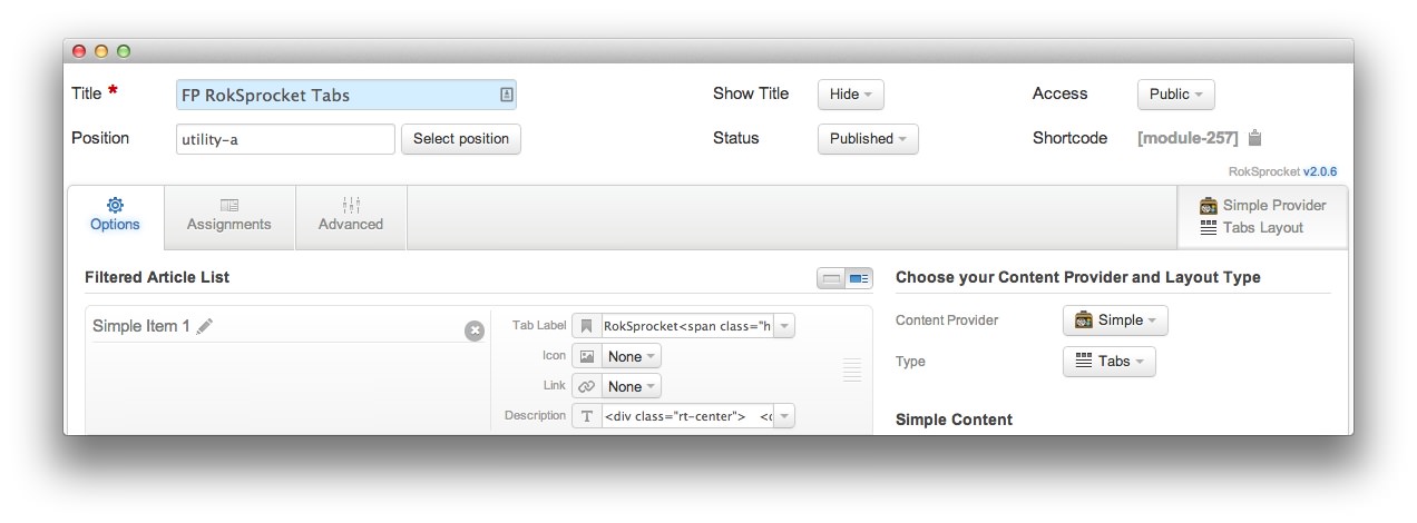
FP RokSprocket Tabs
We used a RokSprocket module with the Tabs layout to make up this area of the front page. You will find the settings used in our demo below.
Details
| Option | Setting |
|---|---|
| Title | FP RokSprocket Tabs |
| Show Title | Hide |
| Access | Public |
| Position | utility-a |
| Status | Published |
| Content Provider | Simple |
| Type | Tabs |
Filtered Article List
Item 1
| Option | Setting |
|---|---|
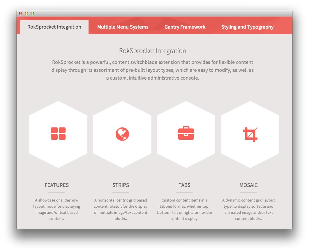
| Label | RokSprocket<span class="hidden-tablet"> Integration</span> |
| Icon | None |
| Link | None |
Description
<div class="rt-center">
    <div class="rt-width-80">
        <h2>RokSprocket Integration</h2>
        <p>RokSprocket is a powerful, content switchblade extension that
        provides for flexible content display through its assortment of
        pre-built layout types, which are easy to modify, as well as a custom,
        intuitive administrative console.</p>
    </div>
    <div class="gantry-width-25 gantry-width-block">
        <div class="gantry-width-spacer">
            <div class="rt-hexagon">
                <a href="#"><span class="icon-th-large"></span></a>
            </div>
            <h5 class="rt-uppercase rt-regular-text">Features</h5>
            <div class="rt-divider"></div>
            <p class="rt-small-text">A showcase or slideshow layout mode for
            displaying image and/or text based content.</p>
        </div>
    </div>
    <div class="gantry-width-25 gantry-width-block">
        <div class="gantry-width-spacer">
            <div class="rt-hexagon">
                <a href="#"><span class="icon-globe"></span></a>
            </div>
            <h5 class="rt-uppercase rt-regular-text">Strips</h5>
            <div class="rt-divider"></div>
            <p class="rt-small-text">A horizontal centric grid based content
            rotator, for the display of multiple image/text content blocks.</p>
        </div>
    </div>
    <div class="gantry-width-25 gantry-width-block">
        <div class="gantry-width-spacer">
            <div class="rt-hexagon">
                <a href="#"><span class="icon-briefcase"></span></a>
            </div>
            <h5 class="rt-uppercase rt-regular-text">Tabs</h5>
            <div class="rt-divider"></div>
            <p class="rt-small-text">Custom content items in a tabbed format,
            whether top, bottom, left or right, for flexible content
            display.</p>
        </div>
    </div>
    <div class="gantry-width-25 gantry-width-block">
        <div class="gantry-width-spacer">
            <div class="rt-hexagon">
                <a href="#"><span class="icon-crop"></span></a>
            </div>
            <h5 class="rt-uppercase rt-regular-text">Mosaic</h5>
            <div class="rt-divider"></div>
            <p class="rt-small-text">A dynamic content grid layout type, to
            display sortable and animated image and/or text content blocks.</p>
        </div>
    </div>
    <div class="clear"></div>
</div>
Layout Options
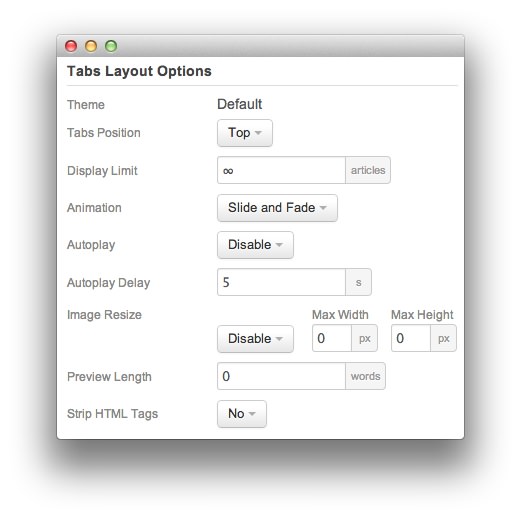
| Option | Setting |
|---|---|
| Theme | Default |
| Tabs Position | Top |
| Display Limit | ∞ |
| Animation | Slide and Fade |
| Autoplay | Disable |
| Autoplay Delay | 5 |
| Preview Length | 0 |
| Image Resize | Disable |
| Strip HTML Tabs | No |
Advanced
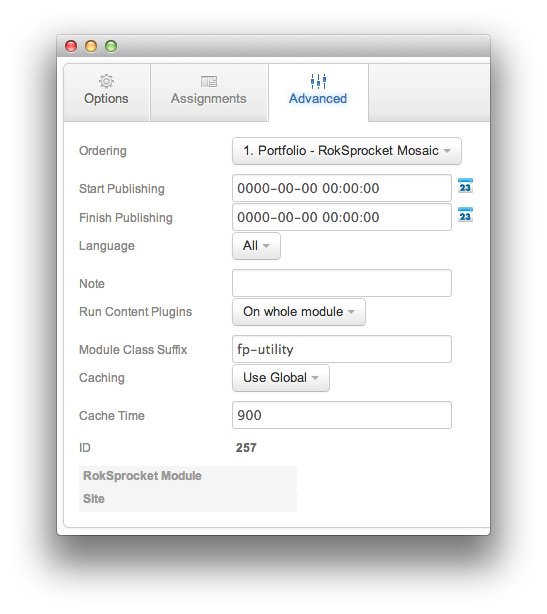
| Option | Setting |
|---|---|
| Module Class Suffix | fp-utility |
Found errors? Think you can improve this documentation? Please edit this page. You can also view the history of this page.