Kirigami
Your Guide to Using the Kirigami Theme for WordPress
Introduction

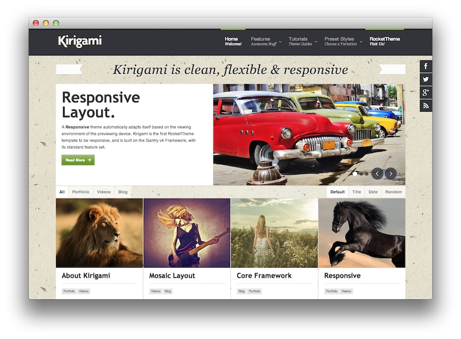
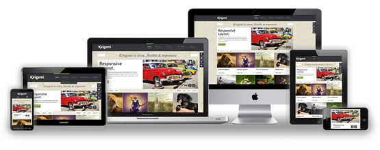
Kirigami, the March 2013 theme release, is the first responsive RocketTheme theme built with the Gantry 4 Framework. A responsive design adapts itself to a particular viewing environment such as desktop or mobile, without the need for separate layouts for varying platforms.
The next generation layout and structure compliments the beautiful and intricate design of the theme, in conjunction with its many features, such as Fusion with MegaMenu, and others based on the Gantry Framework.
Requirements
- Apache 2.x or Microsoft IIS 7
- PHP 5.4+
- MySQL 5.0.4 or higher
- WordPress 5.x
- Gantry Framework
NOTE: Gantry v4.1.15 is required for Kirigami to work correctly. For more details on the Gantry Framework, please visit its Dedicated Website.
Key Features
- Responsive Layout
- 10 Preset Styles
- 78 Widget Positions
- 10 Styled and 25 Structural Widget Variations
- Powerful Core Gantry Framework
- Custom Content Typography
- Fusion MegaMenu & Splitmenu
- Load Transitions
- FF, Safari, Chrome, Opera, IE8+ Compatible
- HTML5, CSS3, LESS CSS
Responsive Layout

Kirigami's responsive grid system is designed for desktop, tablet and smartphone systems, each with minor modifications to ensure compatibility in each mode.
We use the responsive layout based on Twitter's Bootstrap Framework, with its collection of utility classes, to provide a great degree of flexibility for a responsive design.
The table below shows the breakdown of screen resolutions and associated devices, and what layout characters are then applied to each.
| Label | Description | Layout Width | Column Width |
|---|---|---|---|
| Smartphones | Standard smartphones | 480px and below | 100% fluid |
| Smartphones to Tablets | Larger smartphones and small tablets | 767px and below | 100% fluid |
| Tablets | Larger tablets | 768px and above | 64px |
| Desktop | Standard desktops and laptops | 960px and above | 80px |
| Large Display | Large desktops and high-resolution laptops | 1200px and above | 100px |
Responsive Layout for RokSprocket

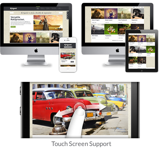
Kirigami comes with the RokSprocket plugin that is built to work with a responsive layout and support mobile touch events, such as 'swipe'.