Audacity: Content Tabs Particle
Your Guide to Using Particles in Audacity for Grav
Introduction
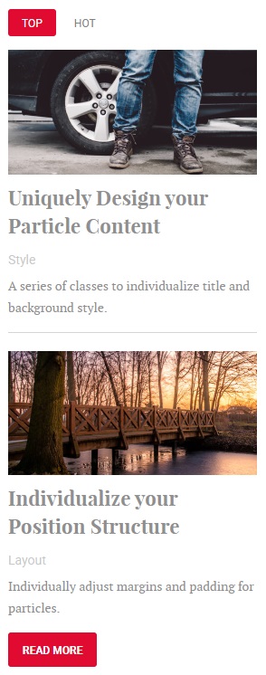
The Content Tabs particle lets you display an abundance of different categories of content in a small space using tabs.
Here are the topics covered in this guide:
Configuration
Main Options
These options affect the main area of the particle, and not the individual items within.
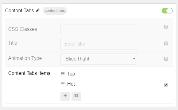
| Option | Description |
|---|---|
| CSS Classes | Set the CSS class(es) you would like to have apply at the particle level. |
| Title | Enter the title of the particle you would like to have appear on the front end. |
| Animation Type | Set the type of animation that plays when tabs are switched. |
Item Options
These items make up the individual featured items in the particle.
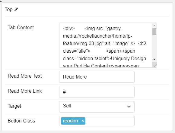
| Option | Description |
|---|---|
| Name | This is the name of the tab, appearing on the front end. |
| Tab Content | Enter text/HTML content for the item. |
| Read More Text | Enter text to appear in the read more button. |
| Read More Link | Enter a URL the icon will send visitors to. |
| Target | Select the window the icon link opens in. |
| Button Class | Enter any CSS class(es) you wish to have apply to the Read More button. |
Found errors? Think you can improve this documentation? Please edit this page. You can also view the history of this page.