Audacity: Image Slider Particle
Your Guide to Using Particles in Audacity for Grav
Introduction
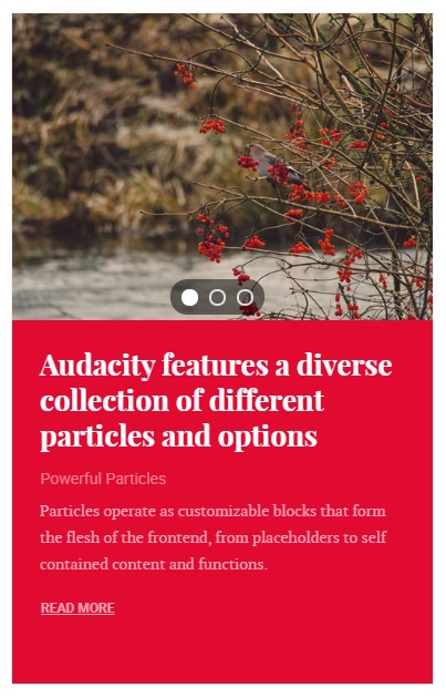
The Image Slider particle is a simple content particle that features an image above an article's title and descriptive content. The slider mechanism enables multiple articles to be featured in a relatively small space in your page's layout.
Here are the topics covered in this guide:
Configuration
Main Options
These options affect the main area of the particle, and not the individual items within.
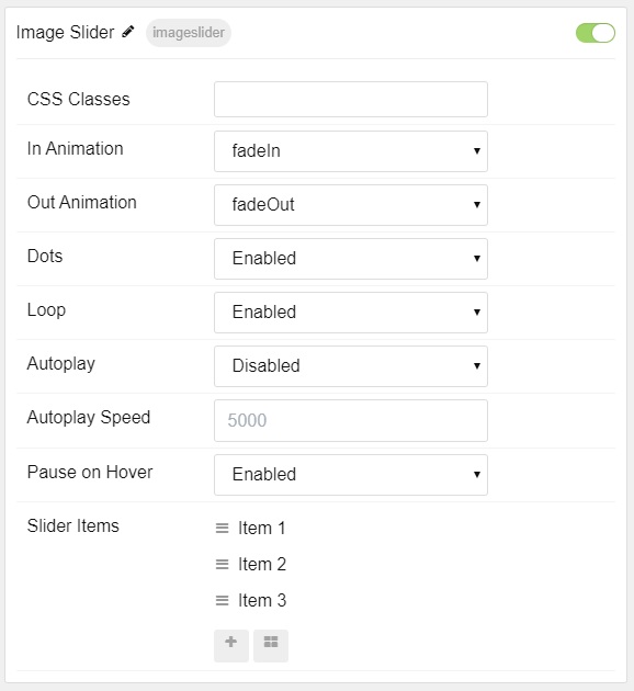
| Option | Setting |
|---|---|
| Particle Name | The name of the particle for organizational use in the backend. |
| CSS Classes | CSS Class(es) you would like to have apply to the particle's content. |
| In Animation | Set the animation type for incoming items. |
| Out Animation | Set the animation type for outgoing items. |
| Dots | Enable or Disable dots navigation. |
| Loop | Enable or Disable looping of slides. |
| Autoplay | Enable or Disable autoplay for the particle. |
| Autoplay Speed | Set the speed (in milliseconds) of the particle's animation. |
| Pause on Hover | Enable or Disable the pause-on-hover effect for the particle. |
Item Options
These items make up the individual featured items in the particle.
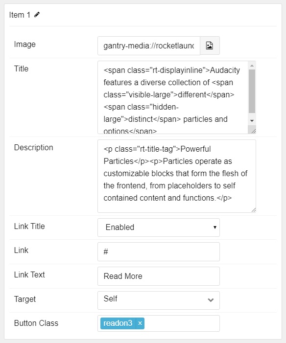
| Option | Description |
|---|---|
| Name | Enter a name for your item. This only appears on the back end. |
| Image | Set an image for the item. |
| Title | Enter a title for the item. |
| Description | Enter a description for the item. |
| Link Title | Enter a title to appear as the link. |
| Link | Enter a link for the item. |
| Link Text | Enter text that appears as the link for the item. |
| Target | Select between Self and New Window for the link's target. |
| Button Class | Enter any CSS class(es) you want to have apply to the button. |
Found errors? Think you can improve this documentation? Please edit this page. You can also view the history of this page.