RokSprocket: Lists Layout Mode
Your Guide to the Lists RokSprocket Layout Mode for WordPress
Lists
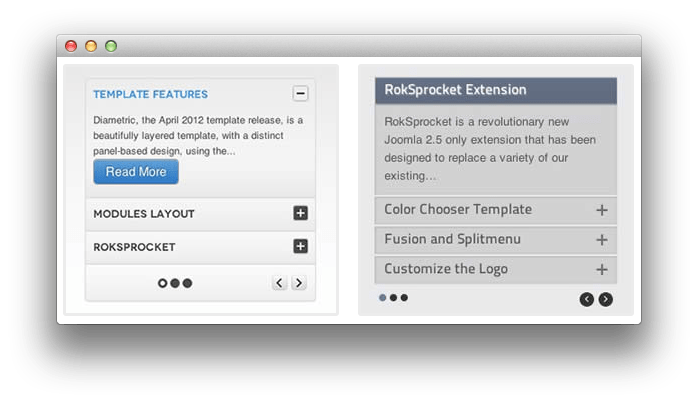
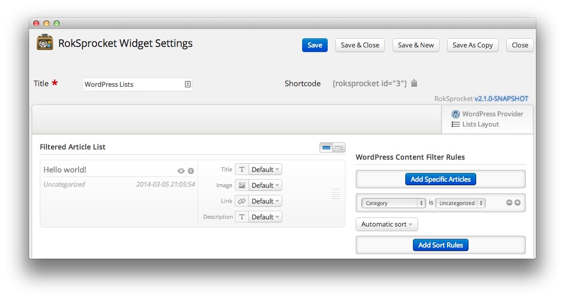
Lists is a vertical display content mode, with accordion support. Here is a look at the options screen for the Lists layout mode.
Themes
There are three themes that come built in to the Lists layout mode in RokSprocket.
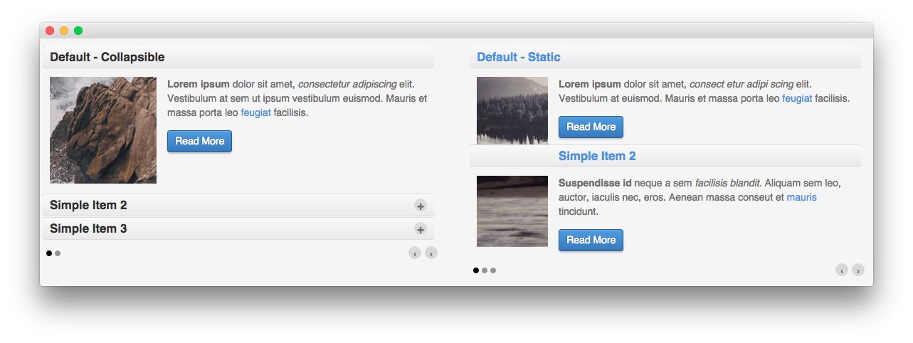
The first of these themes is the Default theme. This theme creates a standard RokSprocket Lists widget, popularly used in many sites to display a lot of content in a relatively small space. It can be set to either Collapsible or Static to create a compact or standard look.
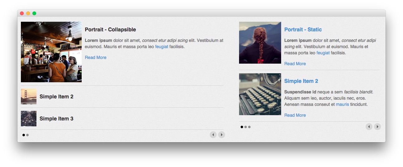
The Portrait theme makes images the focus of your content. In addition to your item title and/or text, your images appear at all times in either the Collapsible or Static format.
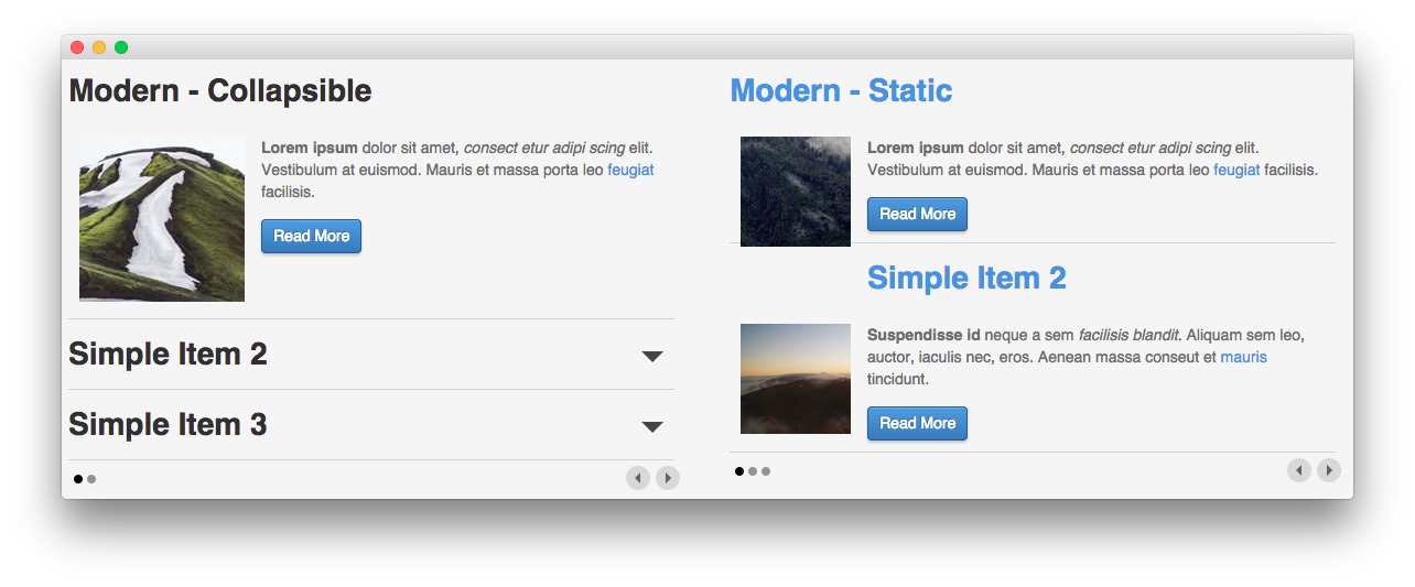
The Modern theme gives you the best of both worlds. It is a modern, flat design approach that mimics the content approach of the default theme, giving you full control over hot much or how little content is featured in the widget.
Setup
-
 1TitleThis is the title of your widget.2Filtered Article List OptionsGives you access to item-specific settings for the articles title, description, image, and link.3Content Filter RulesSets the content filter rules for the widget.
The Title field gives you the ability to set a title for the widget itself. Every widget has to have a title, though you can opt to hide it from public view for a cleaner, more theme integrated look. The Position field right below it gives you the ability to set the position within the theme's layout the widget should appear in.
-
The Filtered Article List gives you access to item-specific settings including:
- Title - Allows you to override the article title in the widget. The article title will be used if this is left at Default. In the Simple content provider, the fallback for the default article title is the item name in the Filtered Article List.
- Description - Allows you to set a description for the item. If this is left at Default the introtext from the article is used.
- Image - This allows you to circumvent the assigned image from the article and replace it with one specifically for the item.
- Link - If set, the link will show a Read More button as well as link the title. On specific themes, it will link the image in the item, as well.
The Content Filter Rules section gives you the ability to determine how the widget will pull content to make up the grid items. For example, you can have the widget pull articles that are within a specific category, contain a particular name or keyword in the title, or choose specific articles. You can also modify how this content is sorted in the widget. In the case of a Simple provider, this area allows you to add new items to the Filtered Article List.
Below the Content Filter Rules section are two options areas specific to the layout mode you have chosen. We have broken down the Lists Layout Options and Lists Article Defaults sections below.
-
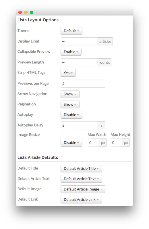 1ThemeThis sets the theme for displaying lists in the widget.2Display LimitThe amount of posts to show when rendering.3Collapsible PreviewThis toggle allows you to enable or disable the collapsible preview capability of the widget.4Preview LengthThis option sets the amount of words you wish to limit the preview to within the widget's post display.5Strip HTML TagsThis option removes HTML tags from the description of a post.6Preview Per PageThis option allows you to set the number of post previews that appear per page in the widget.7Arrow NavigationThis option determines whether you wish to show or hide the arrow navigation controls on the widget.8PaginationThis toggle gives you control over whether or not you wish to show pagination.9AutoplaySets whether you want the widget to start rolling through lists automatically when the page loads, or to await a command from the visitor.10Autoplay DelaySets the amount of time between cycled lists in the widget. The longer this delay (in seconds), the longer a single post will be featured in the widget.11Image ResizeThis option is best utilized on a non-responsive theme. It renders a copy of the selected image with a maximum width or height determined in these fields.12Default TitleYou can set a default title for all posts from this field. If this selection is set at
Default post Title, then the post's given titles are used.13Default Article TextThis field allows you to set default post text for all lists in the widget. If this is not changed from its default, then the post's introductory text is used.14Default Article ImageDetermines which image field the widget will default to when locating an image for the feature.15Default LinkDetermines which link field the widget will default to when locating a link for the feature.
The Theme option sets the theme for displaying lists in the widget. These themes determine how the lists look within the widget. You can choose the one that best fits your theme and/or personal taste.
The Collapsible Preview toggle gives you the ability to choose whether or not the lists should include a collapsible preview feature. When enabled, only one post preview at a time will show expanded.
The Display Limit field sets the amount of posts shown when the page is rendered. Setting this limit to zero or infinity will allow it to cycle through all applicable items.
The Preview Length option sets the amount of words you wish to limit the preview to within the widget's post display. This can help reduce occurrences of controls overlaying the description and make your lists more uniform.
The Strip HTML Tags option removes HTML tags from the description of a post.
The Previews Per Page setting allows you to determine how many previews appear per page within the widget.
The Arrow Navigation option determines whether you wish to show or hide the arrow navigation controls on the widget.
The Pagination toggle gives you control over whether or not you wish to show pagination.
Autoplay sets whether you want the widget to start rolling through lists automatically when the page loads, or to await a command from the visitor.
Autoplay Delay sets the amount of time between cycled lists in the widget. The longer this delay (in seconds), the longer a single post will be featured in the widget.
The Image Resize option is best utilized on a non-responsive theme. It renders a copy of the selected image with a maximum width or height determined in these fields. This option is disabled by default, but can be used to fit a variety of themes which would benefit from this uniformity. In a responsive theme, images will continue to expand or shrink based on the grid and browser window size.
You can set a default title for all posts from the Default Title field. If this selection is set at Default post Title, then the post's given titles are used.
The Default Article Text field allows you to set default post text for all features in the widget. If this is not changed from its default, then the post's introductory text is used. You can choose to use post content, an assigned post excerpt, the default article text, or to have nothing appear at all.
The Default Article Image option gives you the ability to set a standard default image for posts. This includes: a custom image, post intro image, and post full image. Alternatively, you can leave this set to default and it will grab the global default post image.
The Default Article Link gives you the ability to set a default link field from posts in the widget. This can be either the default article link, a custom link that applies as the default for all items, or nothing at all.