ROCKETTHEME IS CLOSING ON JUNE 30, 2025. As a thank-you to our community, enjoy 50% off all themes with the promo code THANKYOU before we shut down.
Read our Farewell Blog Post for more details.
Sirocco
Your Guide to Using the Sirocco Template for Joomla
Introduction
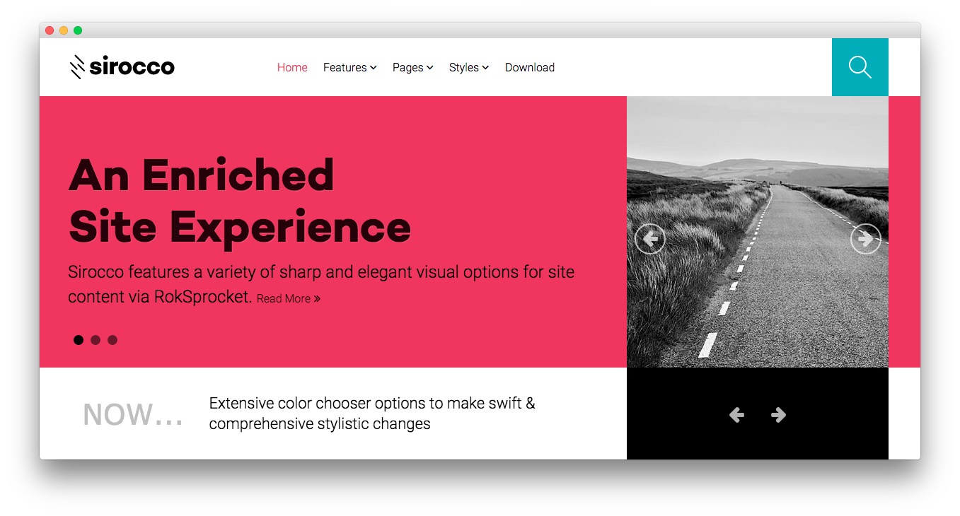
Sirocco features a variety of sharp and elegant visual options for site content via RokSprocket, with its many layouts and themes. The design paradigm behind Sirocco is a flat and contemporary approach, to keep a fresh but engaging site experience.

Requirements
- Apache 2.2+ or Microsoft IIS 7
- PHP 5.3.10+ (PHP 5.5+ Recommended)
- MySQL 5.1+
- Joomla 3.4+
NOTE: Gantry v4.1.35 is required for Sirocco to work correctly. For more details on the Gantry Framework, please visit its Dedicated Website.
Key Features
- Responsive Layout
- 8 Preset Styles
- Content Animations
- 90 Module Positions
- 1200 Fixed Option
- 8 Styled Module Suffixes
- Structural Module Suffixes
- 960 Fixed Option
- Dropdown-Menu and Split-Menu
- Custom Typography
- Custom Logo Option
- Mobile Menu
- Social Buttons Option
- Chart.js
- Coming Soon Page
Responsive Layout
A responsive layout adapts automatically to the viewing device's width, such as mobile, tablet or desktop, without the need for a separate layout or content. Mobile modes have a unique menu to aid usability. 960px and 1200px fixed layout options are also available.
| Label | Description | Layout Width | Column Width |
|---|---|---|---|
| Smartphones | Standard smartphones | 480px and below | 100% fluid |
| Smartphones to Tablets | Larger smartphones and small tablets | 767px and below | 100% fluid |
| Tablets | Larger tablets | 768px and above | 64px |
| Desktop | Standard desktops and laptops | 960px and above | 80px |
| Large Display | Large desktops and high-resolution laptops | 1200px and above | 100px |
Found errors? Think you can improve this documentation? Please edit this page. You can also view the history of this page.