Tessellate: Recreating the Demo - FP RokSprocket Tabs - Showcase
Your Guide to Recreating Elements of the Tessellate Demo for Joomla
FP RokSprocket Tabs - Showcase
-
 1RokSprocket2Still RokSprocket
We used a RokSprocket module with the Tabs layout to make up this area of the front page. It overlaps the Custom HTML module that is also placed in the showcase-c position thanks to custom script in the demo.less file. The fp-roksprocket-tabs-showcase module class suffix must be in place in order for this to work.
You can make adjustments to how your module appears and is placed by adding the below code to a custom.less file and changing the widths, heights, and margins. More information on creating/editing this file can be found in our Gantry documentation.
Here is the block of code you would change to affect the RokSprocket Tabs module specifically:
// FP Showcase B
.menu-home.-aug14-home #rt-showcase .rt-grid-3 {
    background: darken(@header-background, 4%);
}

// FP RokSprocket Tabs - Showcase
.fp-roksprocket-tabs-showcase {
    &.rt-block {
        top: -49px;
        height: 331px;
    }
    .sprocket-tabs {
        .sprocket-tabs-nav li .sprocket-tabs-inner {
            padding: 0;
        }
        &.layout-left {
            .sprocket-tabs-nav {
                min-height: 331px;
                margin-right: 0;
                top: 49px;
                li {
                    margin-bottom: 0;
                }
            }
            .sprocket-tabs-panels {
                margin-left: 110px;
                background: @accent-color1;
                .textColor(@accent-color1);
            }
        }
    }
}

@media (min-width: 960px) and (max-width: 1199px) {
    .fp-roksprocket-tabs-showcase {
        &.rt-block {
            height: 271px;
        }
        .sprocket-tabs {
            .sprocket-tabs-nav li .sprocket-tabs-inner {
                max-width: 90px;
            }
            &.layout-left {
                .sprocket-tabs-nav {
                    min-height: 270px;
                }
                .sprocket-tabs-panels {
                    margin-left: 90px;
                }
            }
        }
    }
}
@media (min-width: 768px) and (max-width: 959px) {
    .fp-roksprocket-tabs-showcase {
        &.rt-block {
            height: 222px;
        }
        .sprocket-tabs {
            .sprocket-tabs-nav li .sprocket-tabs-inner {
                max-width: 74px;
                min-width: inherit;
            }
            &.layout-left {
                .sprocket-tabs-nav {
                    min-height: 222px;
                }
                .sprocket-tabs-panels {
                    margin-left: 74px;
                }
            }
        }
    }
}
You will find the settings used in our demo below.
Details
| Option | Setting |
|---|---|
| Title | FP RokSprocket Tabs - Showcase |
| Show Title | Hide |
| Access | Public |
| Position | showcase-c |
| Status | Published |
| Content Provider | Simple |
| Type | Tabs |
Filtered Article List
Item 1
| Option | Setting |
|---|---|
| Label | <img src="/images/rocketlauncher/home/fp-roksprocket-tabs-showcase/img-01.jpg" alt="image" /> |
| Icon | None |
| Link | None |
Description
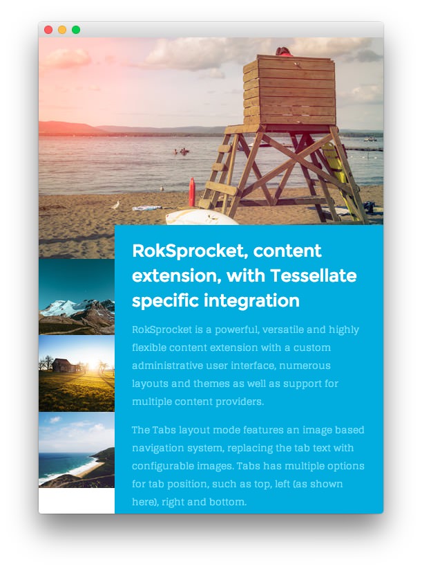
<h3><span>RokSprocket<span class="hidden-tablet">, content</span> extension,
with Tessellate <span class="visible-large">specific</span>
integration</span></h3>

<p class="hidden-tablet"><span>RokSprocket is a powerful, versatile and highly
flexible content extension with a custom administrative user
interface<span class="visible-large">, numerous layouts and themes as well as
support for multiple content providers</span>.</span></p>

<p class="hidden-tablet"><span>The Tabs layout mode features an image based
navigation system, replacing the tab text with configurable images.
<span class="visible-large">Tabs has multiple options for tab position, such as
top, left (as shown here), right and bottom.</span></span></p>

<p class="visible-tablet">RokSprocket is a versatile content extension with a
custom UI.</p>

<p class="visible-tablet">The Tabs layout mode features an image based
navigation system.</p>
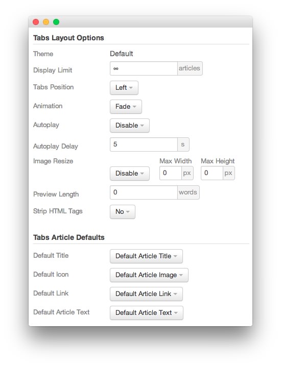
Layout Options
| Option | Setting |
|---|---|
| Theme | Default |
| Display Limit | ∞ |
| Tabs Position | Left |
| Animation | Fade |
| Autoplay | Disable |
| Autoplay Delay | 5 |
| Preview Length | 0 |
| Image Resize | Disable |
| Strip HTML Tabs | No |
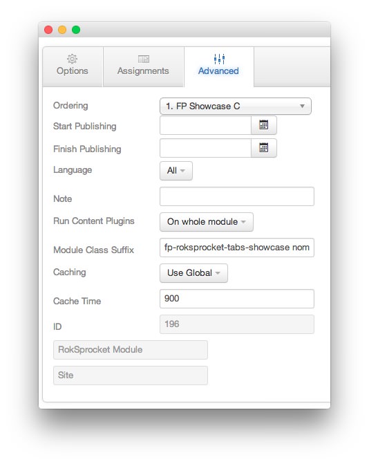
Advanced

| Option | Setting |
|---|---|
| Module Class Suffix | fp-roksprocket-tabs-showcase nomarginall nopaddingall |