RokSprocket: Sliders Layout Mode
Your Guide to the Sliders RokSprocket Layout Mode for Joomla
Sliders

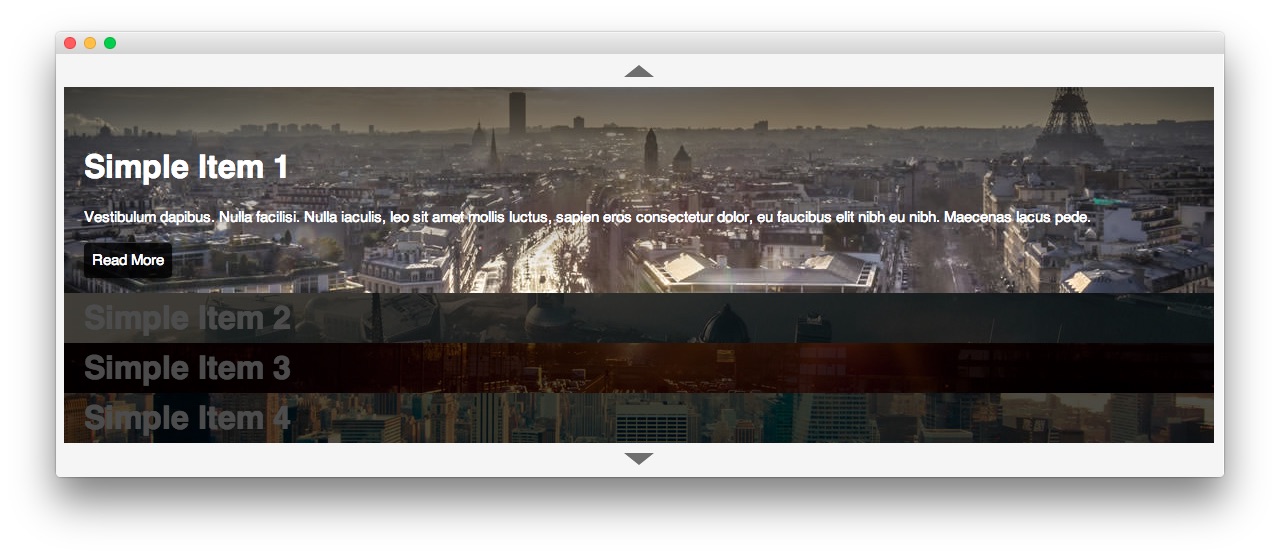
A vertical list layout, set within an accordion setup with images being used as the main structure. Text is also supported. Sliders has a single theme: Accordion.
-
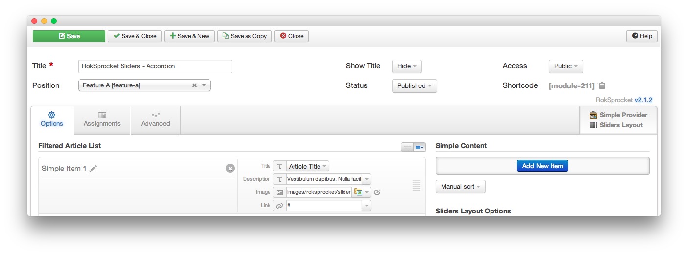
 1TitleThis is the title of your module.2Show TitleDetermines whether the title of the module will appear for visitors or remain hidden.3StatusSets the publishing status for the module.4AccessSets the access level for the module.5Filtered Article List OptionsGives you access to item-specific settings for the articles title, description, image, and link.6Content Filter RulesSets the content filter rules for the module.
The Title field gives you the ability to set a title for the module itself. Every module has to have a title, though you can opt to hide it from public view for a cleaner, more template integrated look. The Position field right below it gives you the ability to set the position within the template's layout the module should appear in.
The Show Title option gives you the ability to determine whether or not the title of the module will appear with the module on the frontend.
The Status option allows you to determine the current publishing status of the module. An unpublished module will still appear on the backend for administrators, but will not appear on the live site.
The Access option gives you the ability to determine which user group will be able to see the module on the frontend. Someone logged in as a registered user may be able to see a module set at that level while random visitors do not see it.
-
The Filtered Article List gives you access to item-specific settings including:
- Title - This is the title of the item as it appears in the module. You can select article title, none, or custom. If article title is selected in the Simple content provider, the simple item's title in the Filtered Article List will be used.
- Description - This is the main text body of the item. You can use HTML in this field to customize how you want the content to appear.
- Image - This field enables you to add an image which appears as a background for the item.
- Link - If set, the link will show a Read More button as well as link the title. On specific themes, it will link the image in the item, as well.
The Content Filter Rules section gives you the ability to determine how the module will pull content to make up the quotes. For example, you can have the module pull articles that are within a specific category, contain a particular name or keyword in the title, or choose specific articles. You can also modify how this content is sorted in the module. In the case of a Simple provider, this area allows you to add new items to the Filtered Article List.
Below the Content Filter Rules section are two options areas specific to the layout mode you have chosen. We have broken down the Sliders Layout Options and Grids Article Defaults sections below.
-
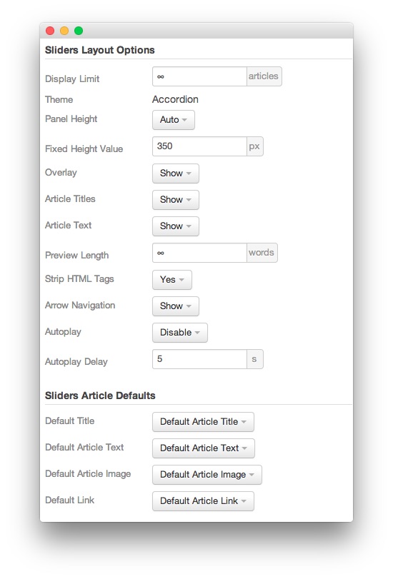
 1Display LimitThe amount of items to show when rendering.2ThemeThis sets the theme for displaying items in the module.3Panel HeightThis sets the height of the panel to either auto or fixed. If it is set to fixed, the Fixed Height Value will be used.4Fixed Height ValueThis sets the height of the panel when the Panel Height is set to Fixed.5OverlayToggles a dark overlay which puts inactive panels out of focus, drawing more attention to the active panel.6Article TitlesAllows you to toggle whether or not article titles appear in the item display.7Article TextAllows you to toggle whether or not article text appears in the item display.8Preview LengthThis option sets the amount of words you wish to limit the preview to within the item's text field.9Strip HTML TagsThis option removes HTML tags from the item text.10Arrow Navigation: This option enables arrow navigation for visitors to switch between pages of items in the module.11Autoplay: Automatically switches between pages of items without a required action by the visitor.12Autoplay Delay: Sets the delay between page switches during autoplay.13Default TitleYou can set a default title for all articles from this field. If this selection is set at
Default Article Title, then the articles' given titles are used.14Default Article TextThis field allows you to set default article text for all items in the module. If this is not changed from its default, then the article's introductory text is used.15Default Article ImageDetermines which image field the module will default to when locating an image for the item.16Default LinkDetermines which link field the module will default to when locating a link for the item.
Display Limit: The amount of items to show when rendering.
Theme: This sets the theme for displaying items in the module.
Panel Height: This sets the height of the panel to either auto or fixed. If it is set to fixed, the Fixed Height Value will be used.
Fixed Height Value: This sets the height of the panel when the Panel Height: is set to Fixed.
Overlay: Toggles a dark overlay which puts inactive panels out of focus, drawing more attention to the active panel.
Article Titles: Allows you to toggle whether or not article titles appear in the item display.
Article Text: Allows you to toggle whether or not article text appears in the item display.
Preview Length: This option sets the amount of words you wish to limit the preview to within the item's text field.
Strip HTML Tags: This option removes HTML tags from the item text.
Arrow Navigation: This option enables arrow navigation for visitors to switch between pages of items in the module.
Autoplay: Automatically switches between pages of items without a required action by the visitor.
Autoplay Delay: Sets the delay between page switches during autoplay.
Default Title: You can set a default title for all articles from this field. If this selection is set at
Default Article Title, then the articles' given titles are used.Default Article Text: This field allows you to set default article text for all items in the module. If this is not changed from its default, then the article's introductory text is used.
Default Article Image: Determines which image field the module will default to when locating an image for the item.
Default Link: Determines which link field the module will default to when locating a link for the item.